

Hello there!! Since you have arrived here, allow me to explain the contents of this space in brief.
Welcome to my portfolio website. With experience across institute-level projects, industry internships, and self-initiated endeavors, I have used these platforms to enhance my design knowledge and communication skills to a great extent.
Currently pursuing User Experience Design, I possess a diversified skill set that includes usability testing, wireframing, prototyping, user research, user interface design, visual design, mobile/web application design, and user analytics.
As an open-minded person, I encourage you to feel free to reach out to me. Let’s collaborate to create new and interesting projects for the future.
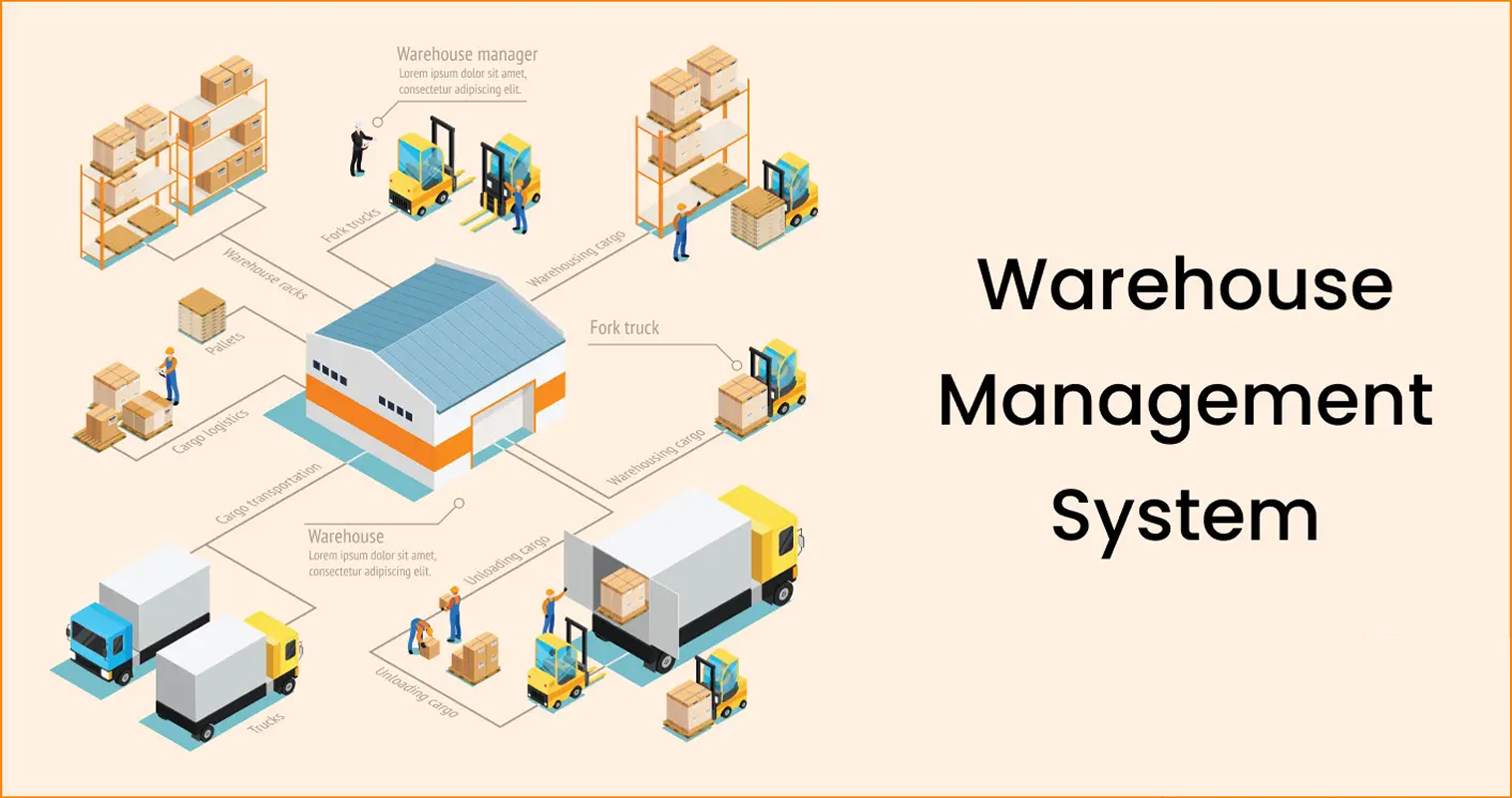
Warehouse Management System (Graduation Project)
This project involved the designing and developing of a Warehouse Management System (WMS) as part of an industry project at Aliter Business Solutions Pvt. Ltd. Managing warehouse operations can often prove to be a challenge if not automated. Maintaining physical logbook records of each and every data entry consumes extra time and could lead to manual errors, which disrupt operations. A Warehouse Management System (WMS) was the need of the hour to support on-ground operation and limit the use of physical records. This WMS project aims at solving these issues by optimizing and streamlining warehouse operations on digital platforms. By extending this platform to the warehouse workers, it creates an environment where tasks are completed faster, errors are close to none, and workers utilize their time in other important responsibilities at the warehouse apart from desk work.

Name of organisation: Aliter Business Solutions Private Limited
Organisation tagline: Passionately curious
About the organization: Aliter Business Solutions is a technology-based IoT and automation company that helps businesses by providing them simple and effective solutions that help make their processing more efficient and competent. Aliter Business Solutions began by offering business process and industrial automation solutions and has since expanded to include a wide range of allied services under its umbrella. It has since grown into a structured group of 80+ working enthusiasts in multiple locations across India, with its headquarters in Mumbai and offices in multiple cities such as Ahmedabad and Pune, since its inception in 2017. Aliter’s team of highly motivated experts has helped customers belonging to a plethora of different verticals by delivering innovative and customised solutions to suit their business models.
Location: Mumbai, Maharashtra, India
Workstyle: On-site
![]()
Rexel Group is a French multinational and a global leader in energy distribution, providing tailored solutions for production, maintenance, renovation, and construction to the industrial, residential, and commercial markets. Rexel is a renowned Paris Stock Exchange-listed global organisation with a presence in 19 countries. Rexel India is a 100% subsidiary of Rexel.
Rexel brings global expertise to India, aiming to be the top technical distributor for customers, suppliers, and employees with reliability and expertise. Rexel provides customer support with industrial automation, field instrumentation, complementary automation products, lighting solutions, and consolidation services, enhancing productivity and reducing energy consumption with innovative solutions from top manufacturers.
Evolve Automation Platform is a business platform by Aliter that is easy to configure, map, and integrate with any Enterprise Resource Planning (ERP) platform and third-party application. From gate-in to production, production to warehouse, and warehouse to gate-out, end-to-end traceability can be possible through Evolve. Evolve also provides real-time monitoring and tracking reports as per business OEM, OEE, or HO-level required analytics. With Evolve, there is no need to worry about user licenses, as it is a user-friendly platform and is built as per the latest UI/UX standards.
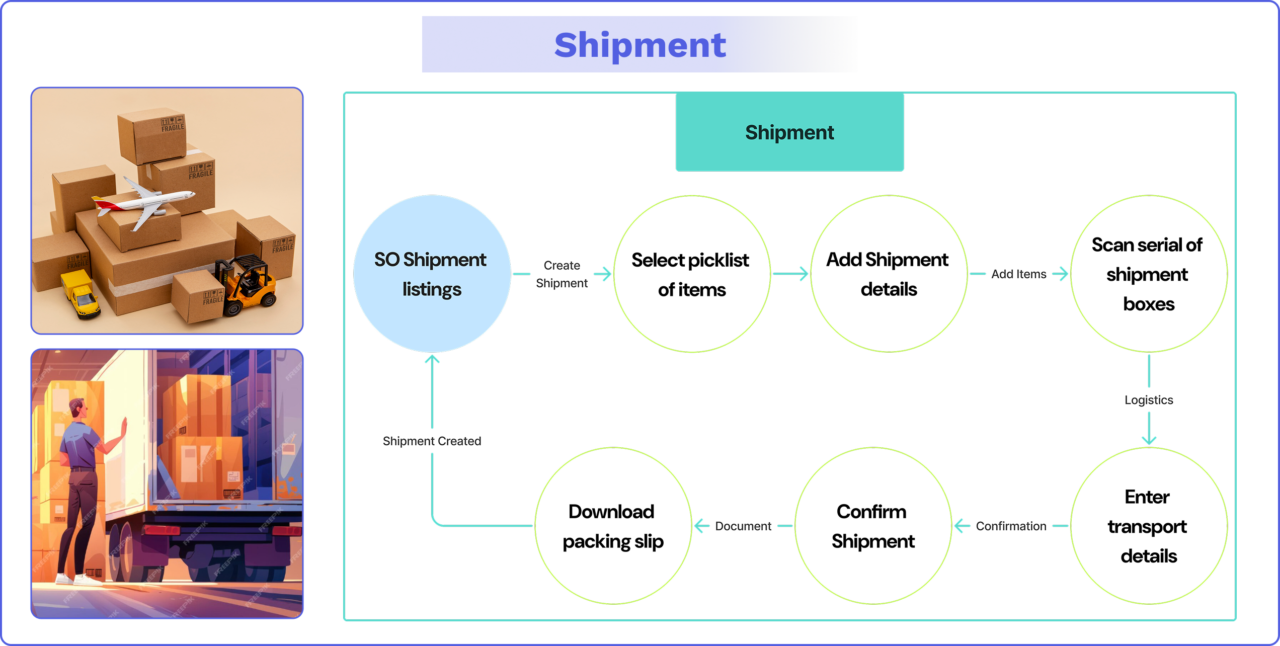
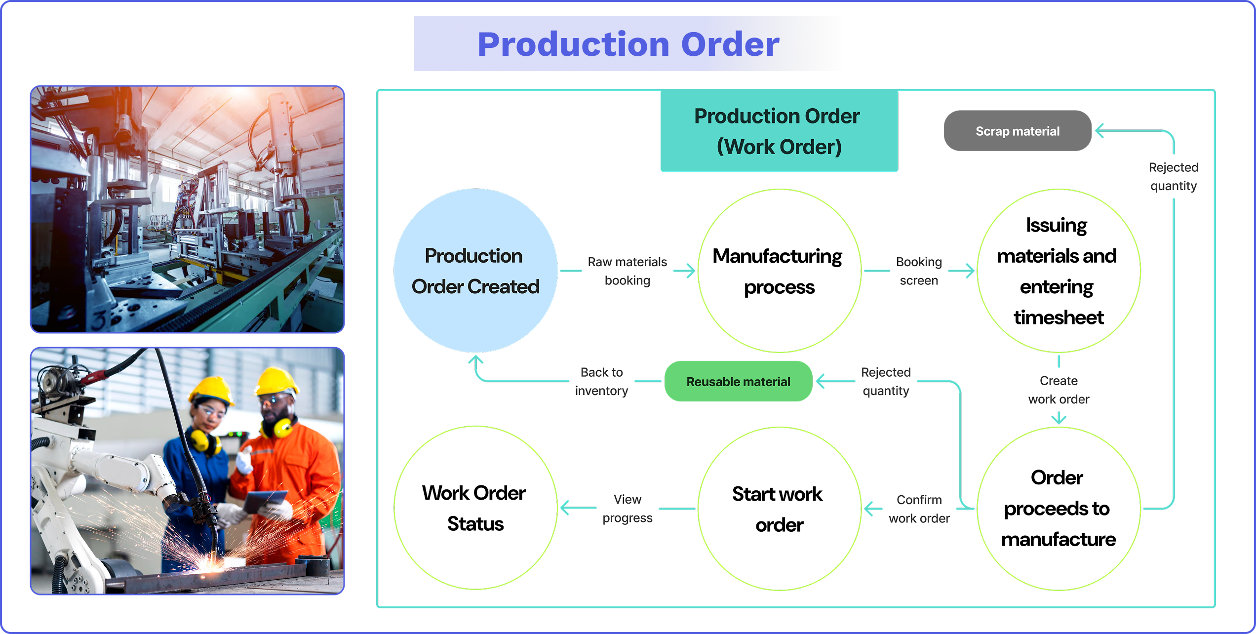
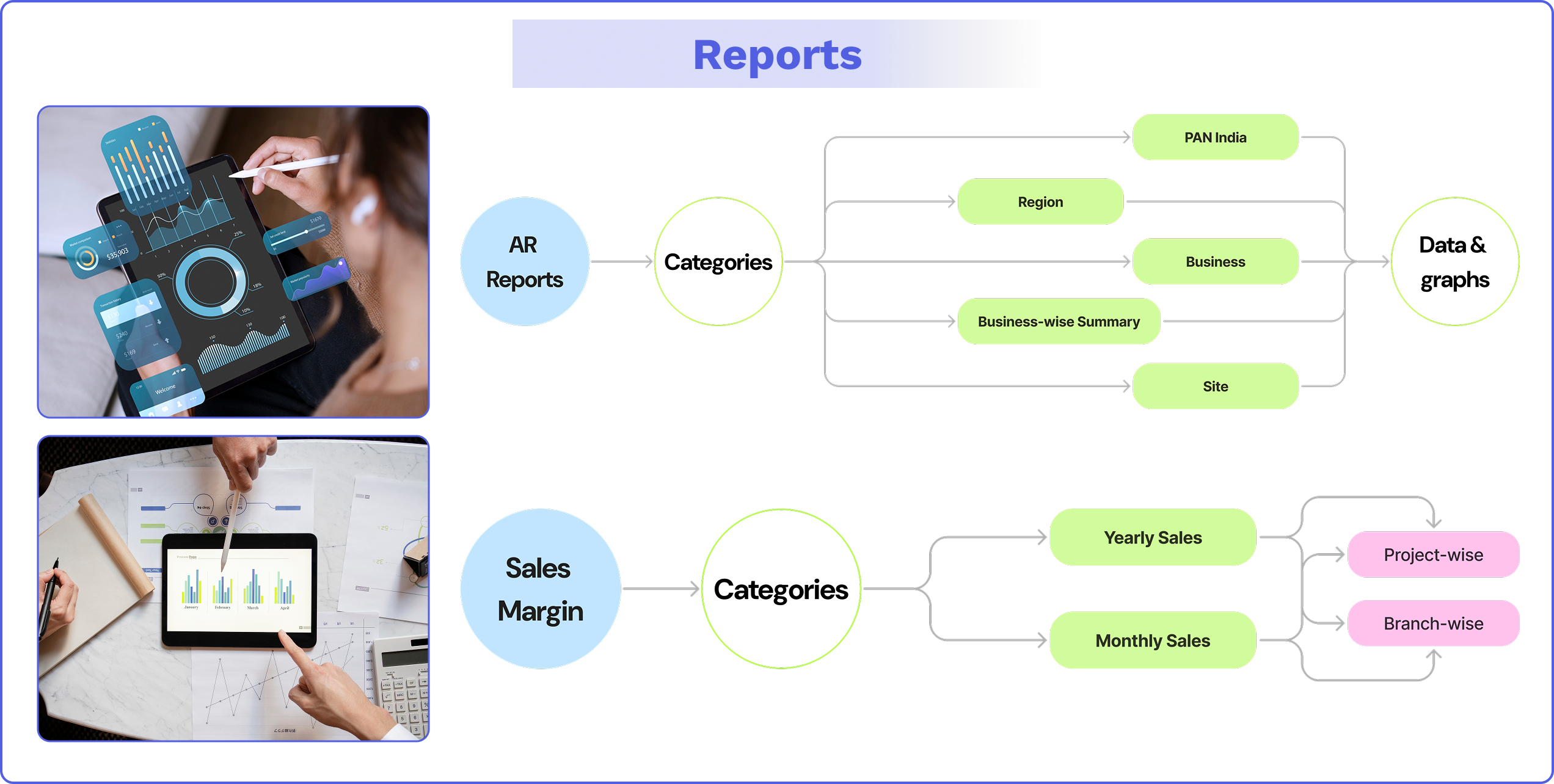
The Warehouse Management System (WMS) is a service that is part of the Evolve Automation Platform provided by Aliter.

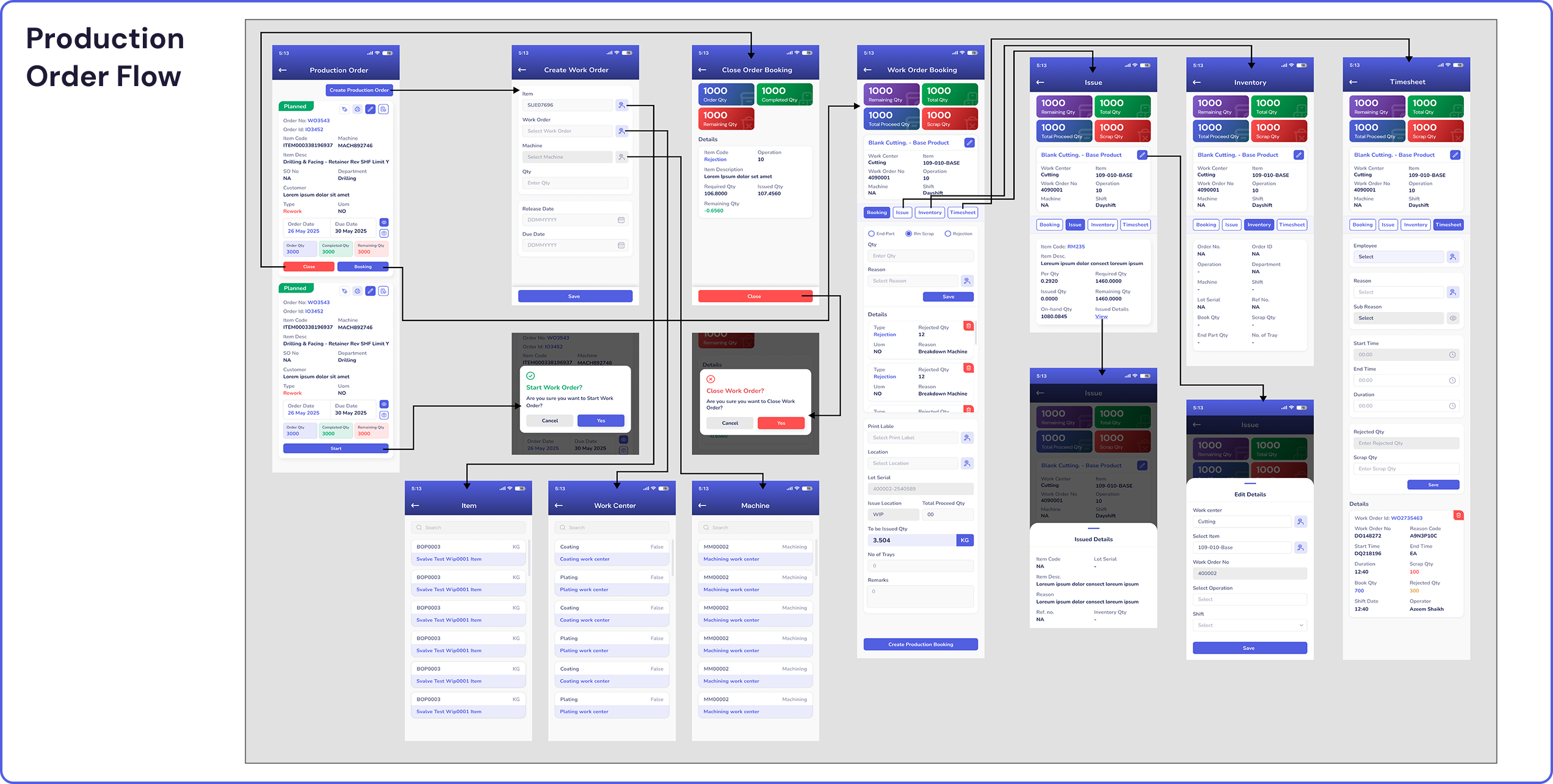
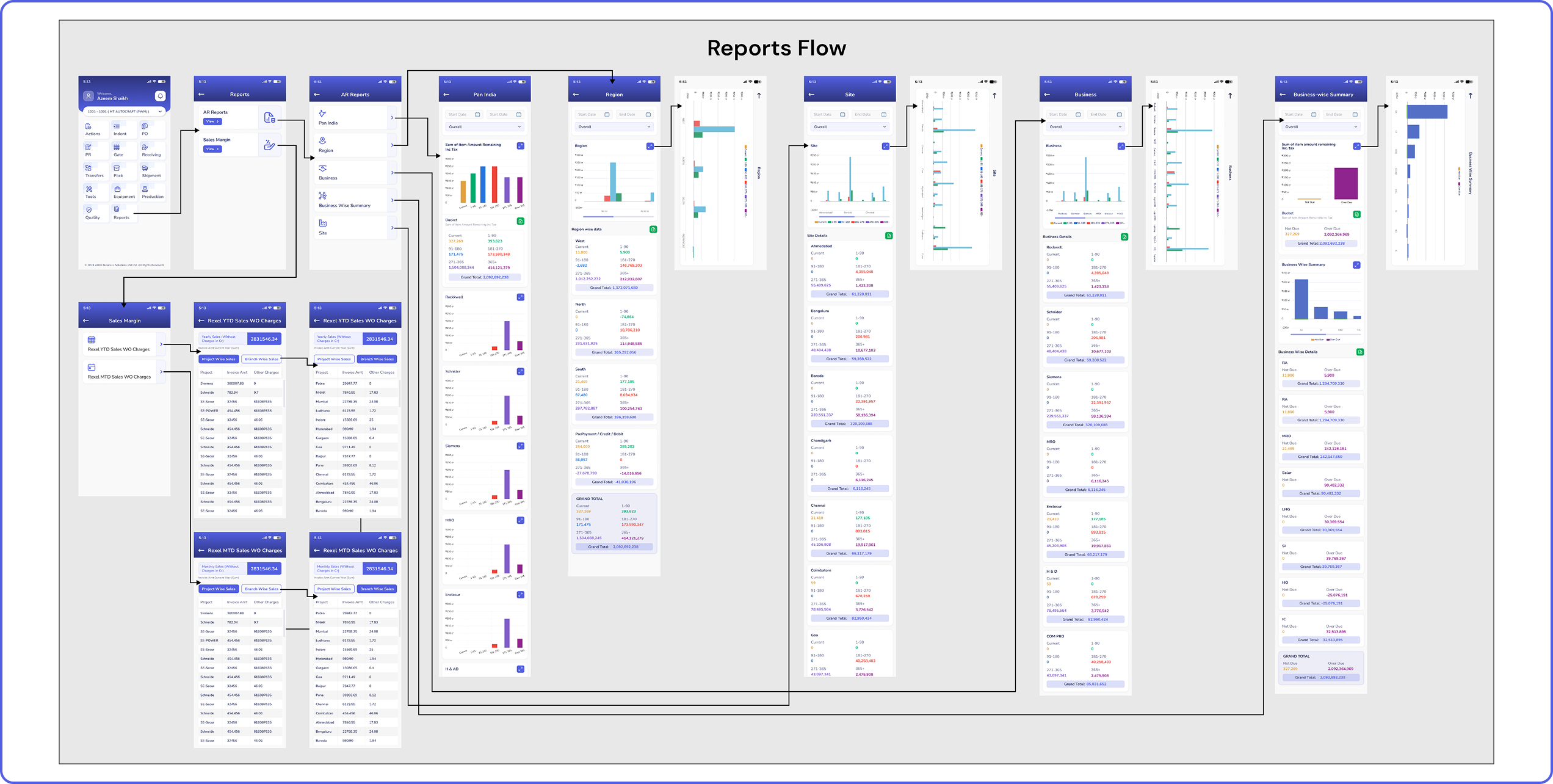
The important stepping stone prior to starting the project designs was understanding the concept of warehouse management systems and its importance in managing daily warehouse activities. My role in this project was to assess and study the target groups’ design psychology, design various interfaces for each action, and assess the performance of the WMS after it is introduced in different warehouses.
My responsibility in the project was to coordinate research and design the interface of the application along with the associate UX designer (mentor). The design team consisted of 2 people (including me) who were responsible for designing all the interfaces pertaining to the system, interacting and gathering data and content from the content management team, coordinating the development of the project with the developer team, handing over the designs to the developers at Zeplin after low front-end coding, and assessing the performance of the system (design-wise) once it was introduced in the warehouses.


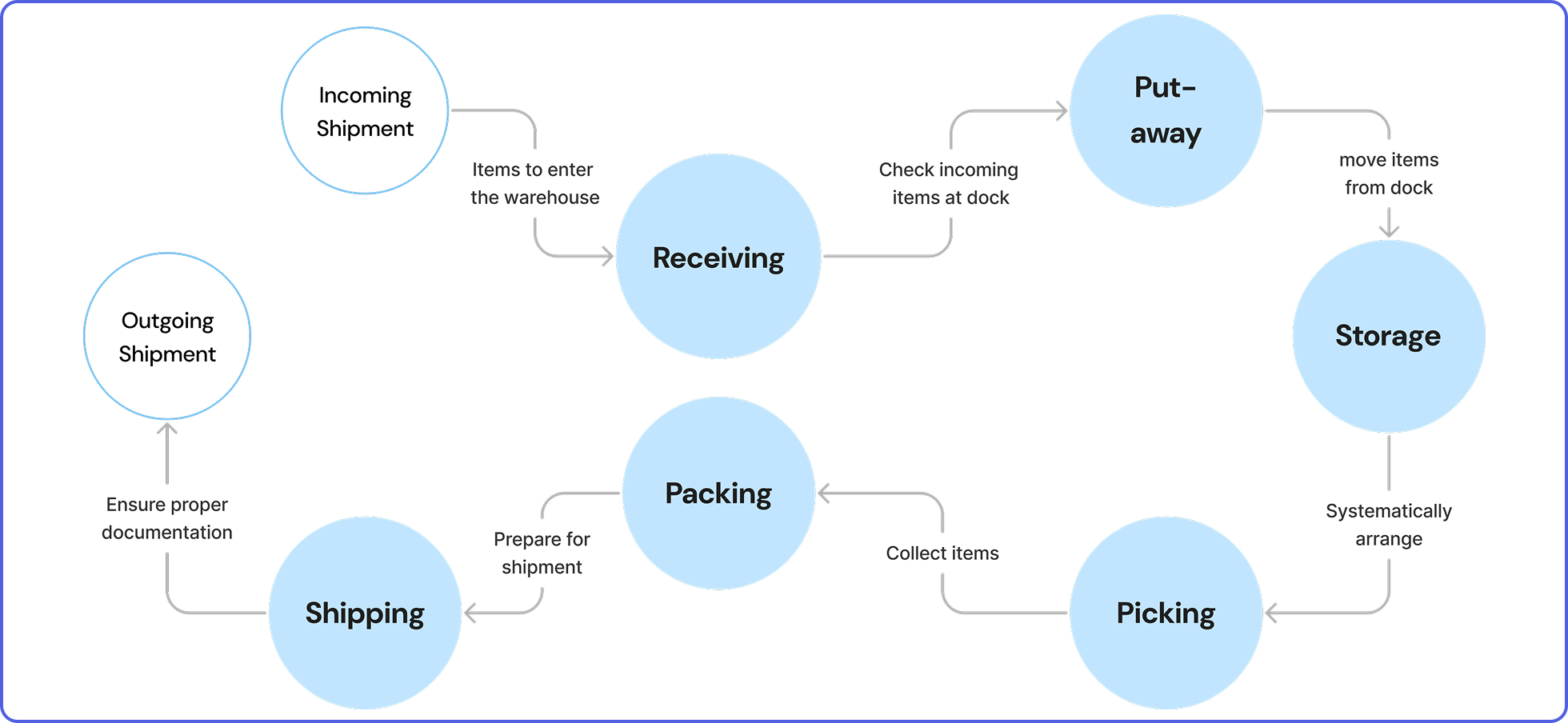
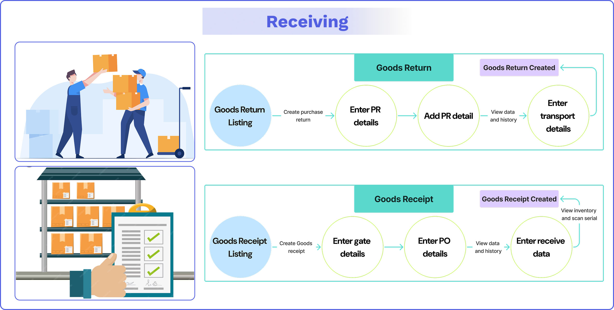
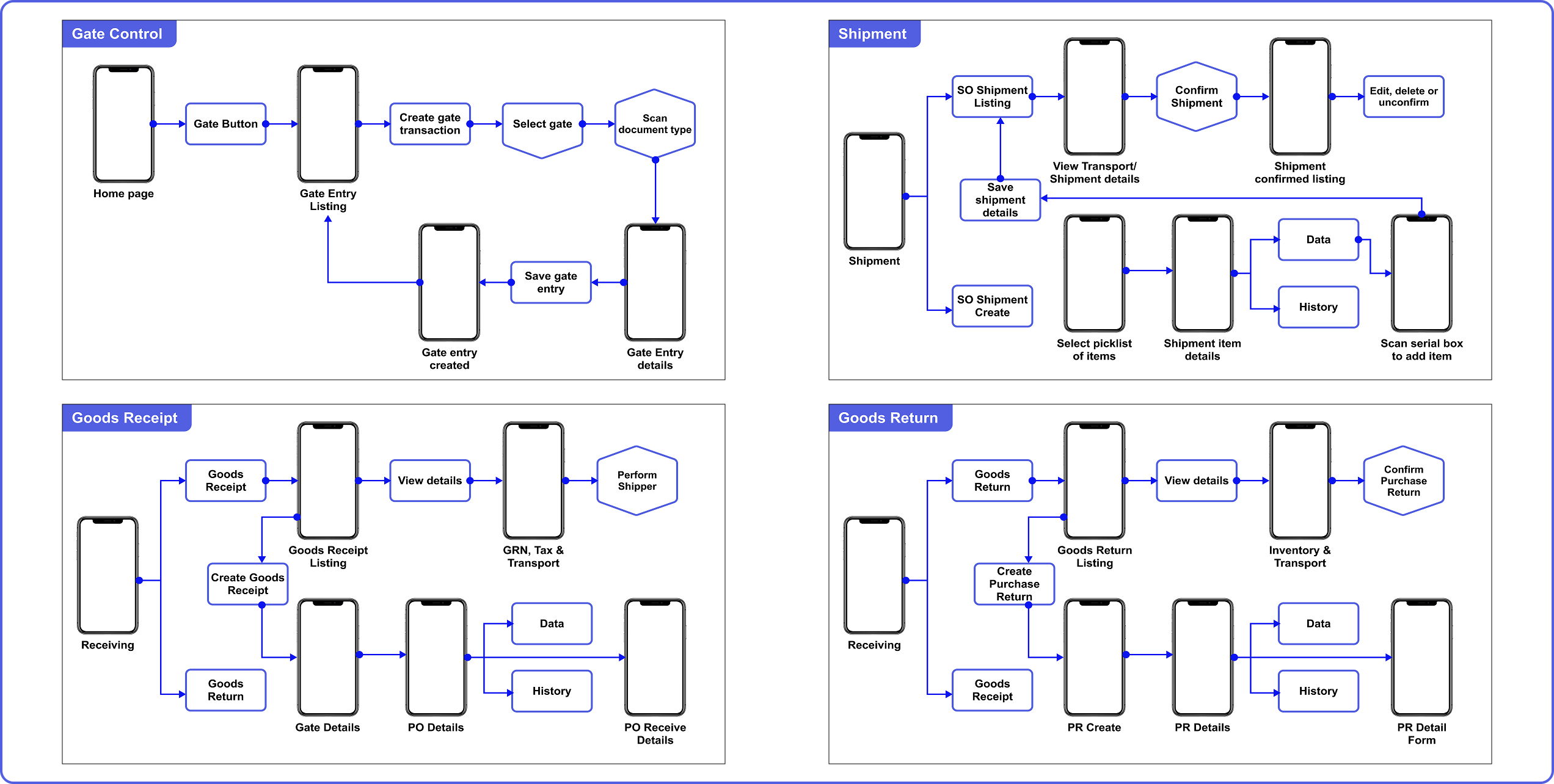
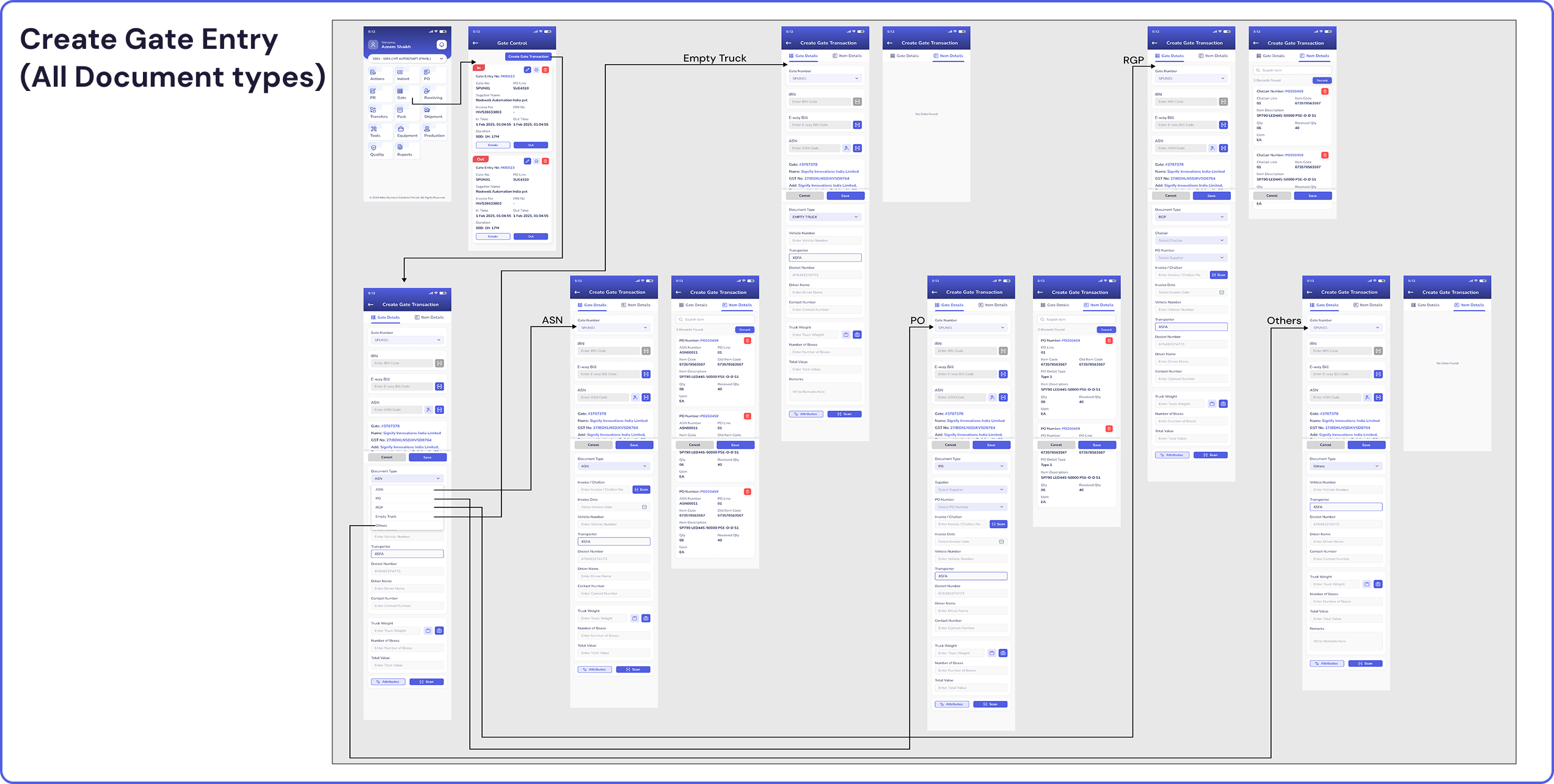
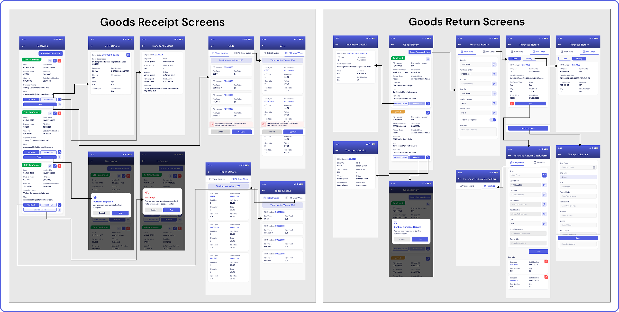
Receiving: Check in and log incoming items. Verify that you’re receiving the right quantity, in the right condition, at the right time.
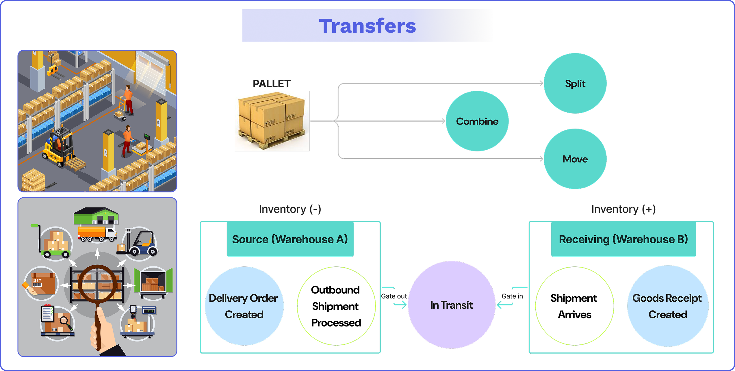
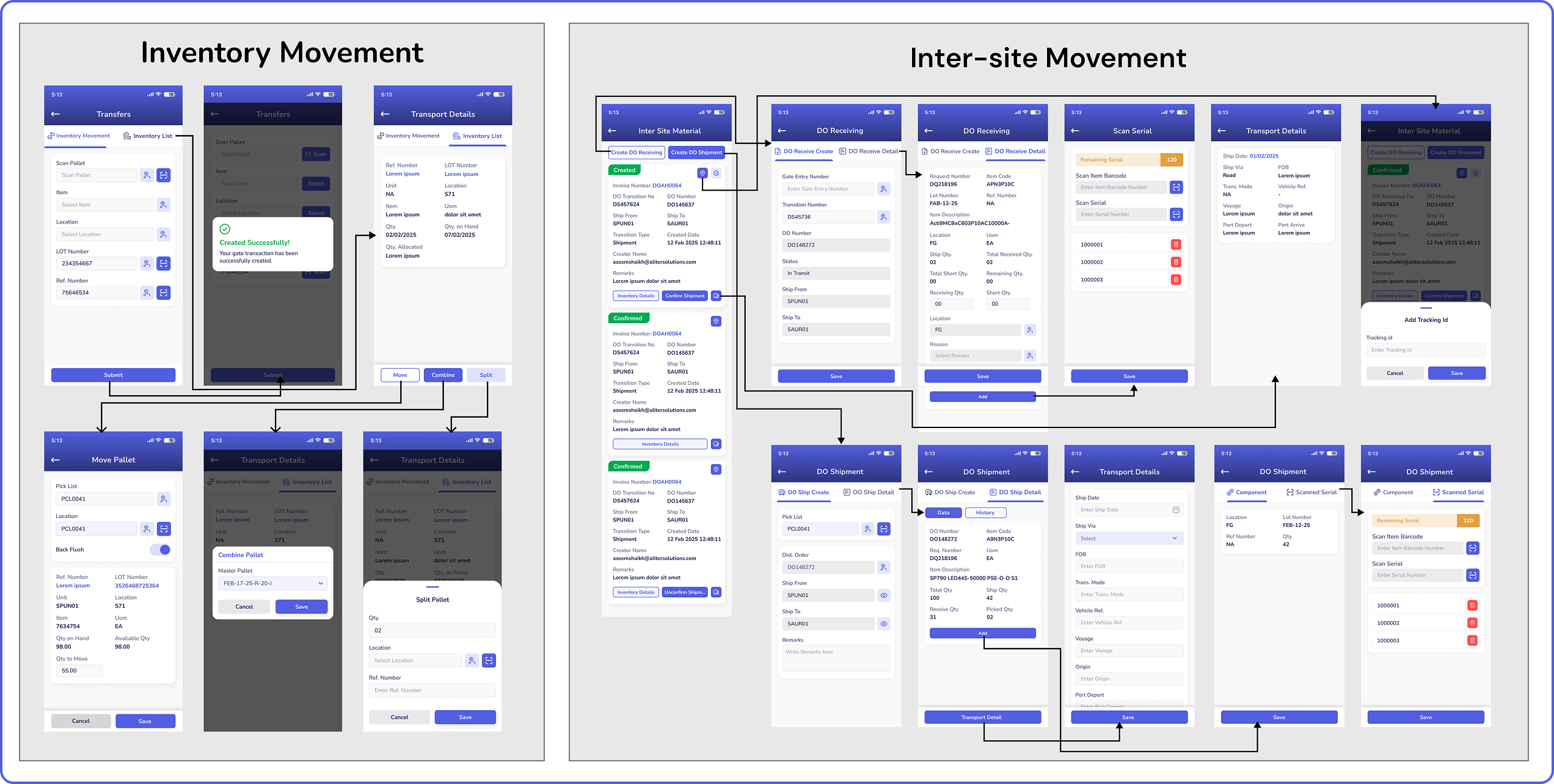
Put-away: Move items from the receiving dock to their correct storage locations.
Storage: Safely store and logically arrange inventory to enable fast and accurate picking.
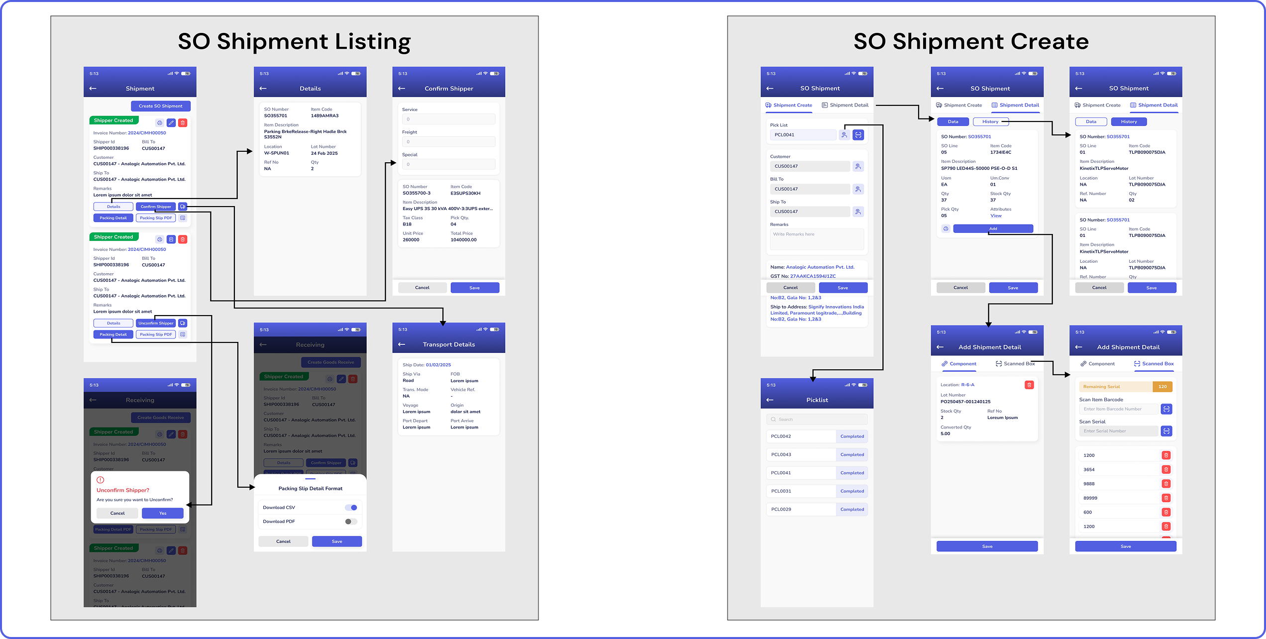
Picking: Collect the items needed to fulfill sales orders.
Packing: Prepare the picked items for shipment. They must be safely packed into the correct packaging with an accurate packing slip.
Shipping: Send out the finalized sales orders, ensuring that they are on the right vehicle, at the right time, with the correct documentation, so customers receive their orders on time.
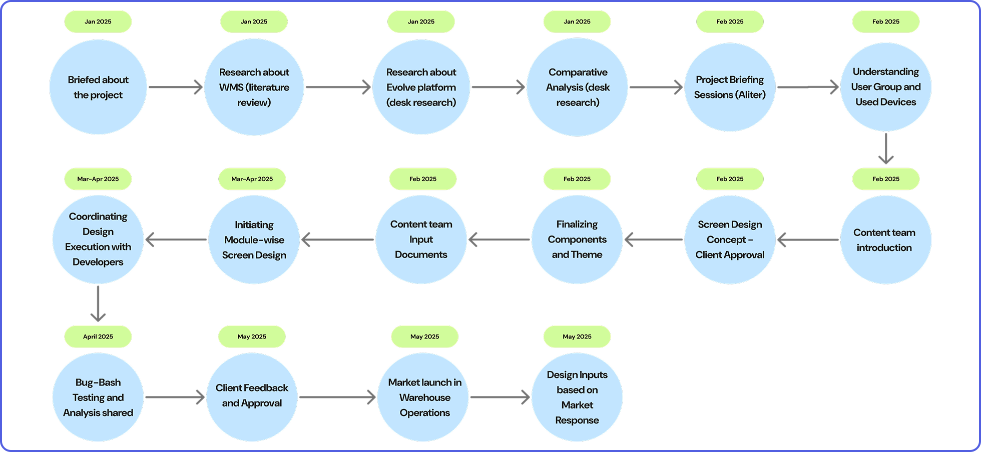
The project was initiated by the last week of January 2025. A project briefing with the project lead and managing director of Aliter gave a heads-up to do a literature review to understand the project. Screen designs and development were done after approval from the client, and the project was presented to the client, ready for warehouse operations, post-bug-bash testing, and project lead approval. The WMS was launched for market operations in May 2025.
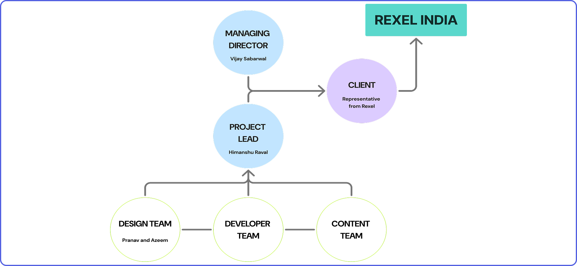
The project followed a structural hierarchy of communication. In this hierarchy flow, the client Rexel is at the top, and the mode of communication to the top follows a process from the working teams to the project lead and the company managing director. The project lead was in charge of supervising all the deliverables of the design, development, and content teams and communicated all the deliverables and developments of the project, along with the managing director, to the representative of Rexel India.


Questions based on which functional requirements were set:
1. Do you have any design references or visual guidelines you recommend we follow for the application’s user interface and overall look and feel?
2. Would you prefer the design to assume that only trained workers will be using the system, or should we also account for usability by untrained workers who may need to learn the system on the go?
3. Could you please specify the types of devices you plan to use for operating the WMS? Should it be designed for desktops, tablets, handheld scanners, mobile devices, or a combination of these?
4. Could you please provide some insight into the educational background and skill level of the primary users, such as warehouse workers? This will help us tailor the design to better suit their needs and ensure ease of use.
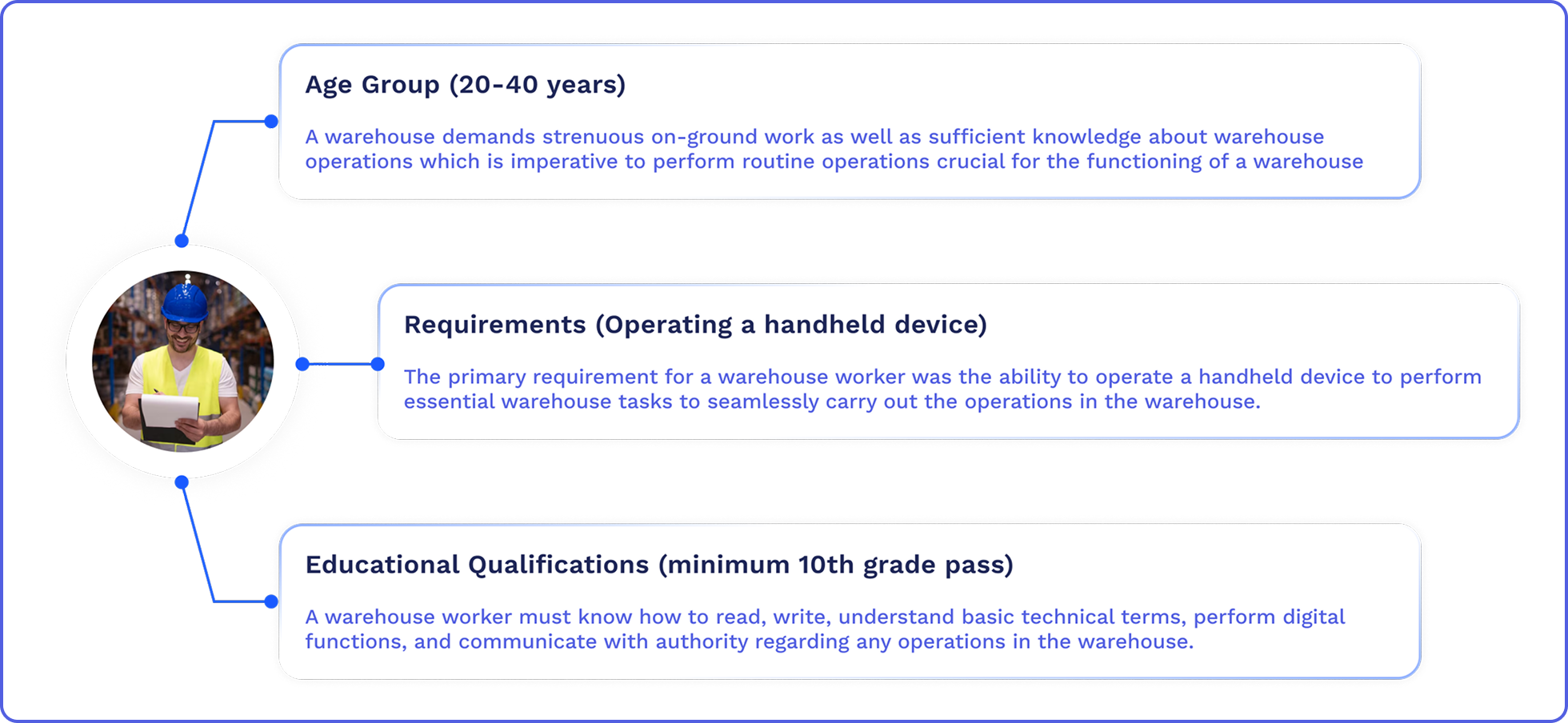
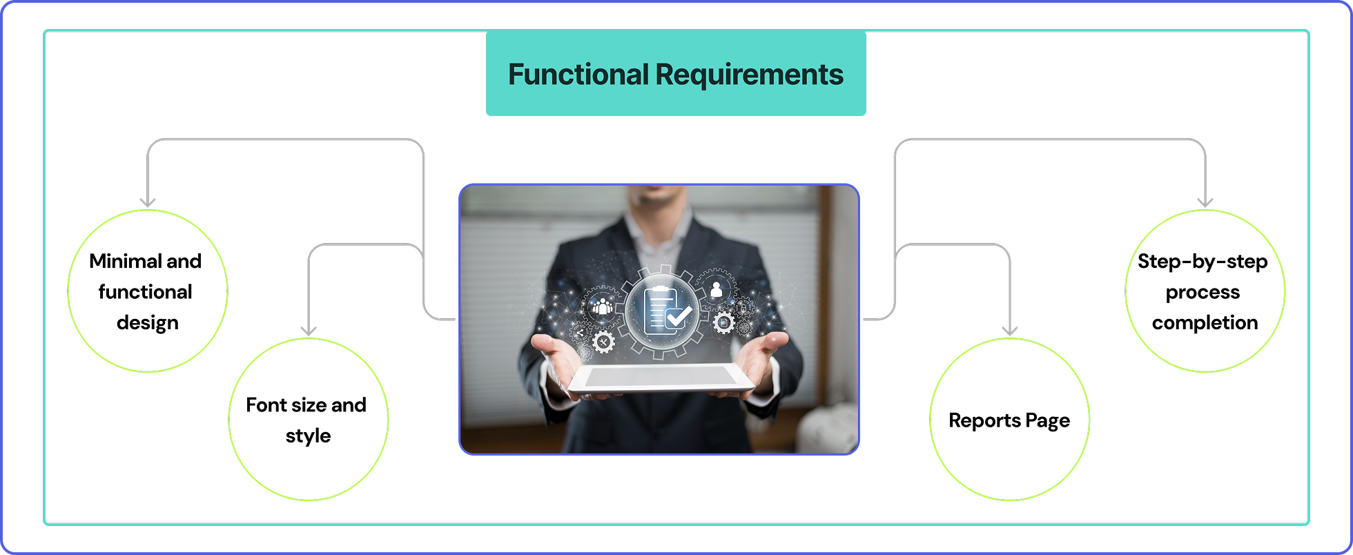
Upon discussions with the client, it was made clear that the application had to cater to warehouse workers, who have limited technical knowledge related to application usage and basic skill sets that are sufficient enough for warehouse operations. The main objective of the design was to keep everything plain and simple to ease the workload of the workers instead of increasing it through complicated systems. The application had to be made as self-explanatory as possible, ensuring task flows guiding the workers in one path towards a single goal.
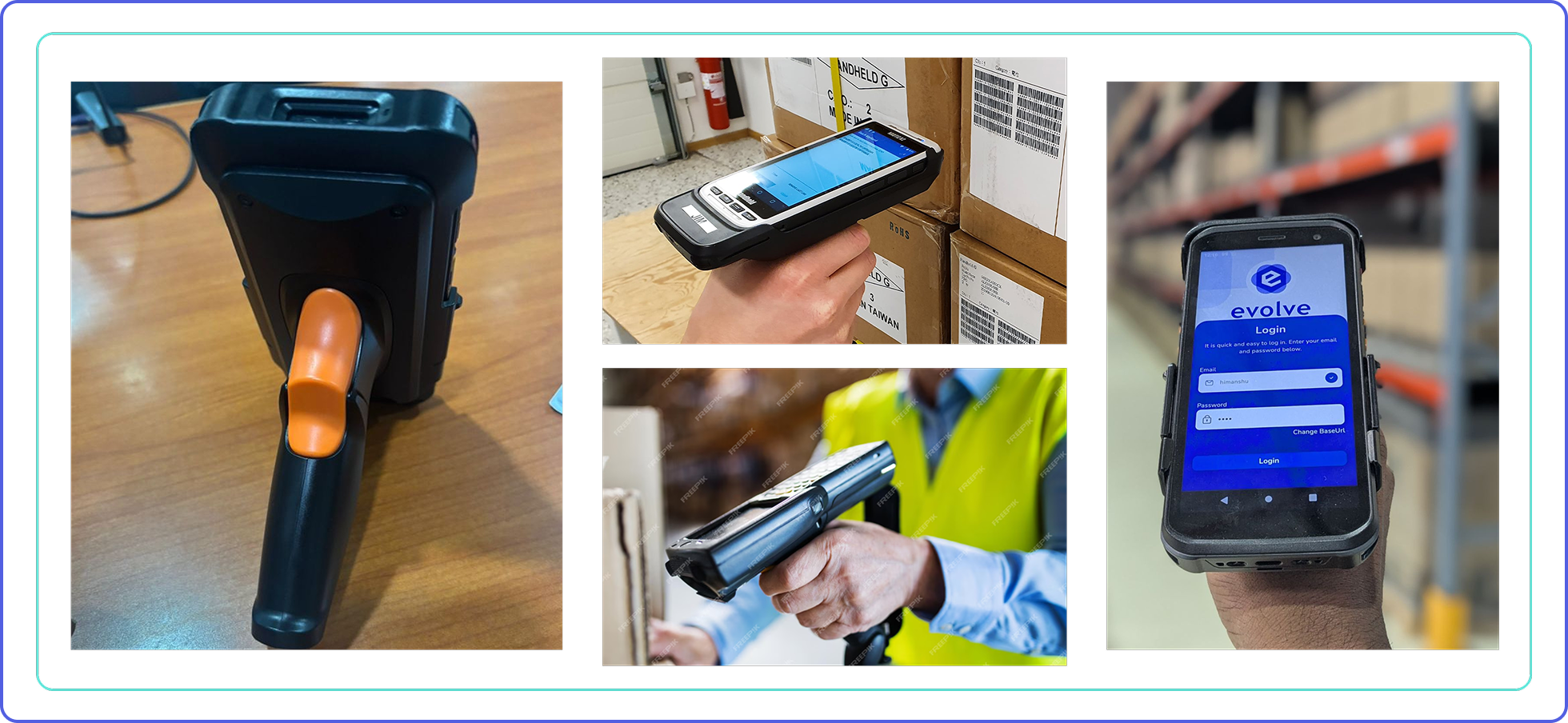
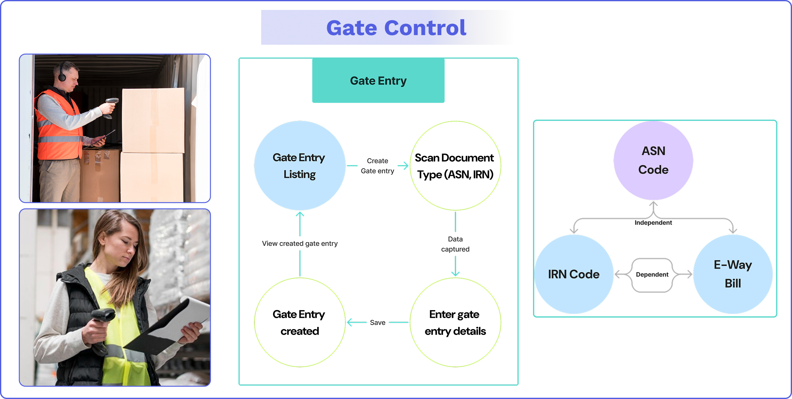
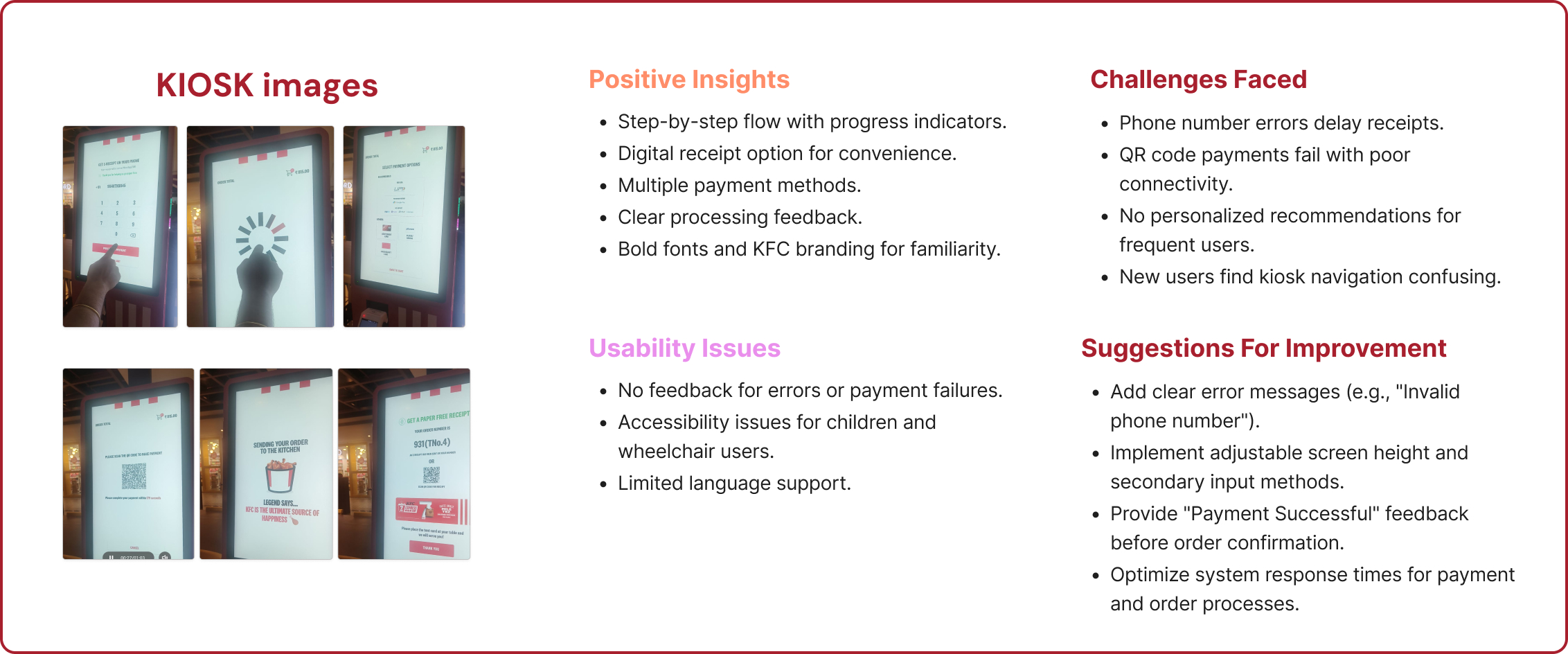
Warehouse handheld devices, also known as portable data collection terminals (PDTs) or mobile RF terminals, are handheld devices used in warehouses to manage inventory, track goods, and streamline various operations. These devices typically feature barcode scanning capabilities and often include features like wireless connectivity and real-time data processing. Warehouse workers will be equipped with handheld devices capable of scanning barcodes, allowing for quick and automatic updating of entries to the warehouse cloud database.
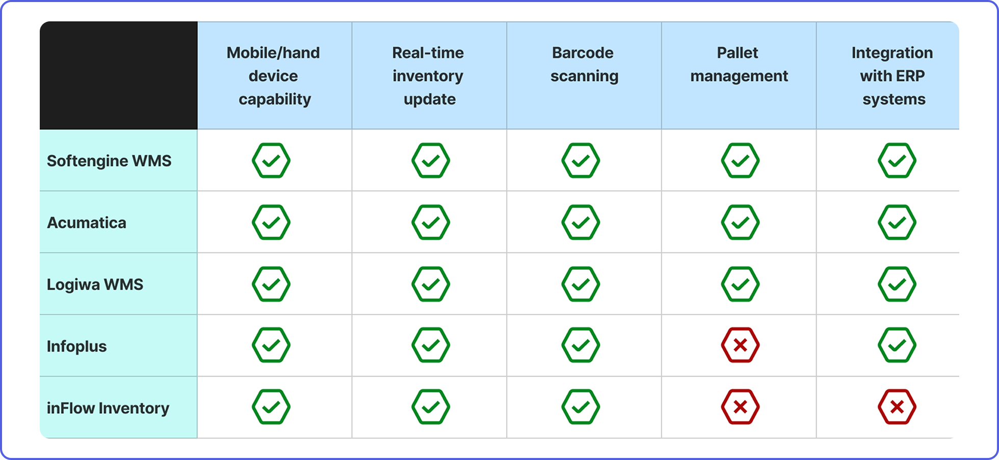
A comparative study of existing mobile-based Warehouse Management Systems (WMS) was conducted before the design phase, focusing on key features relevant to the system being developed by Aliter. Leading WMS platforms such as Softengine WMS+, Infoplus, Logiwa WMS, and others were compared and analyzed based on the features highlighted in the table above.


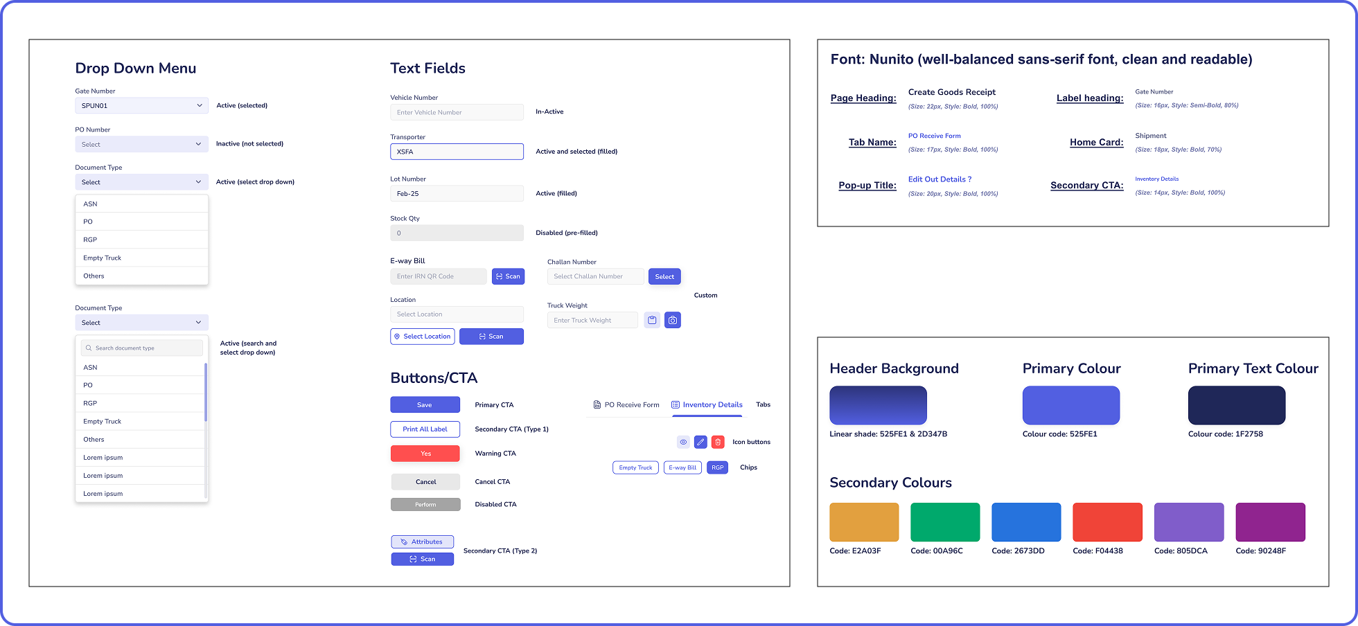
A component sheet specifying all types of elements to be used in the application was created. In the sheet, drop-down menus, text fields, icon buttons, CTA buttons, regular buttons, chips, and tabs were created. These components were created as a base for all the UI elements that were going to be incorporated in the application.
The main colour theme used in the application is shades of blue.
The font used throughout the application is Nunito. Nunito is a sans-serif, well-balanced, readable font.
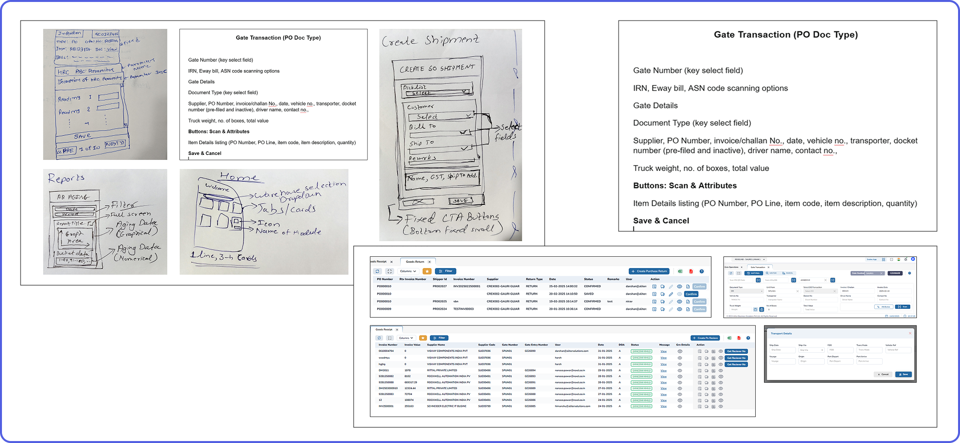
References from accessible third-party platforms were used for a few commonly existing modules, such as goods return and receipt lists. These references were used just to refer to the data present in it and not the design.
For the other modules, basic sketches were sent by the content team to give the design team an idea of how to make the screen appear. Most of the data was shared through unorganised Word documents containing content labels of each module.
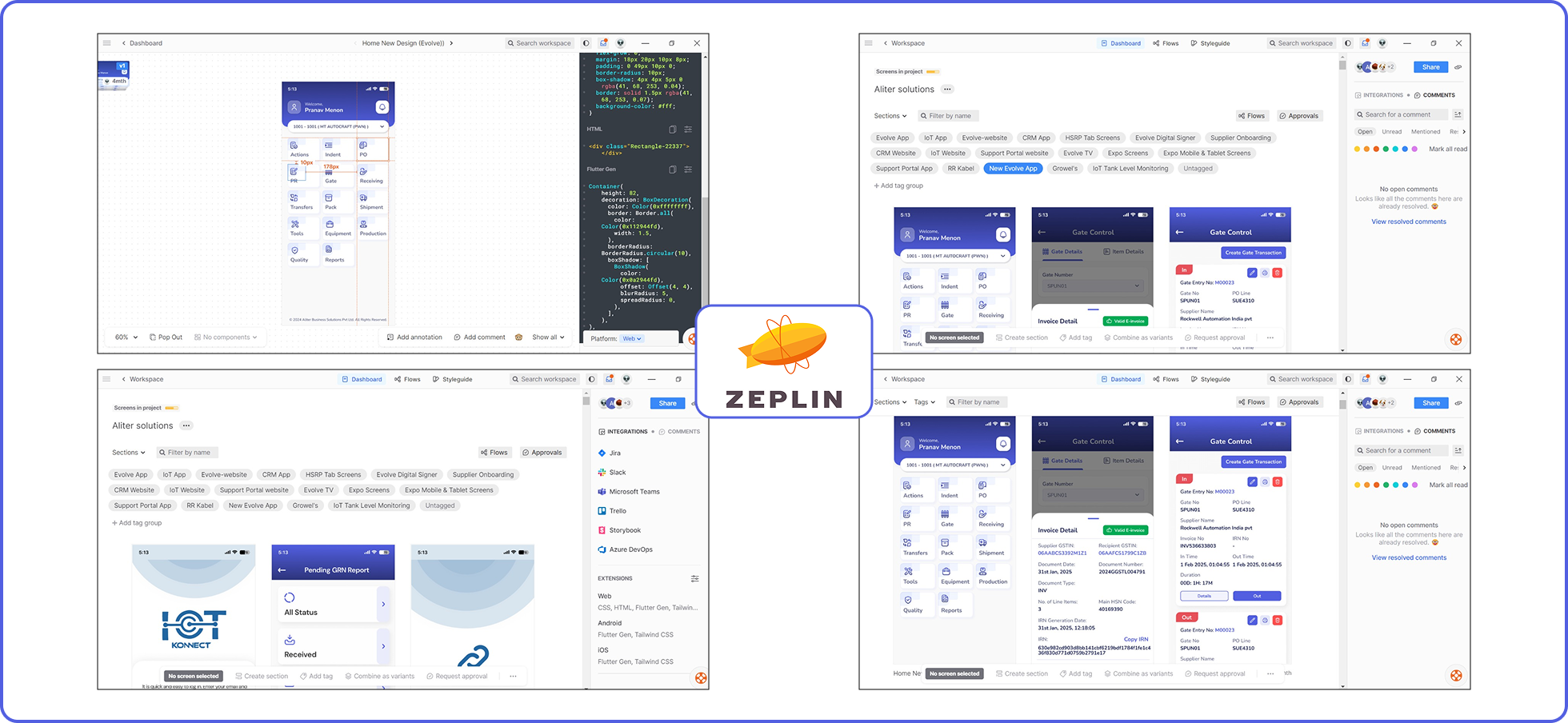
In order to ensure a common platform for sharing all design deliverables, Zeplin software was used. The developers had complete access to the exported design screens on Zeplin from Figma (“Export to Zeplin” plugin was used on Figma) to know the relevant requirements, such as padding, spacing, dimensions, colour codes, font weight, and functionality.
Each interface screen on Zeplin produced the basic HTML and CSS codes, making the task easier for developers. Adding the “Flutter code” extension even provided the code suitable for Flutter development, which ensured the developers focused on the functionality and end product.


The WMS had been operational for a month when performance-based insights began reaching Aliter. These insights were provided by the client to the organization in charge, who passed on the interface and functionality-based insights to the design team. The reception and attitude towards the entire app functionality were majorly positive (green), with suggestions for scope of improvement (yellow).
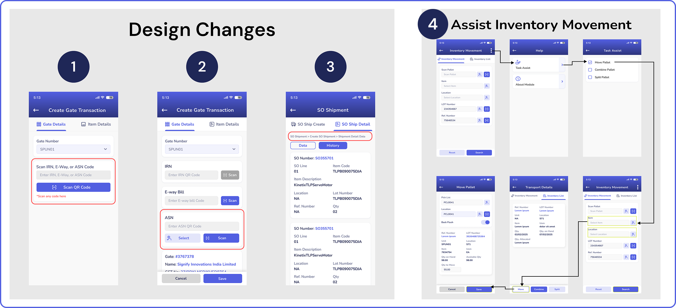
1. There will be a common scanning button for all three barcode types. The system will smartly detect the type of barcode scanned.
2. The action buttons have been made bigger in size to cater to all types of users.
3. Breadcrumbs will be displayed at the top of each page, where the users can keep track of where they are in the flow of each task.
4. The task-assist feature will allow the user to use a smart task guide to highlight the upcoming steps of each task in yellow.
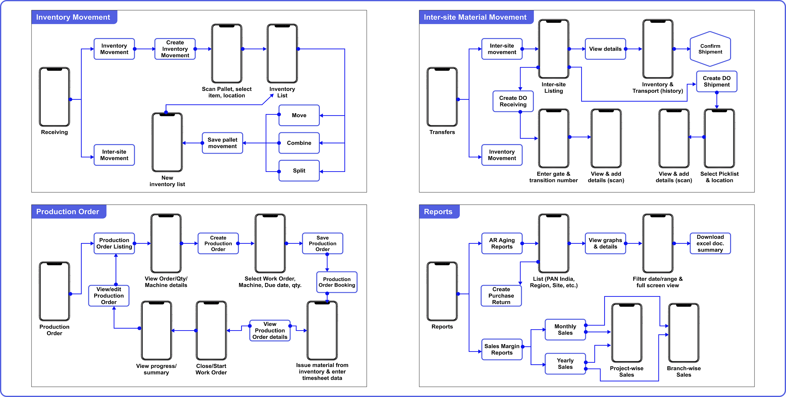
The future scope of work includes the completion of the remaining modules of the WMS, such as equipment handling, packaging, tools, and the quality maintenance module. There is scope for this system to reach more clients who require a good WMS for managing their warehouse operations. In the Indian market, warehouse management systems are being implemented in more and more warehouses, and usage on mobile devices is being promoted in the market. The Aliter WMS is an efficient and capable system and is ready to be implemented in the market.
Another future scope for Aliter would be to make efforts and facilitate more discussions and interactions between the primary stakeholders and client representatives. Designers ensure more accurate and promising results when they get a detailed interaction with the stakeholders, which was not very possible during the course of this project.
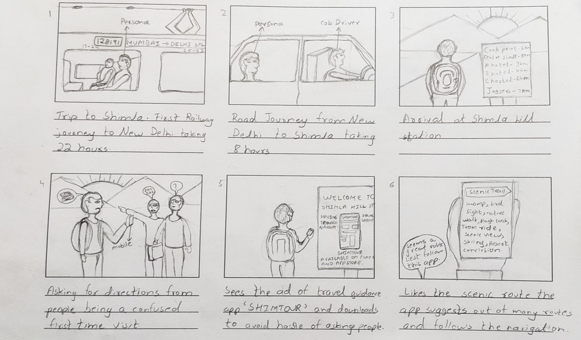
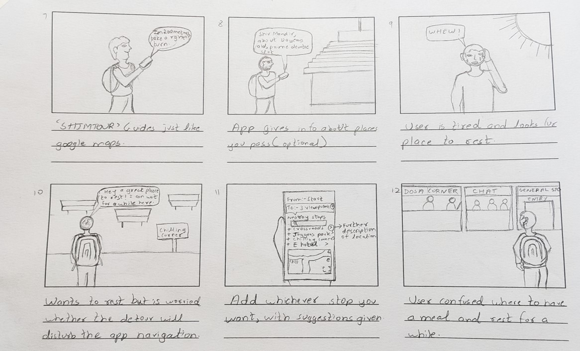
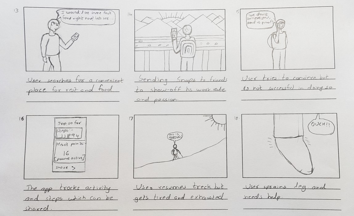
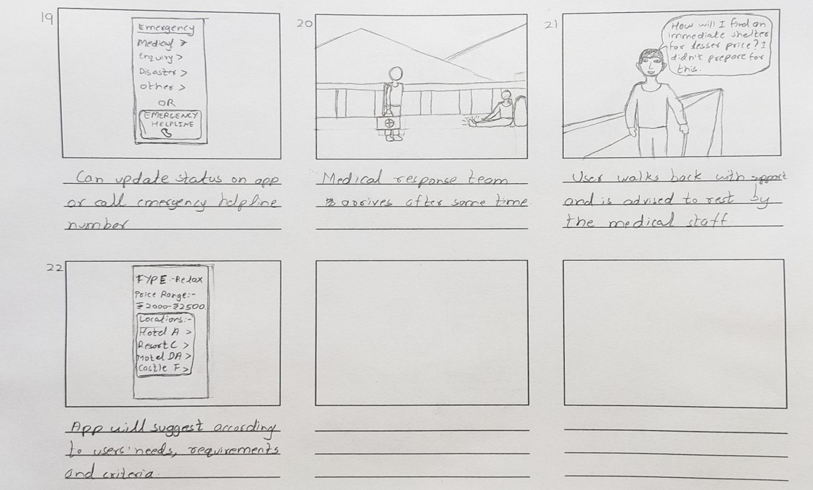
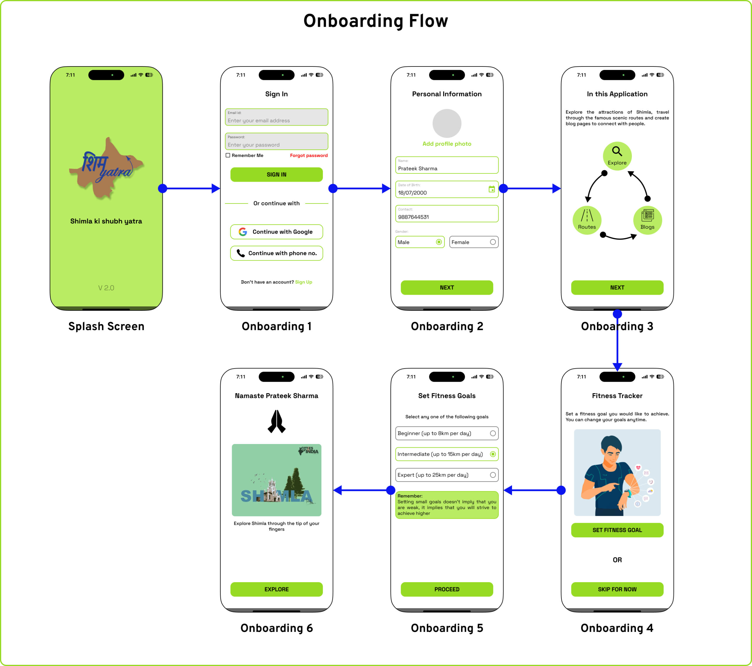
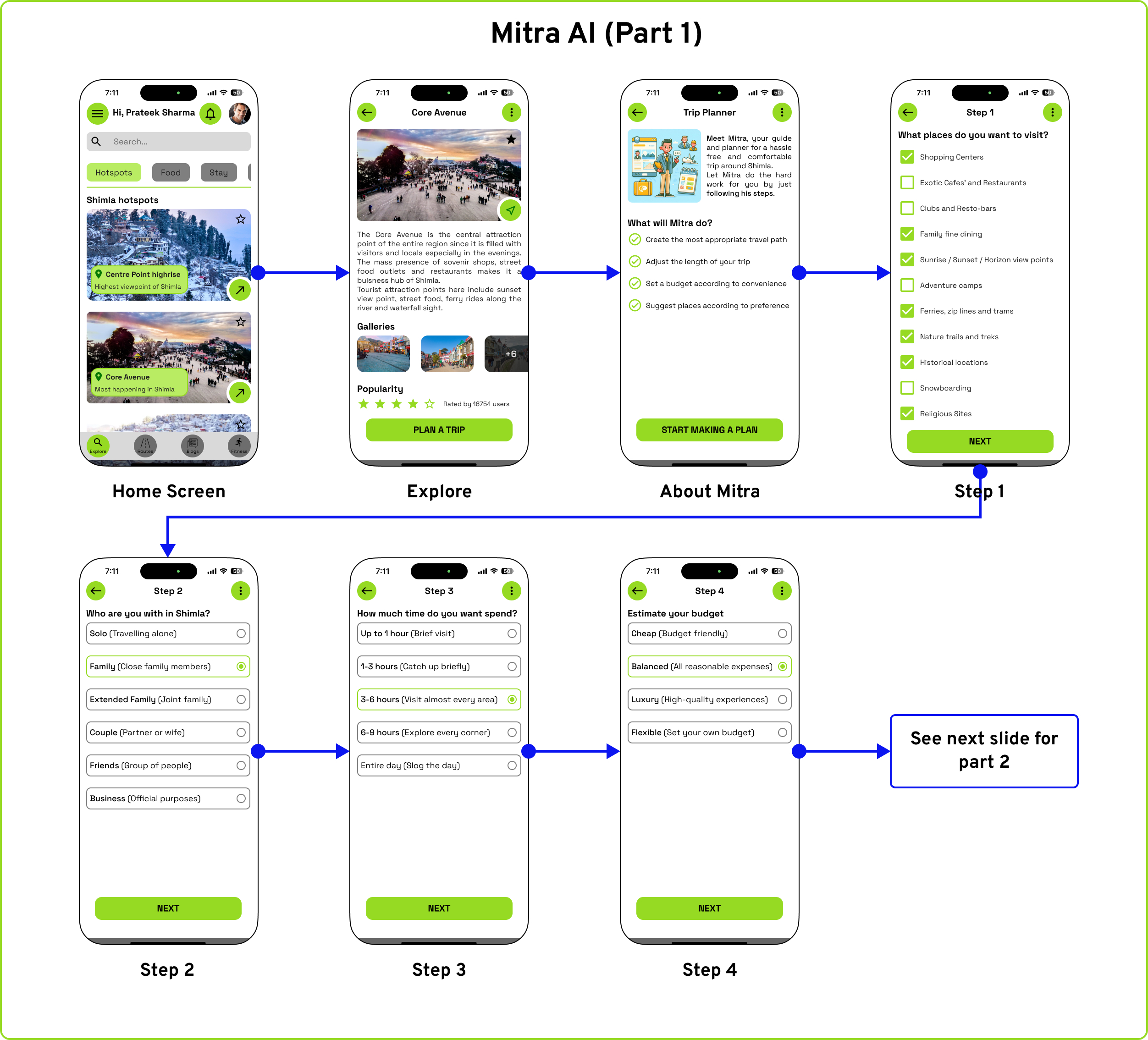
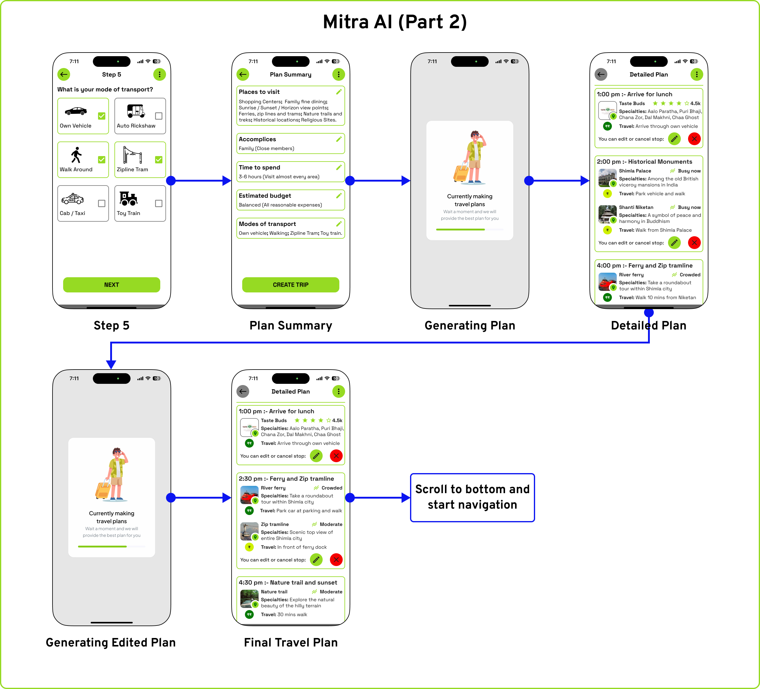
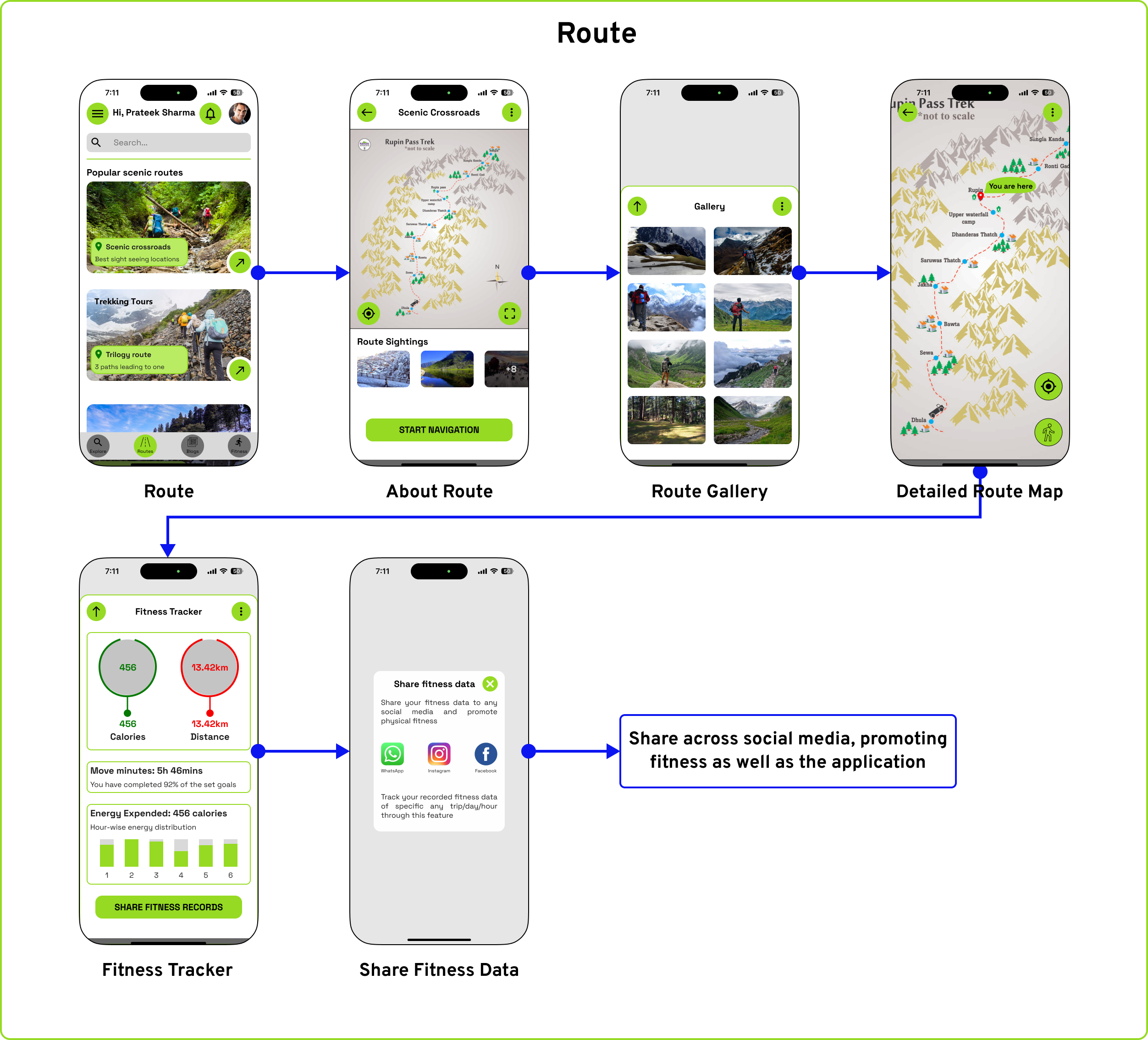
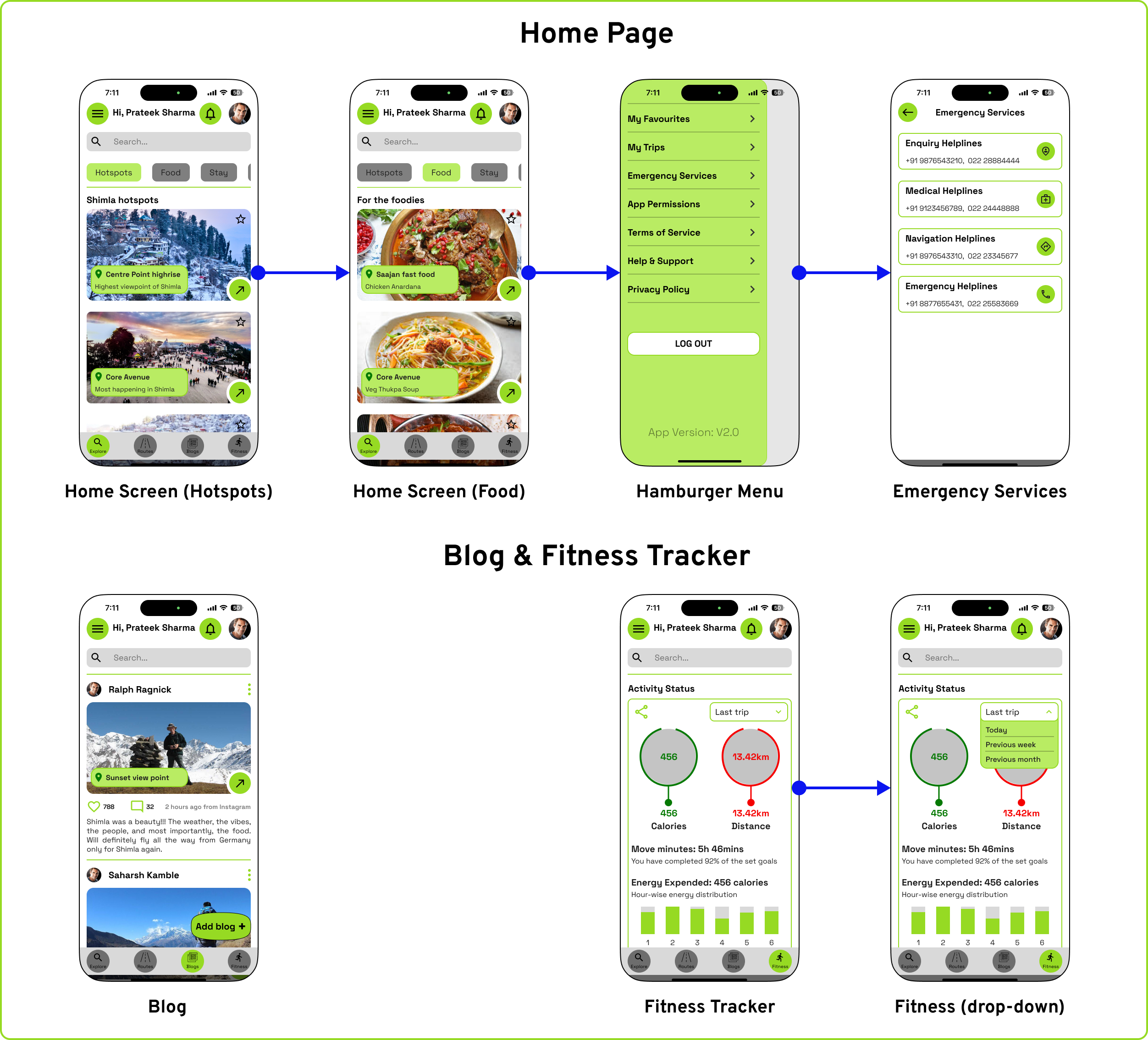
The Travel App (Hypothetical)
This application has been developed around two distinct scenarios to address various facets of an app’s functionality and user needs. The first concept presents a creative storyboard of an individual embarking on a solo journey to Shimla, while the second concept focuses on planning a family trip to the same destination. The primary objective of this project is to develop an application that assists tourists in navigating and exploring a new city. The logo represents the map of Shimla in the background, and the running font represents continuous and seamless travel.


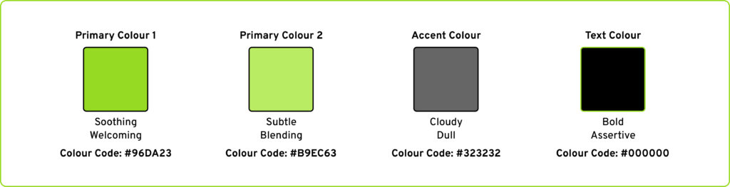
Colour: The application utilized two primary colours, with the first serving as the design element for action buttons and interactive functions, while the second was applied as the background for essential but non-interactive features.
Font: The font used in the application was Space Grotesk, a sans-serif typeface that is proportional and designed to be more readable at non-display sizes.
As part of this project, secondary research was conducted to gather information about the importance of city-specific applications. The factors that influence the idea of introducing city specific applications are:
- Ease of travel: City guide apps can help tourists and locals explore cities more easily, with features like maps, directions, and information about attractions, restaurants, and hotels. They can also help users find events, save time and money, and access information offline.
- Smart-city progress: Smart city apps can provide real-time updates about events and other useful information to citizens. They can also help cities run more efficiently and respond to challenges. They can suggest the best routes based on traffic conditions, personal preferences, and environmental impact.
- Informative: An app can support almost 90% of smartphones, which makes it easy to use for finding locations.
Additionally, integrated technologies like Google Maps, AI assistant, and health trackers make it convenient for users to access multiple travel information anytime and anywhere. - Personalized suggestions: City applications can collect user preferences in terms of travel, eateries, etc. and give suggested locations to visit based on the information. This will further encourage users to share their personal preferences to ensure a convenient travel plan across the city.

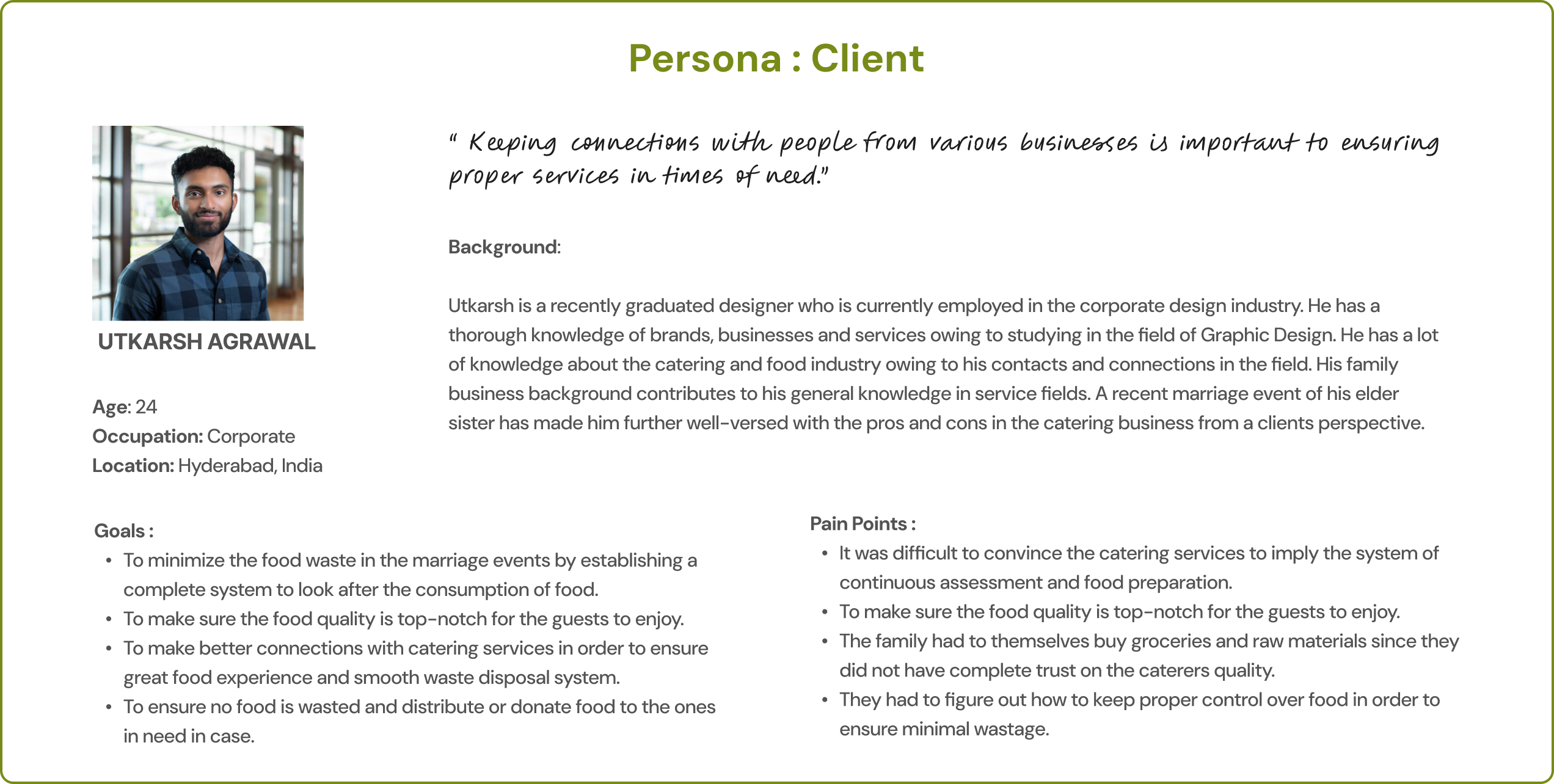
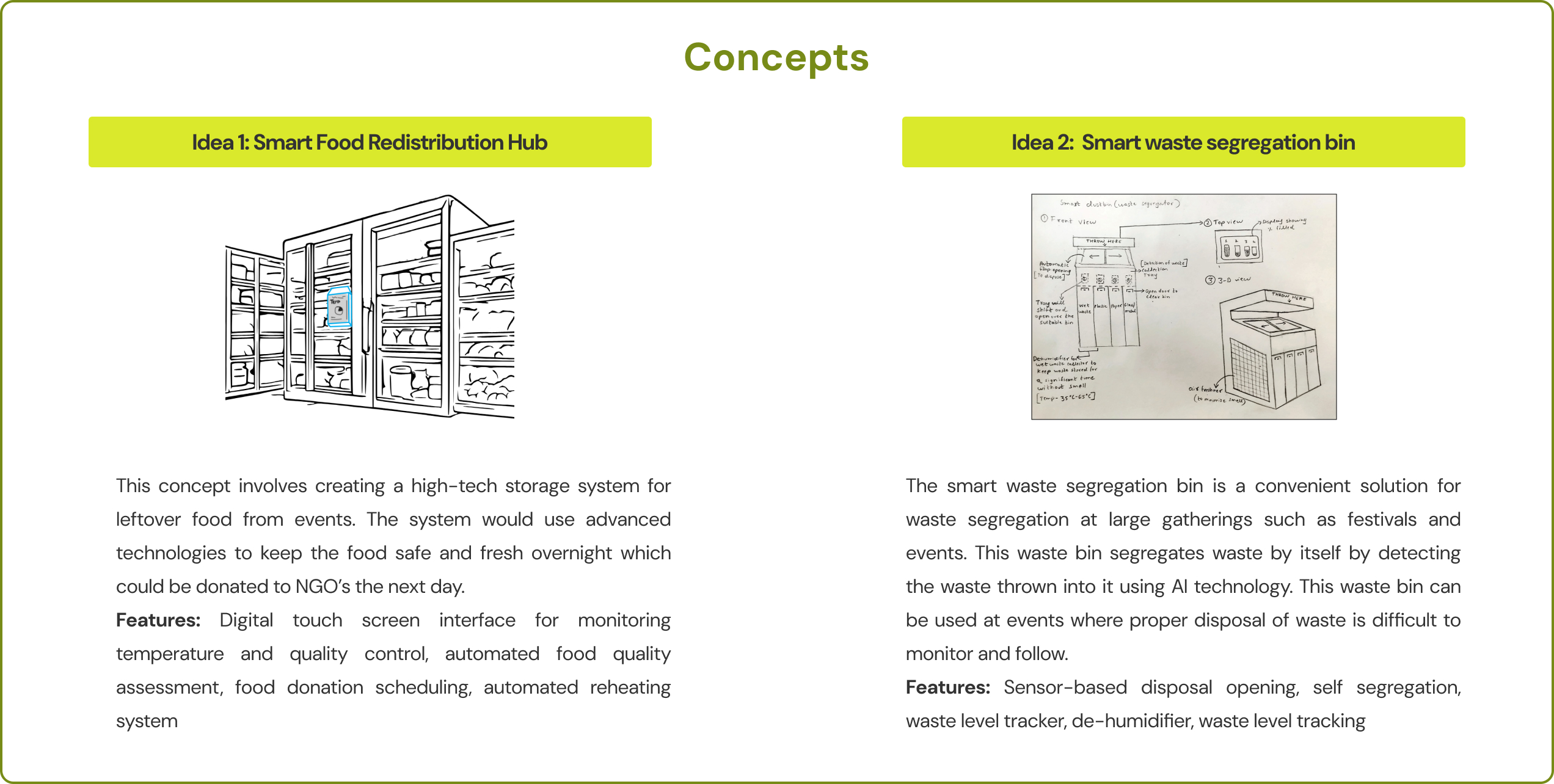
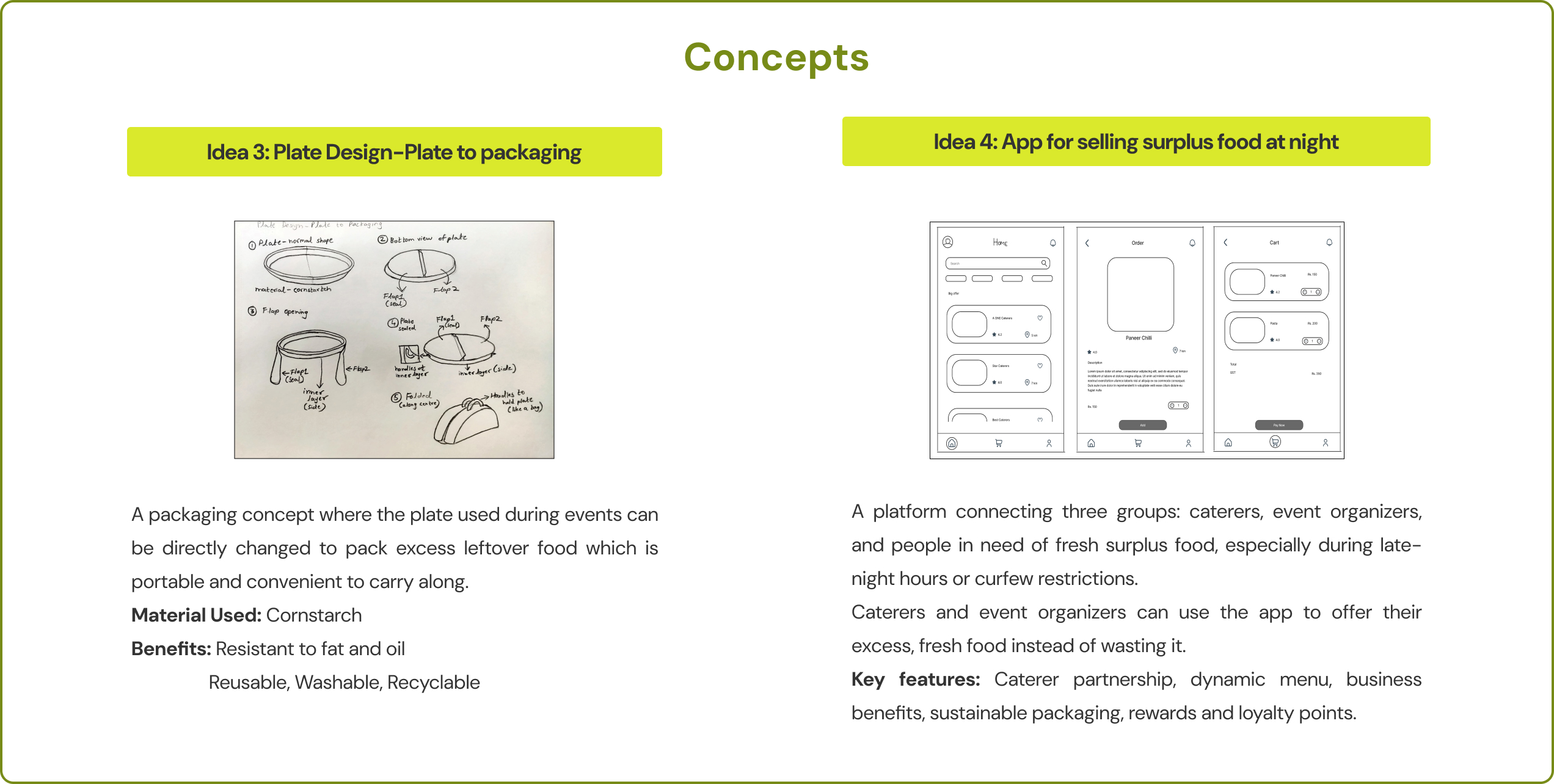
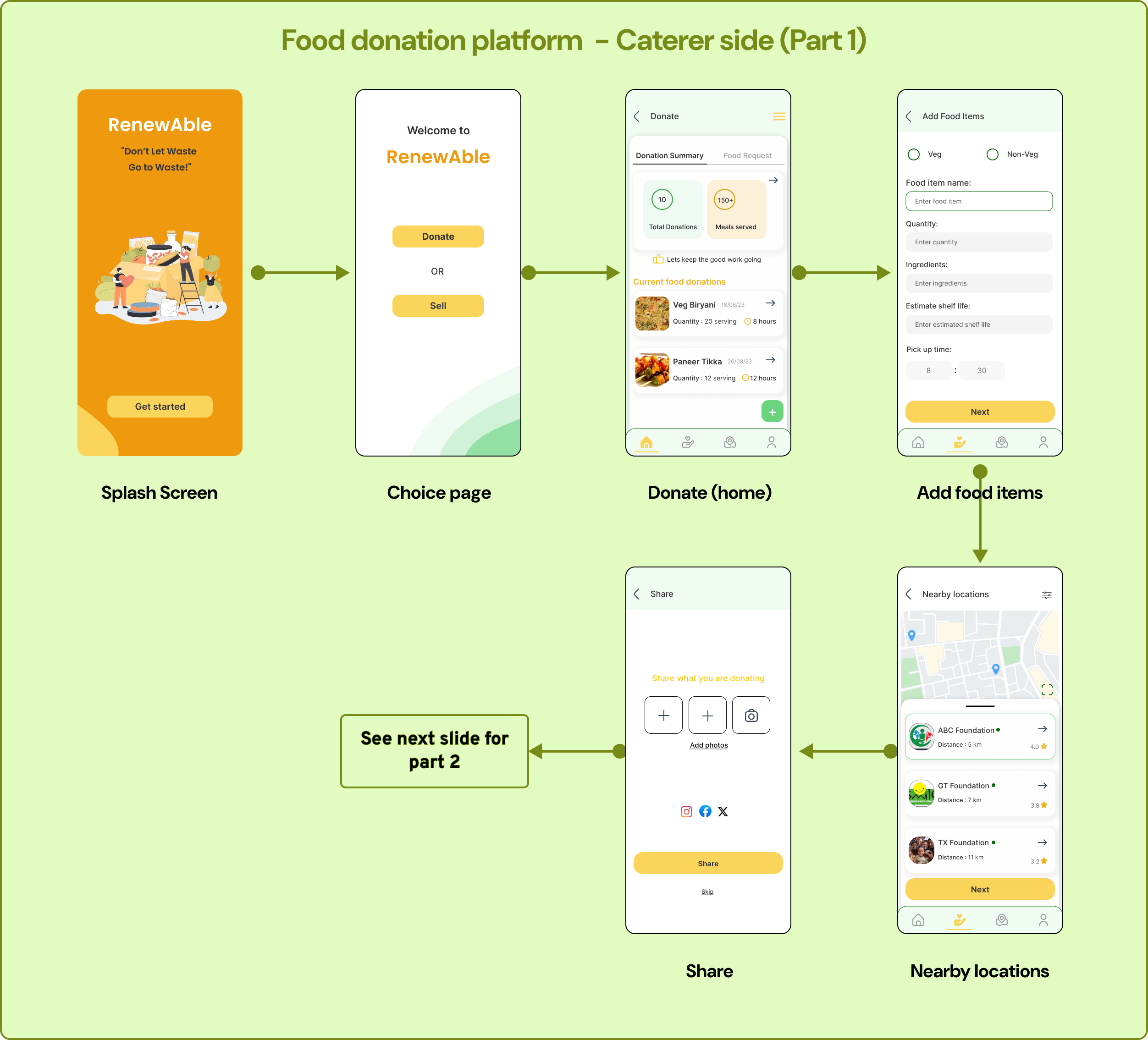
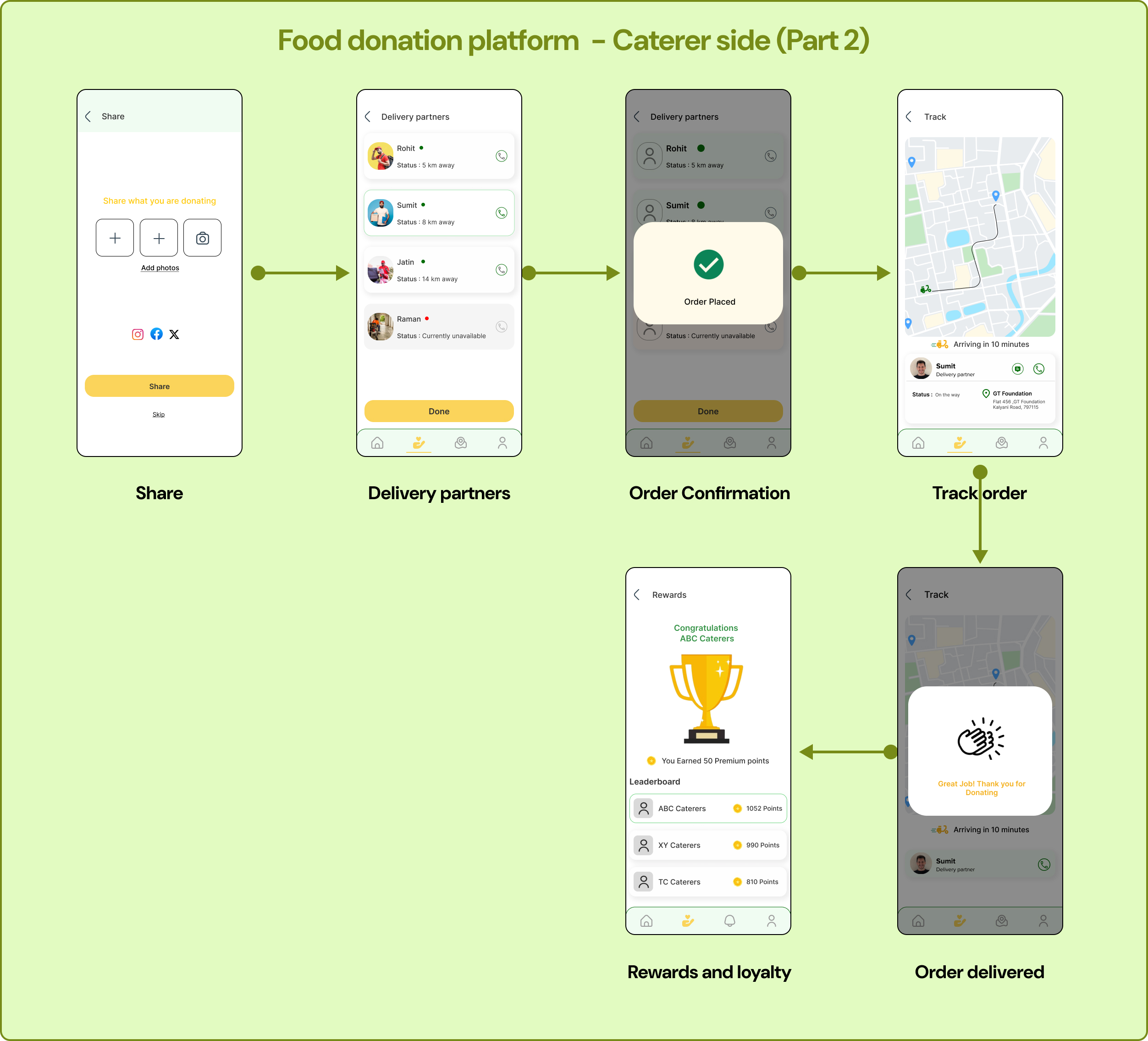
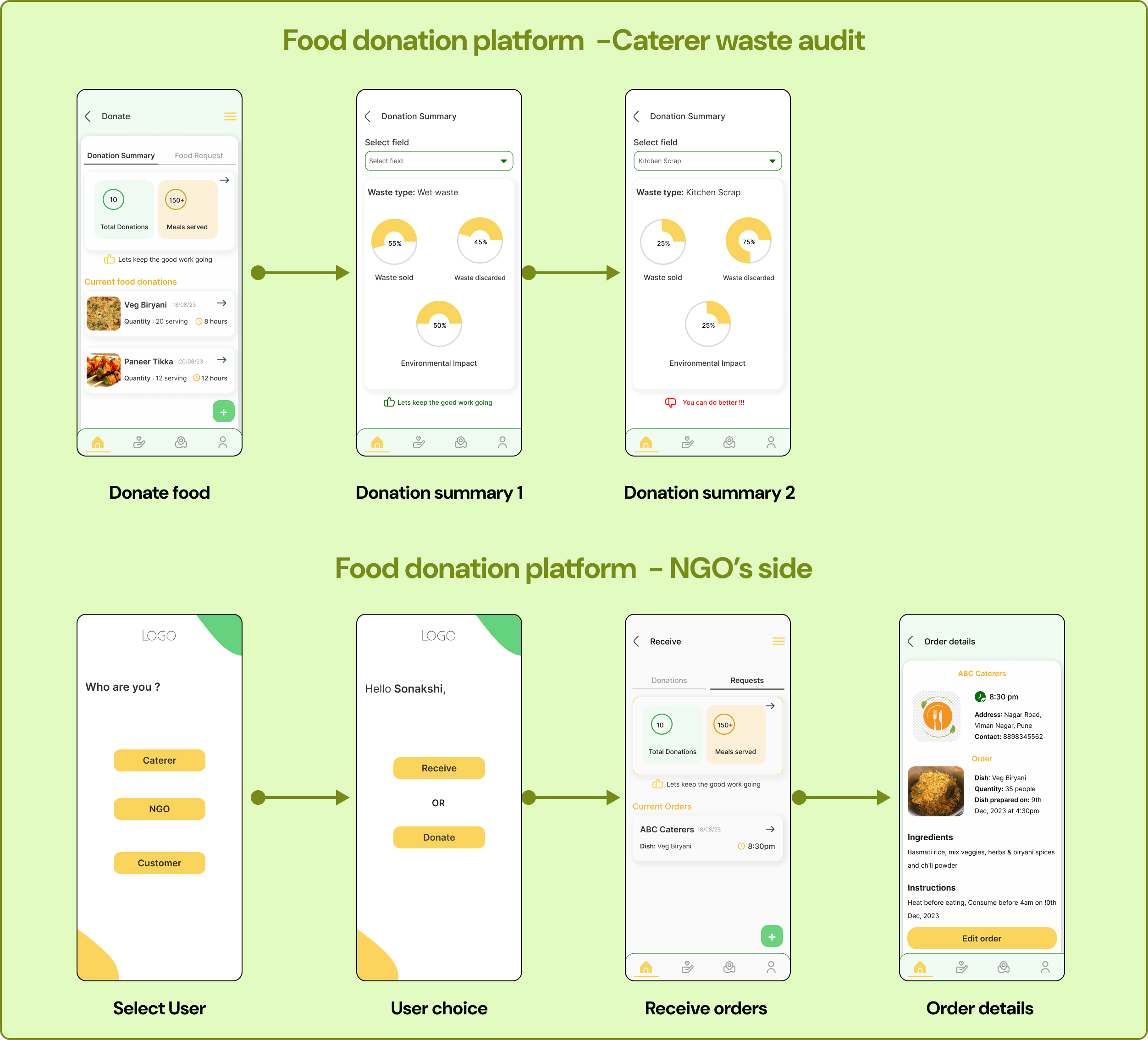
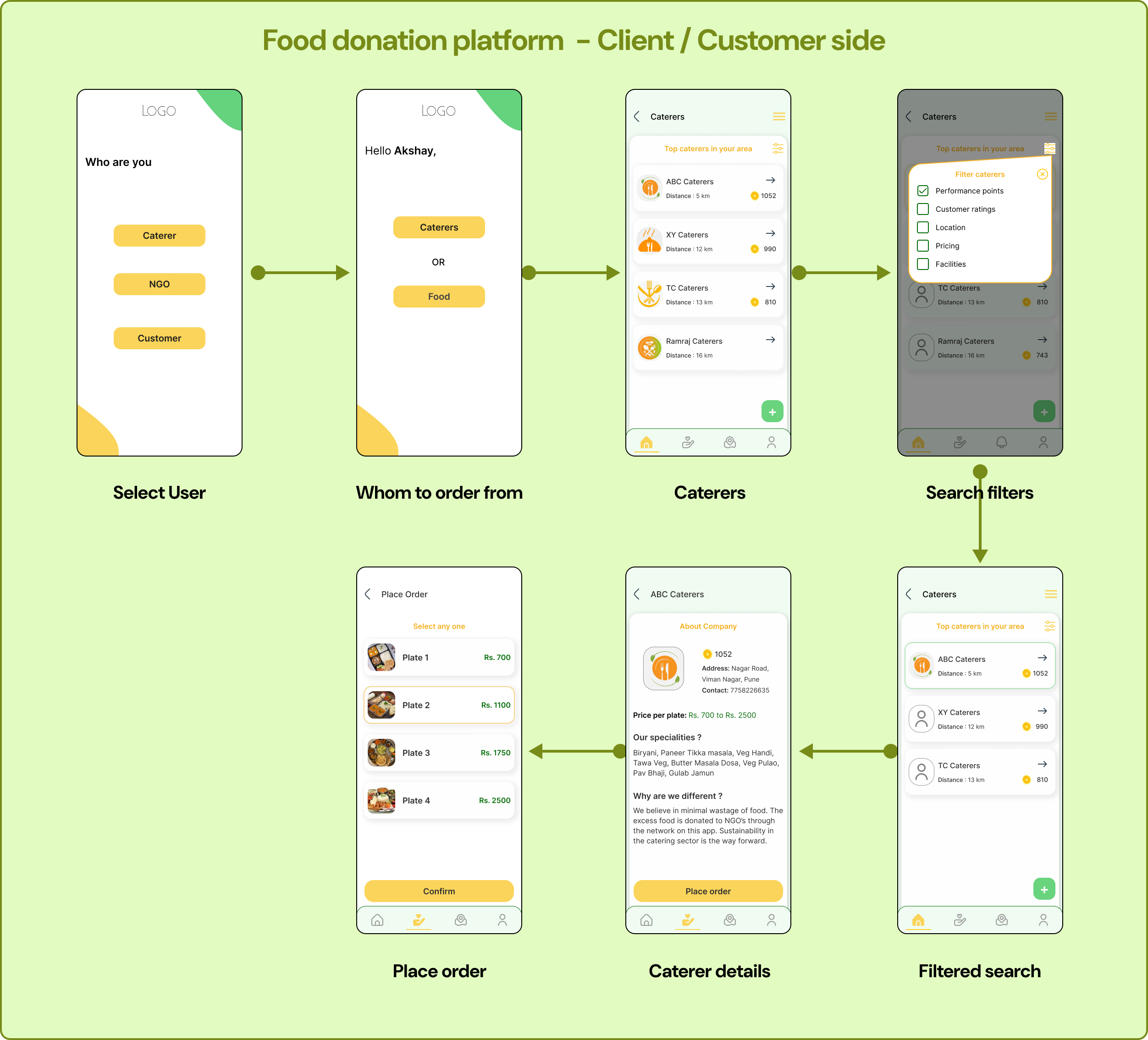
Post-event Waste Management (A Design Methods Project)
Design methods refer to the structured techniques, procedures, tools, and resources employed during the design process. They serve to articulate and systematize a designer's approach, enabling the externalization and communication of their thought process. Post-event waste refers to the accumulation of discarded materials and by-products generated after the conclusion of an event, such as conferences, festivals, sports events, or social gatherings. Almost 92% send their waste to landfills without segregating based on a study. (TOI, 2023)


Post-event waste, if not properly managed, can end up in landfills, contributing to pollution and climate change. It can also strain local waste disposal systems and pose health risks.
The impact of post-event waste goes beyond the immediate venue, affecting local communities, ecosystems, and waste management systems.
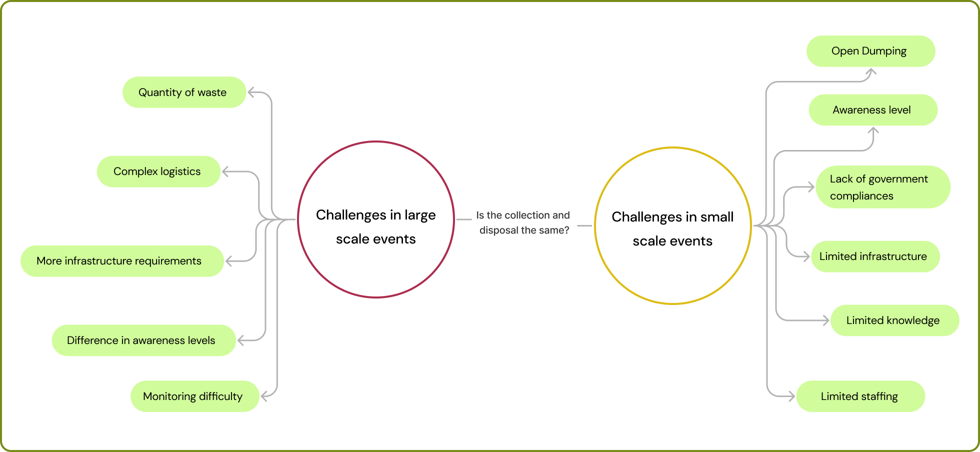
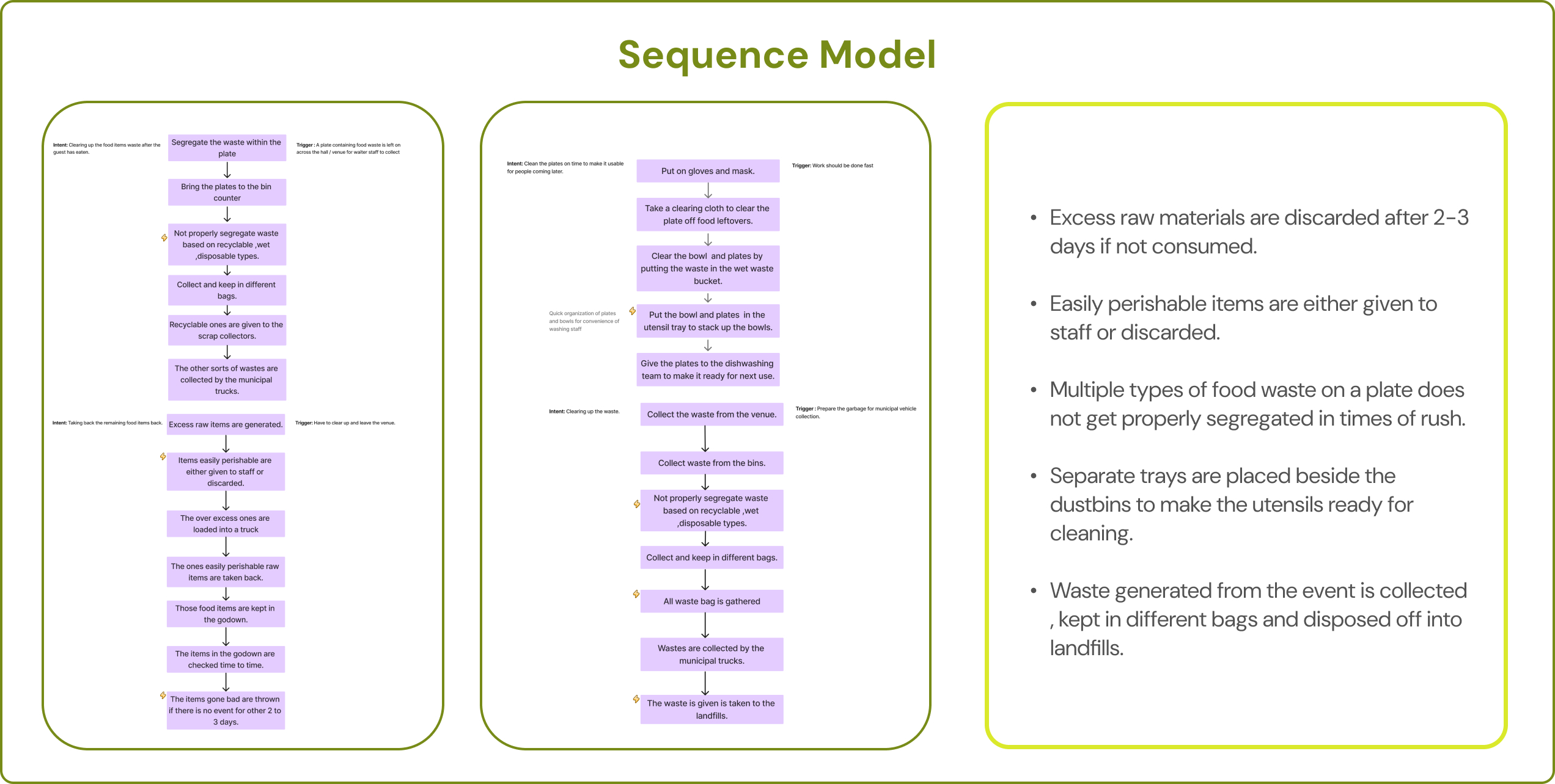
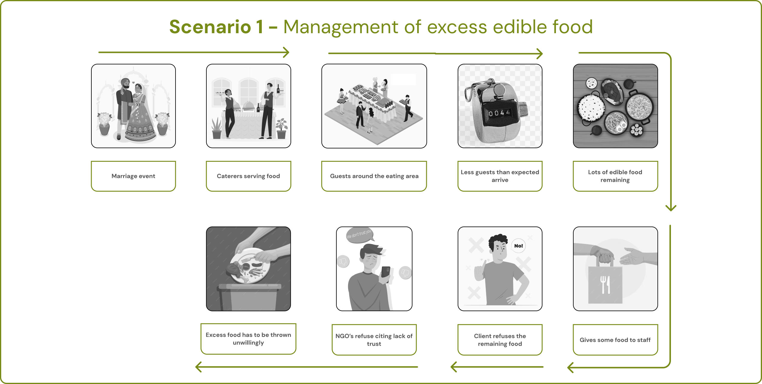
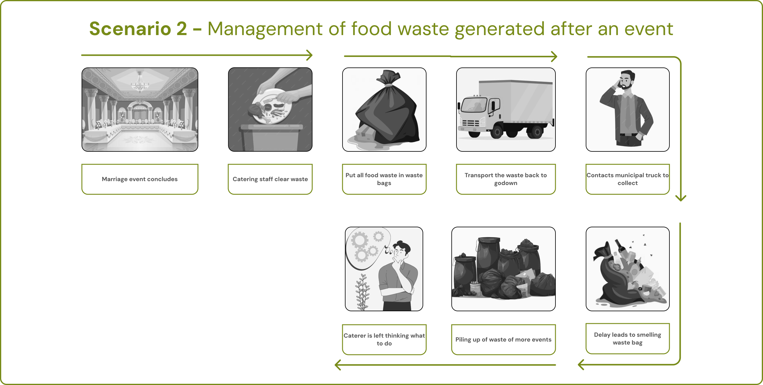
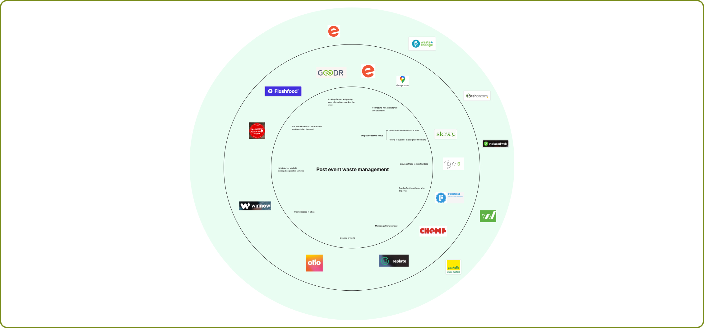
We tried to understand what differences there could be in the waste generation process of small and big-scale events. To understand more about the waste type, generation, and segregation methods, we conducted primary research by using the relevant design methods.
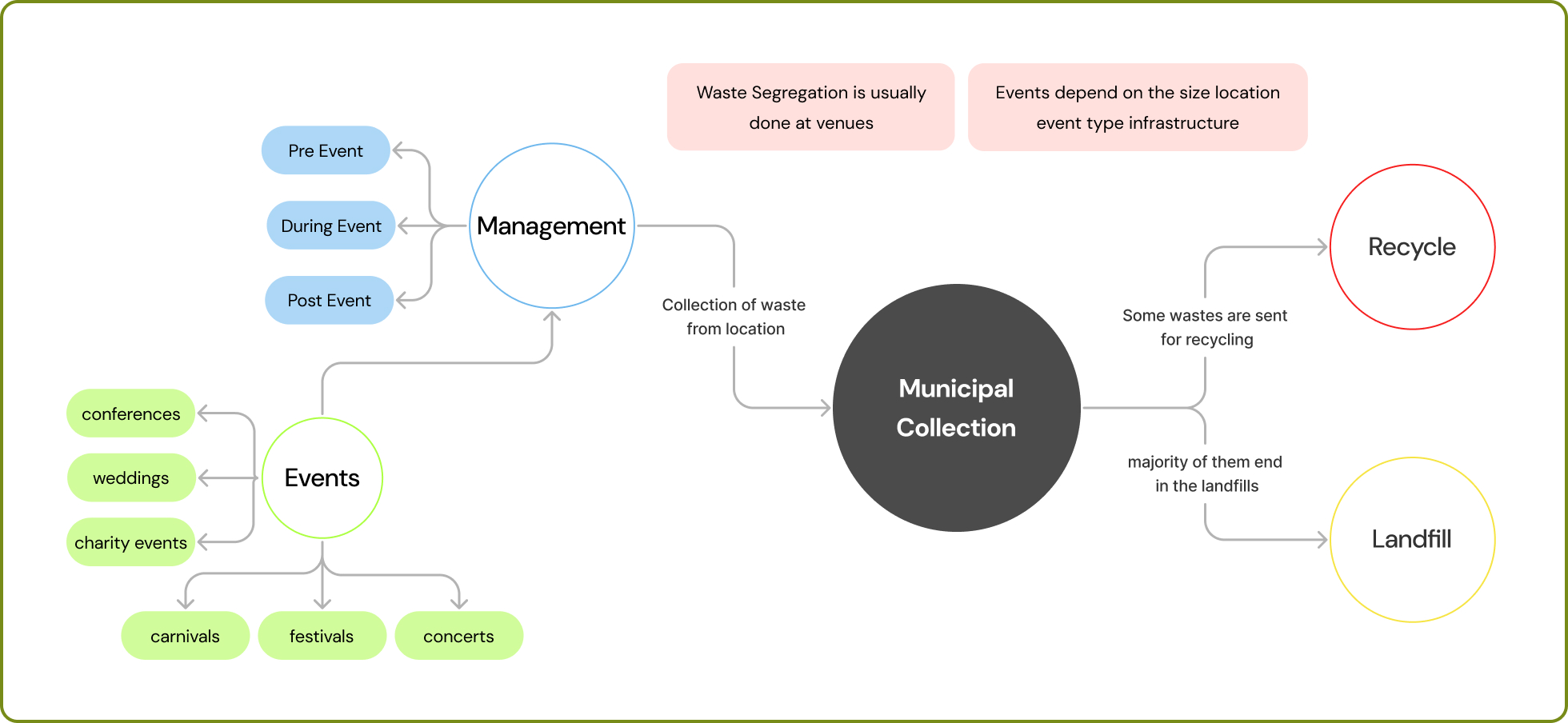
Based on secondary research, we started mapping the path of where waste is generated and its aftermath. The complete course of waste, right from the events to the municipal corporation either recycling or disposing of the waste, was mapped out in detail.
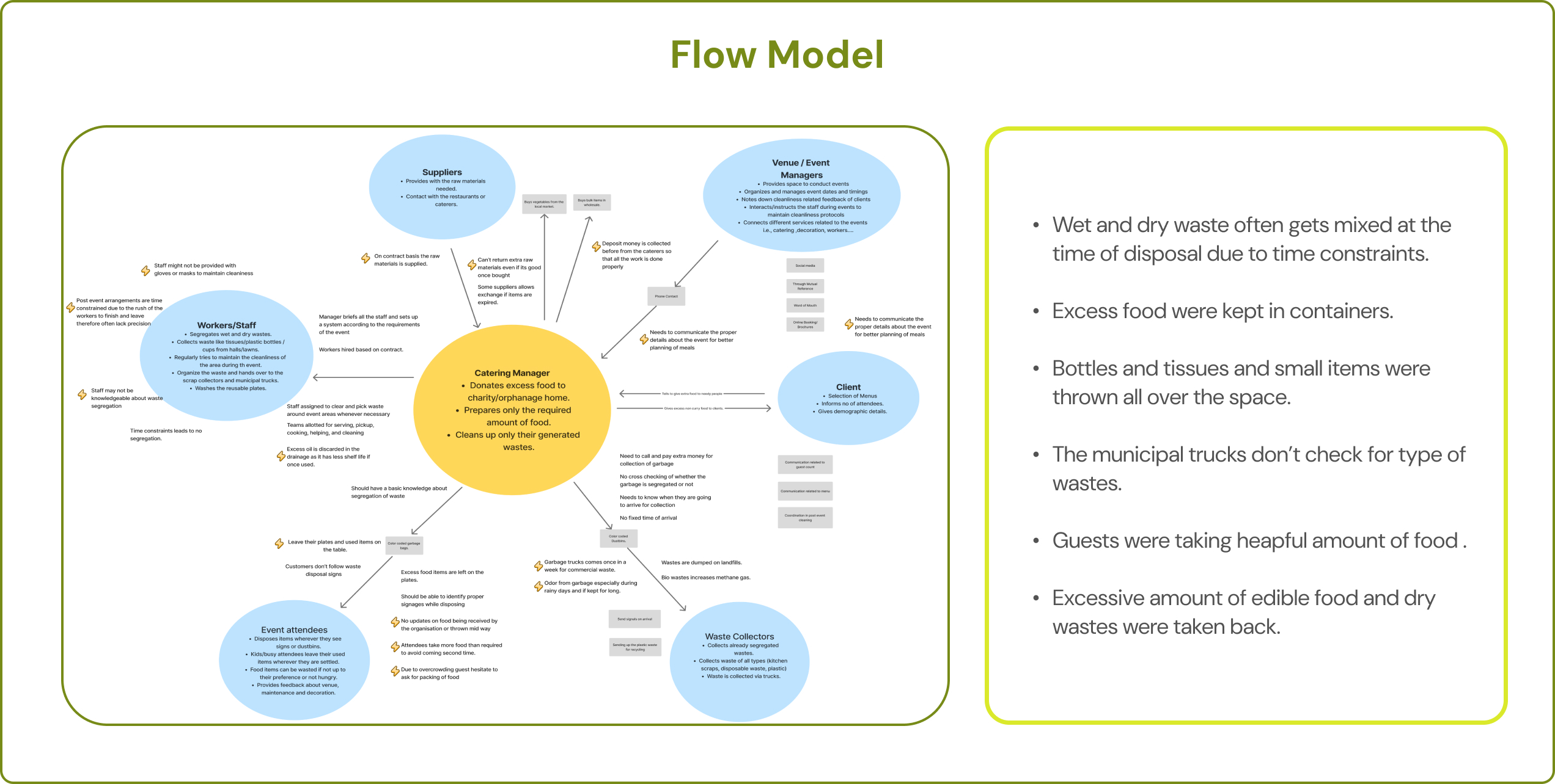
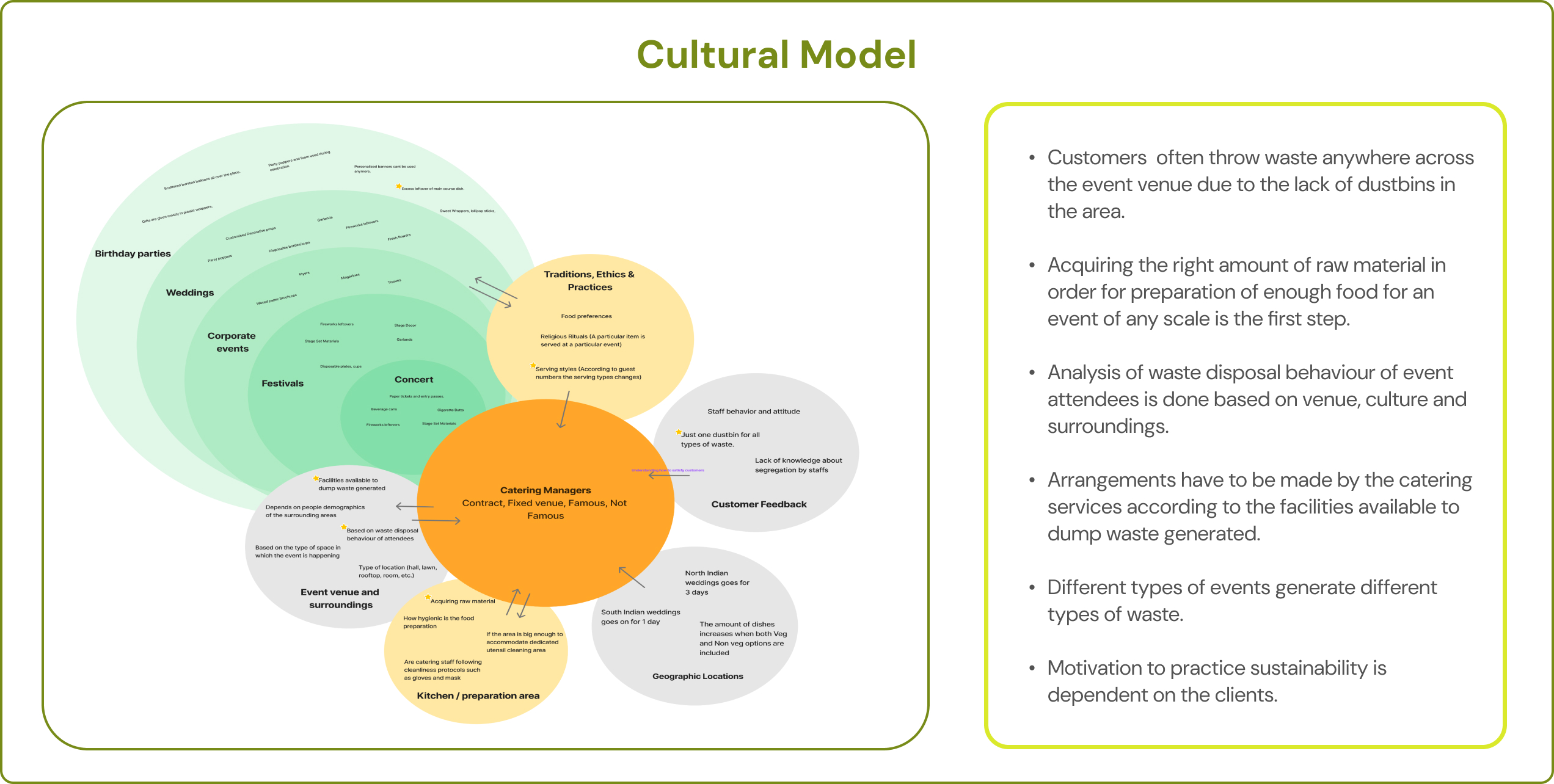
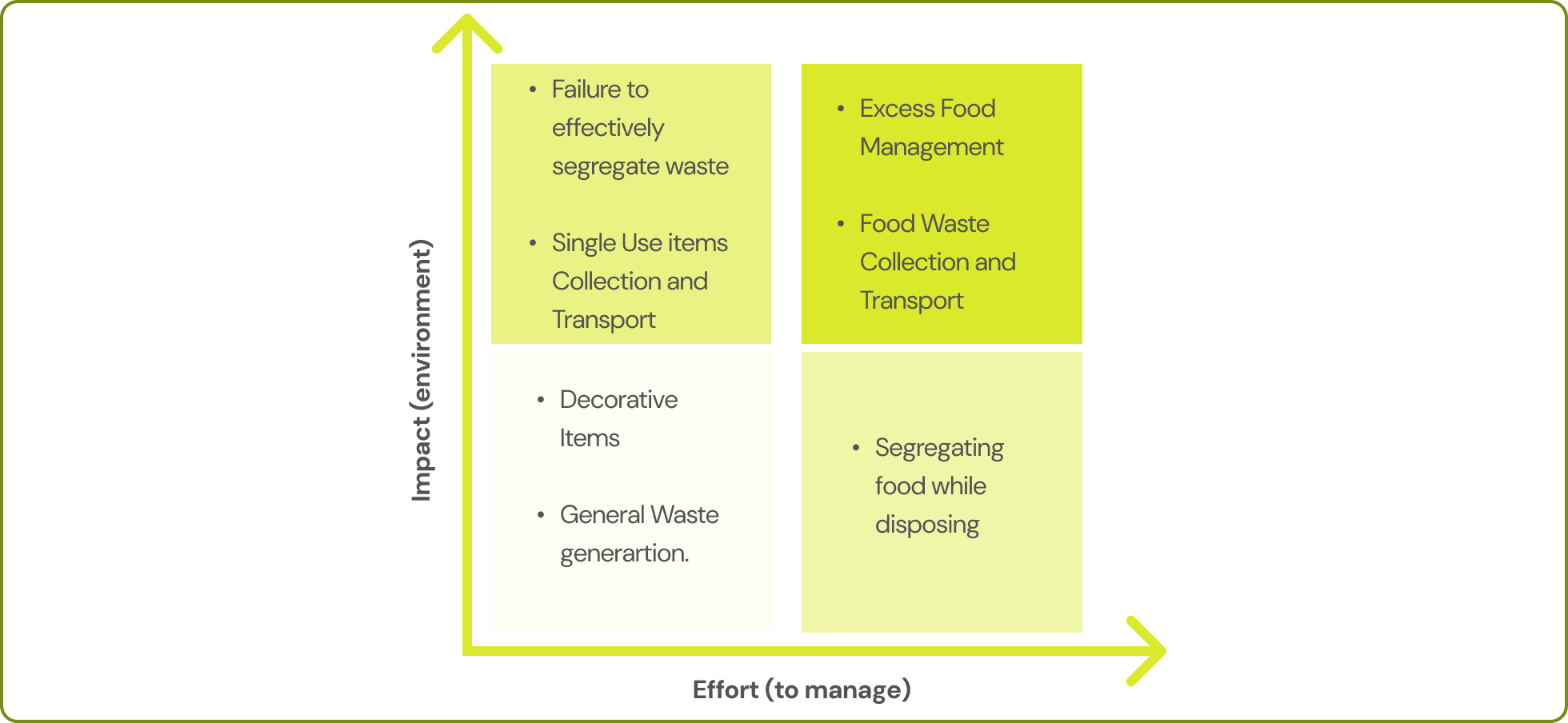
Based on the inferences from the contextual inquiry, we singled out a few problem/stress areas that could be worked upon. A graph was made comparing the effort taken to manage waste to the environmental impact it could potentially have.
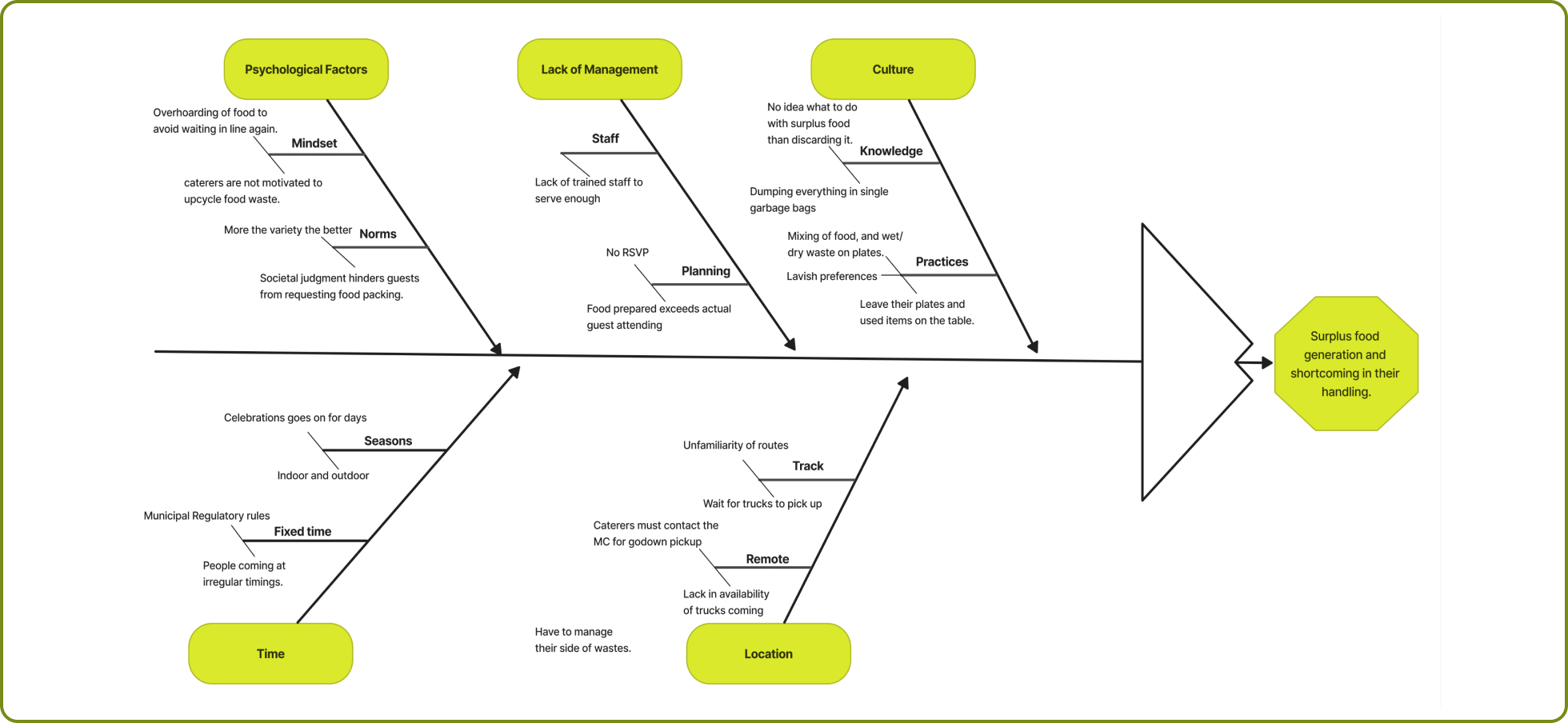
A fishbone diagram is a visual tool that helps identify the root causes of a problem. The key insights from the fish-bone diagram were the following:
1. There is a certain concern about cleaning up before time due to the constraint of venue closing.
2. The caterer is left frustrated when fewer than expected number of people attend the event.
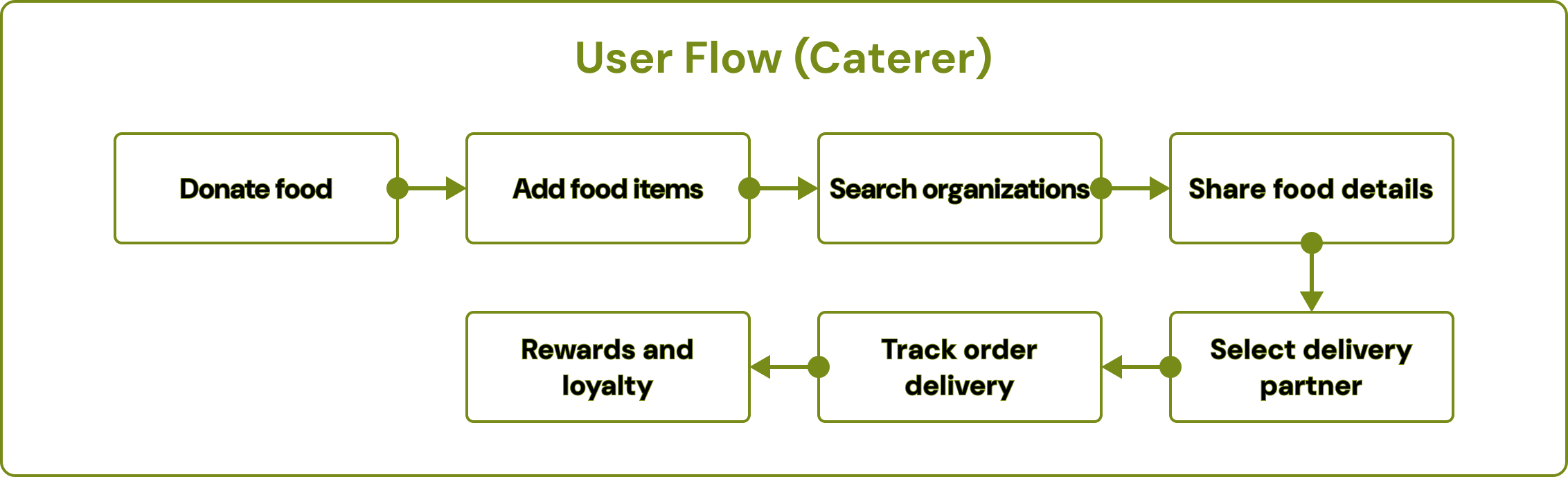
3. When the catering organizations deliver the food to the NGO’s, they don’t receive proper communication about whether the food has reached the location.
4. There is no set mode of connection with companies innovatively purposing waste management.
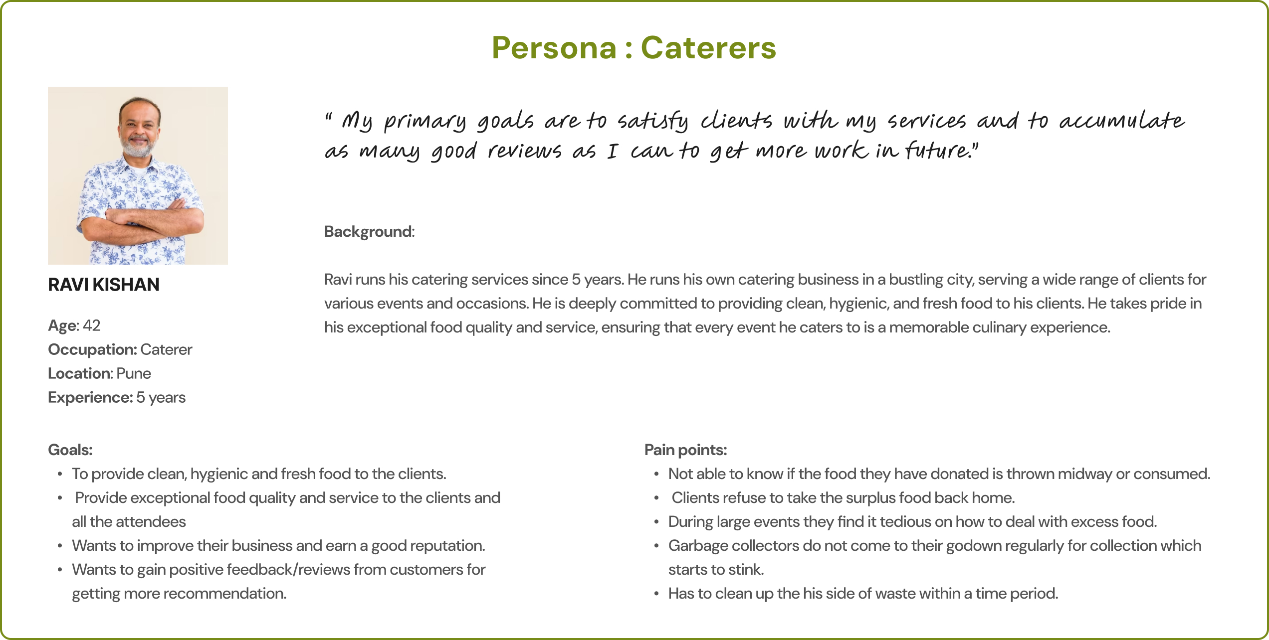
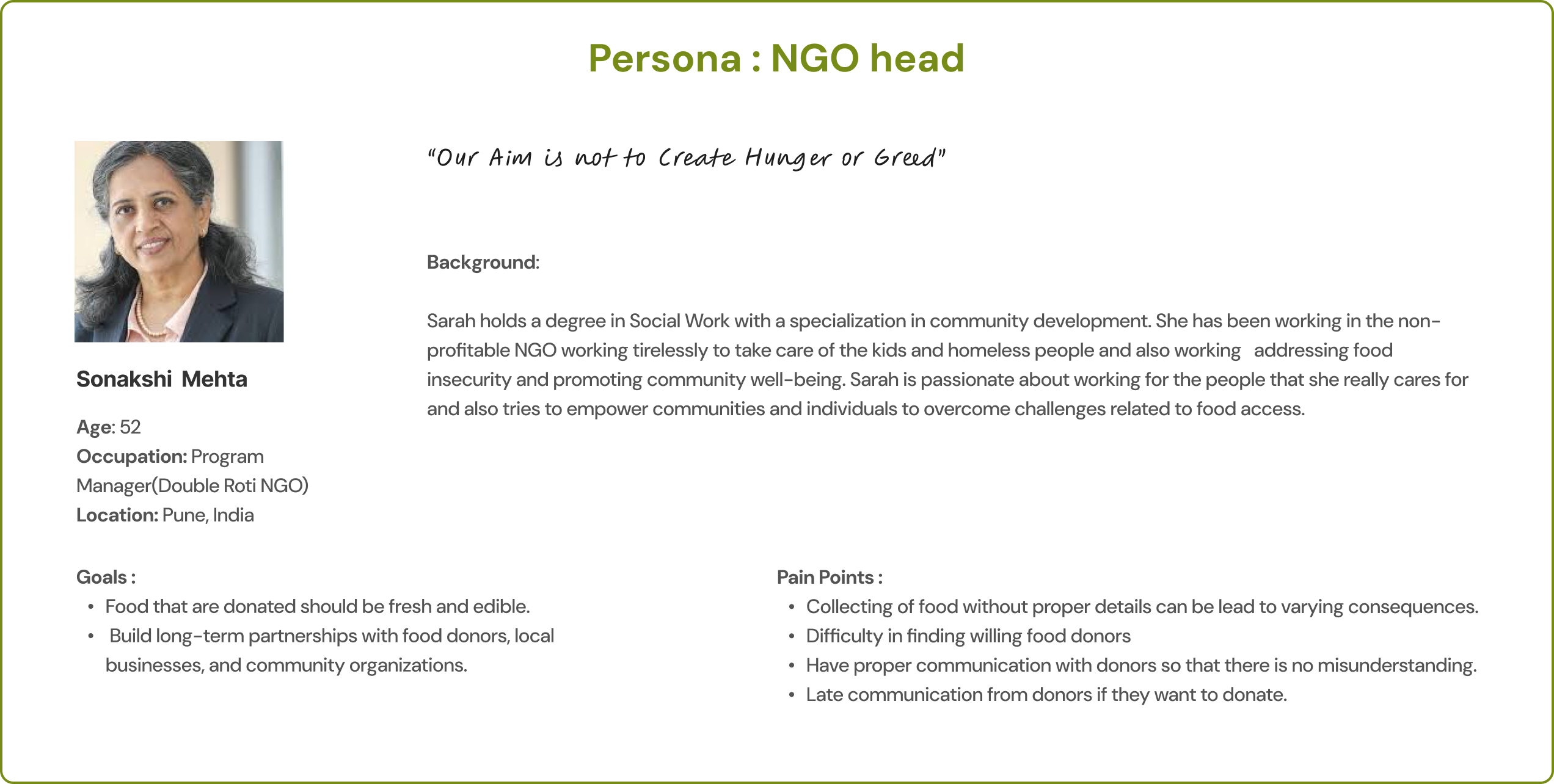

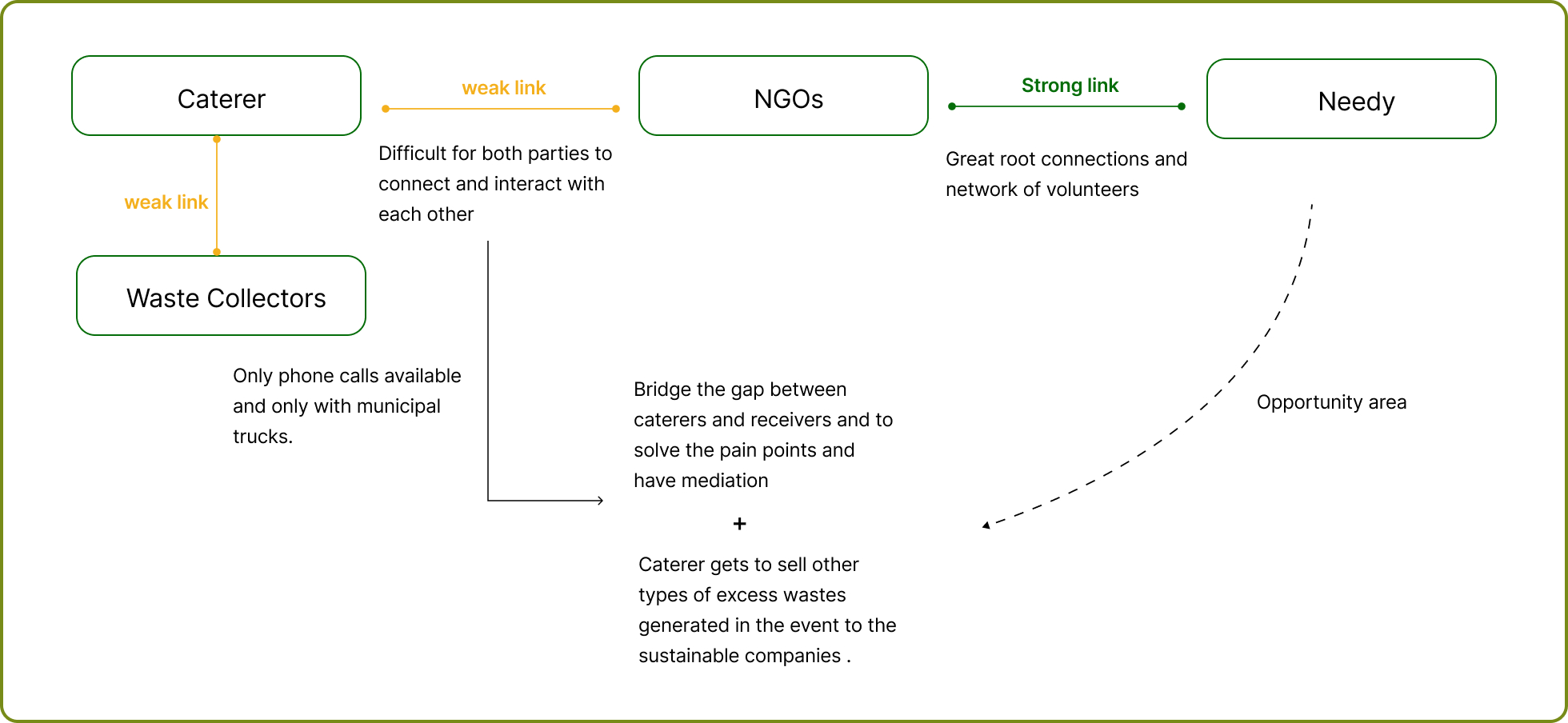
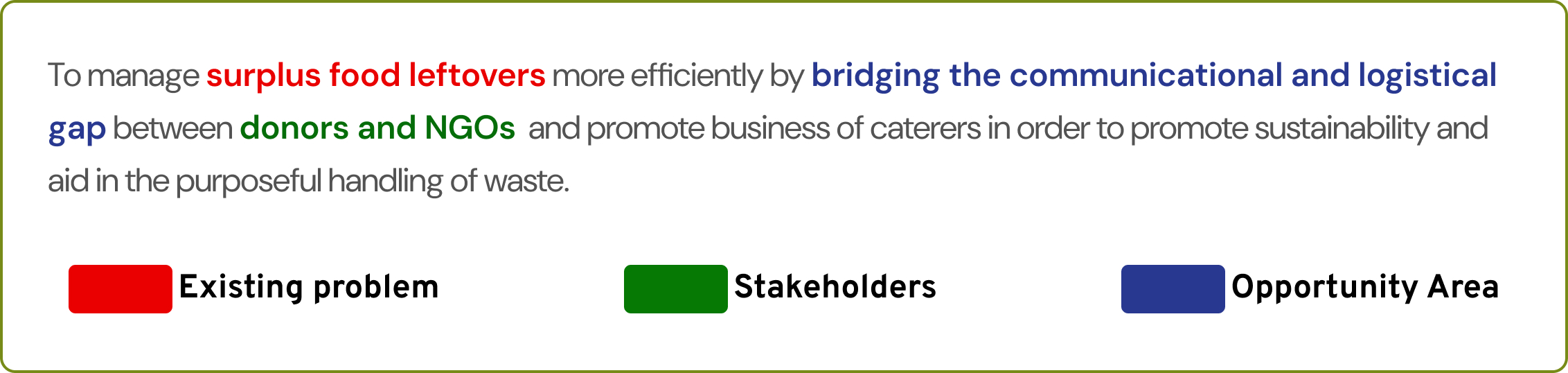
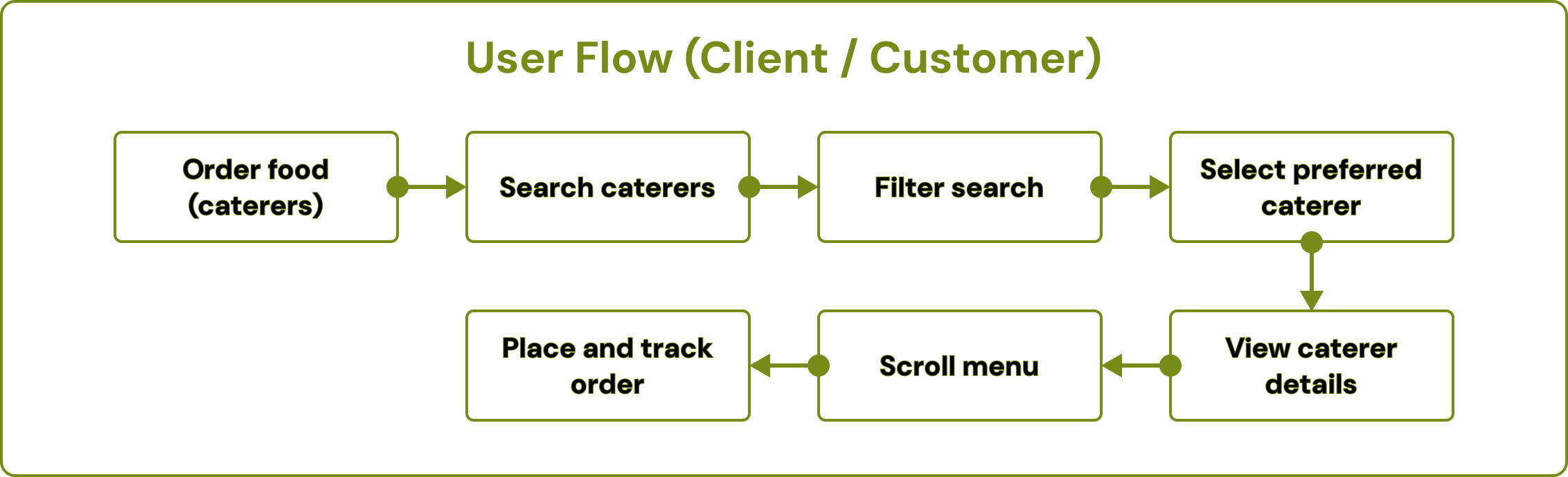
An opportunity area was discovered by linking the common pain points of all three persona sets. The final opportunity presented from the research was to bridge the gap between all the stakeholders through a system online.
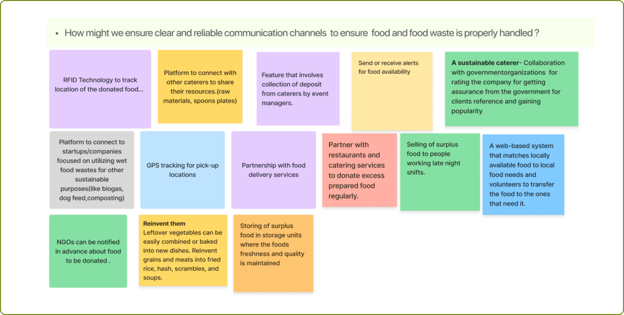
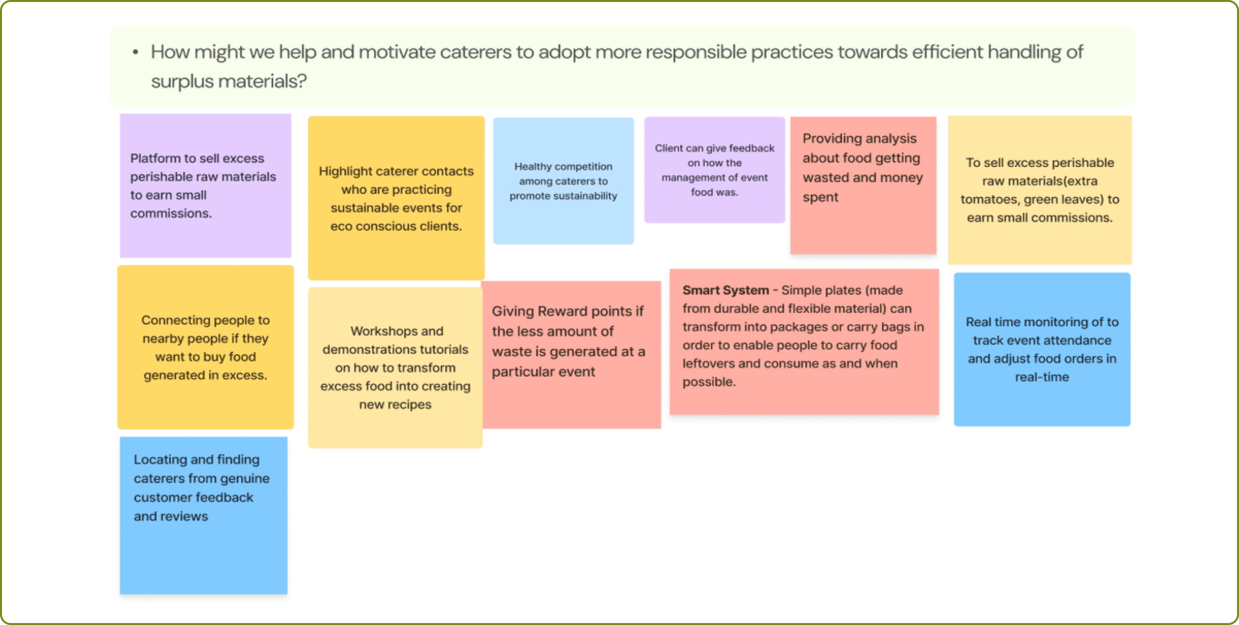
A set of “how might we” questions were constructed to form a problem statement to proceed with. The “how might we” questions are as follows:
1. How might we ensure timely pick-up of waste so that the food waste is properly handled and disposed off?
2. How might we help caterers be more responsible towards better management of surplus food instead of being discarded all together?
3. How can we make it feasible for caterers to manage food waste more efficiently so that waste generated doesn’t end up in dumping sites?
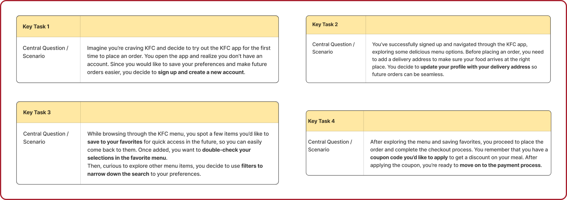
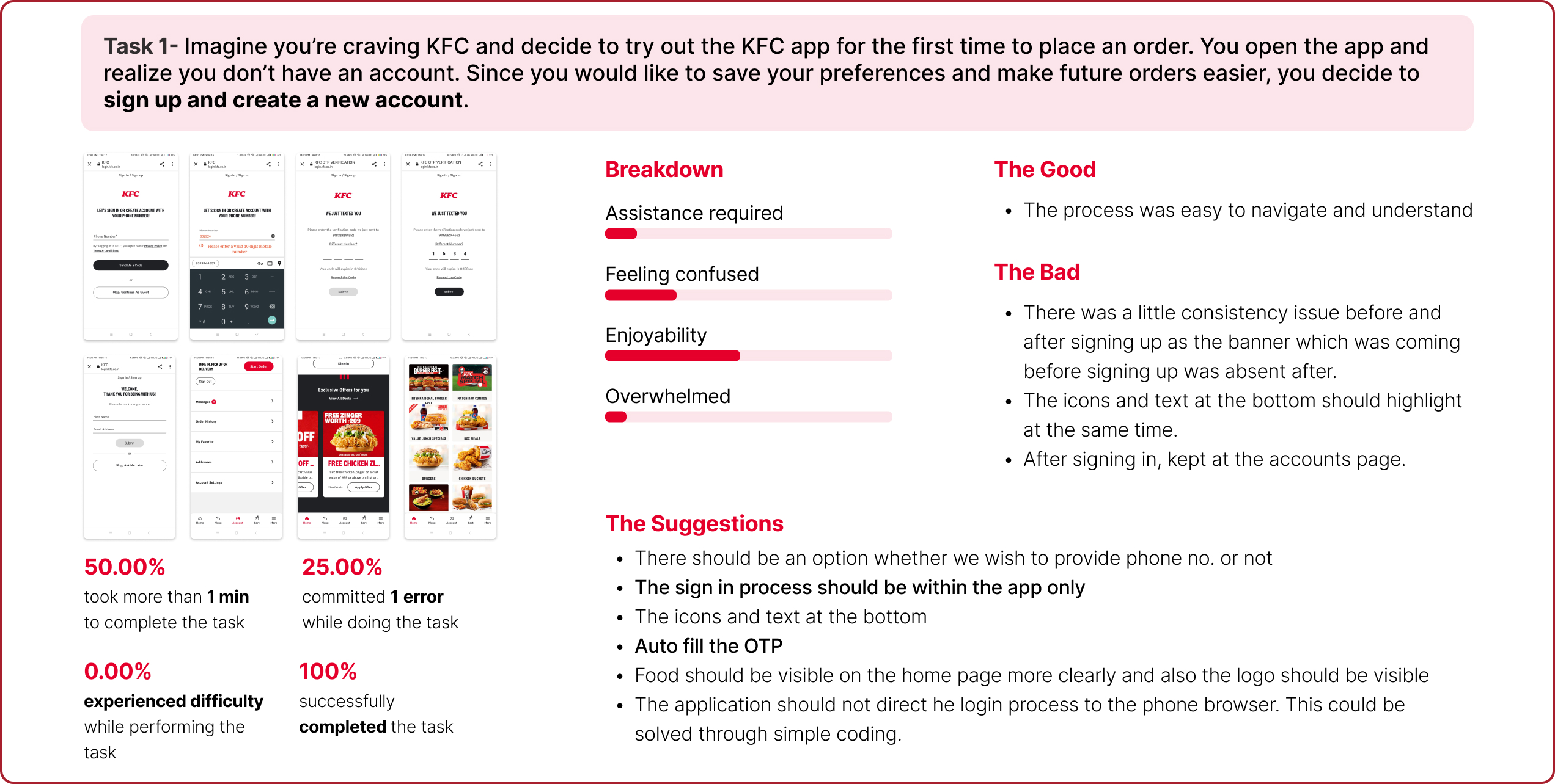
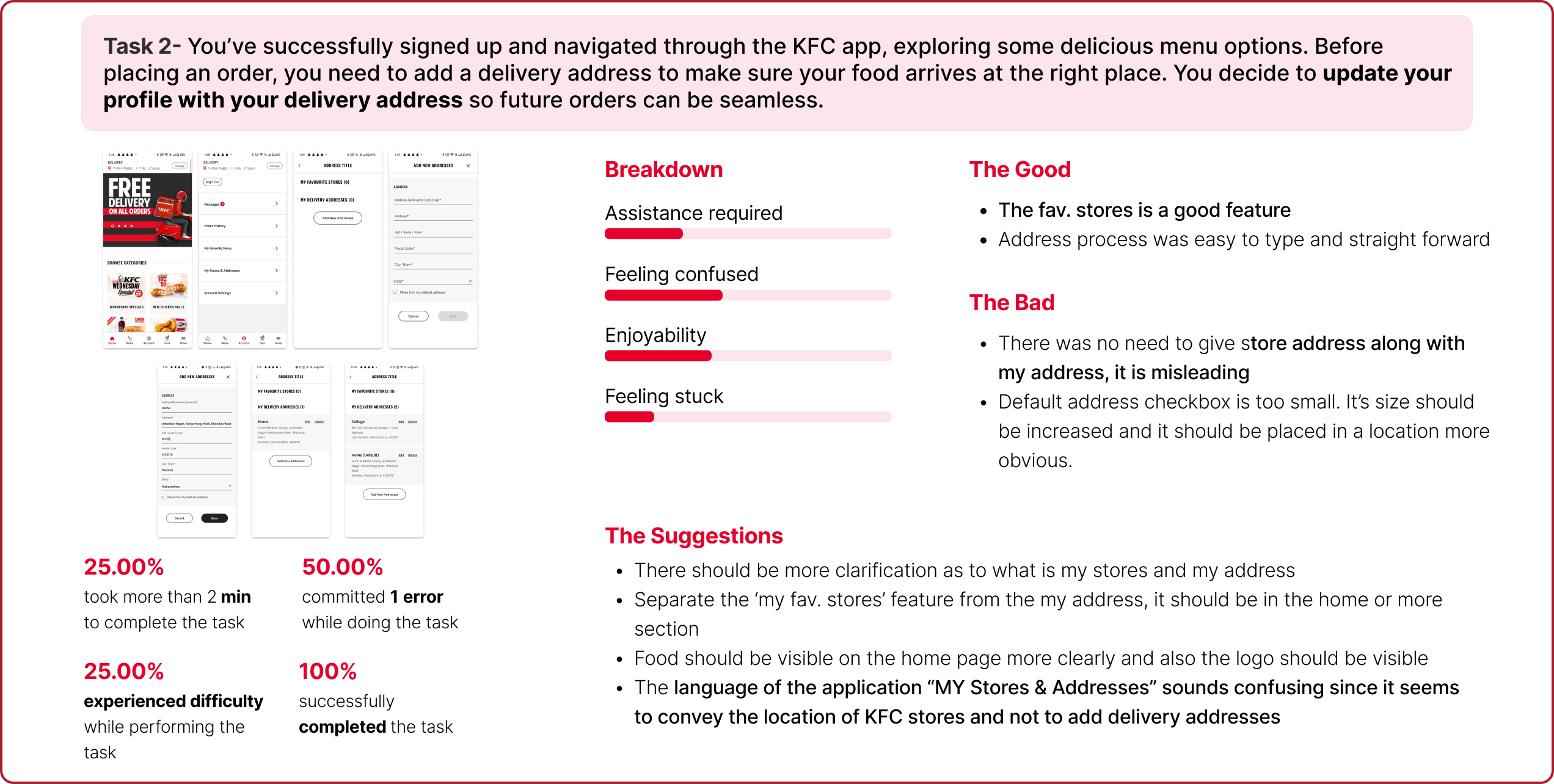
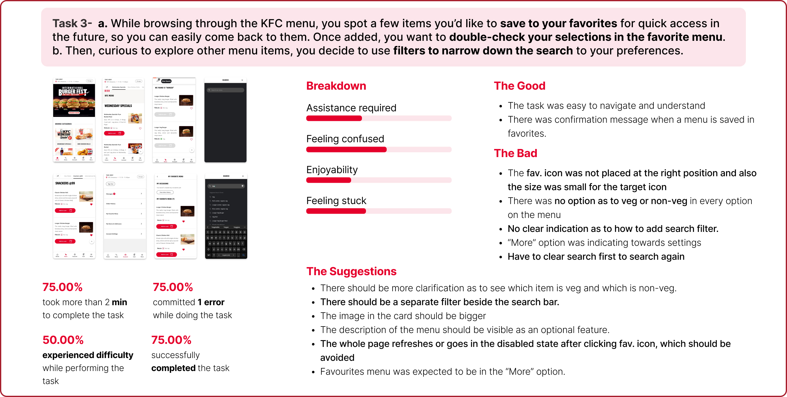
KFC Application (Usability and A/B Testing)
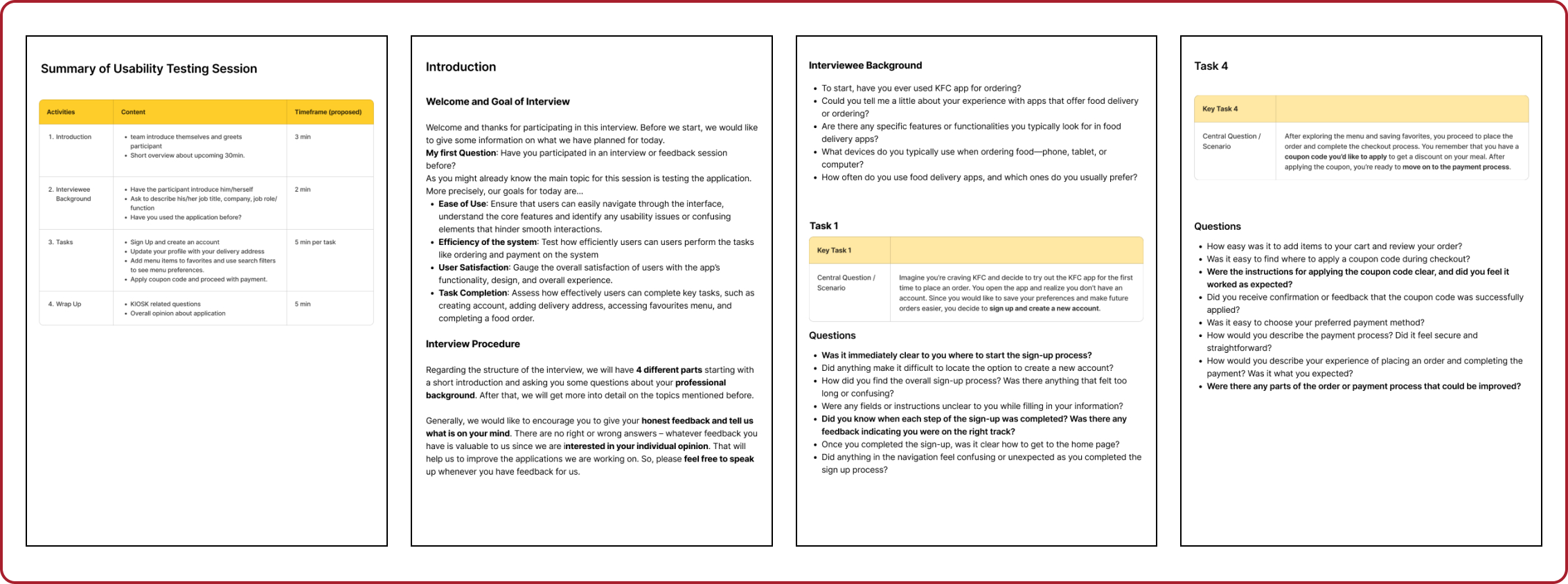
KFC Corporation, doing business as KFC, is an American fast food restaurant chain that specializes in fried chicken. The purpose of the project was to revamp the KFC mobile application to improve usability, engagement, and retention. The project was carried out in four key phases: conducting usability testing on the existing application, developing redesigned interfaces, performing A/B testing to compare the two versions of the application, and delivering a final design proposal.
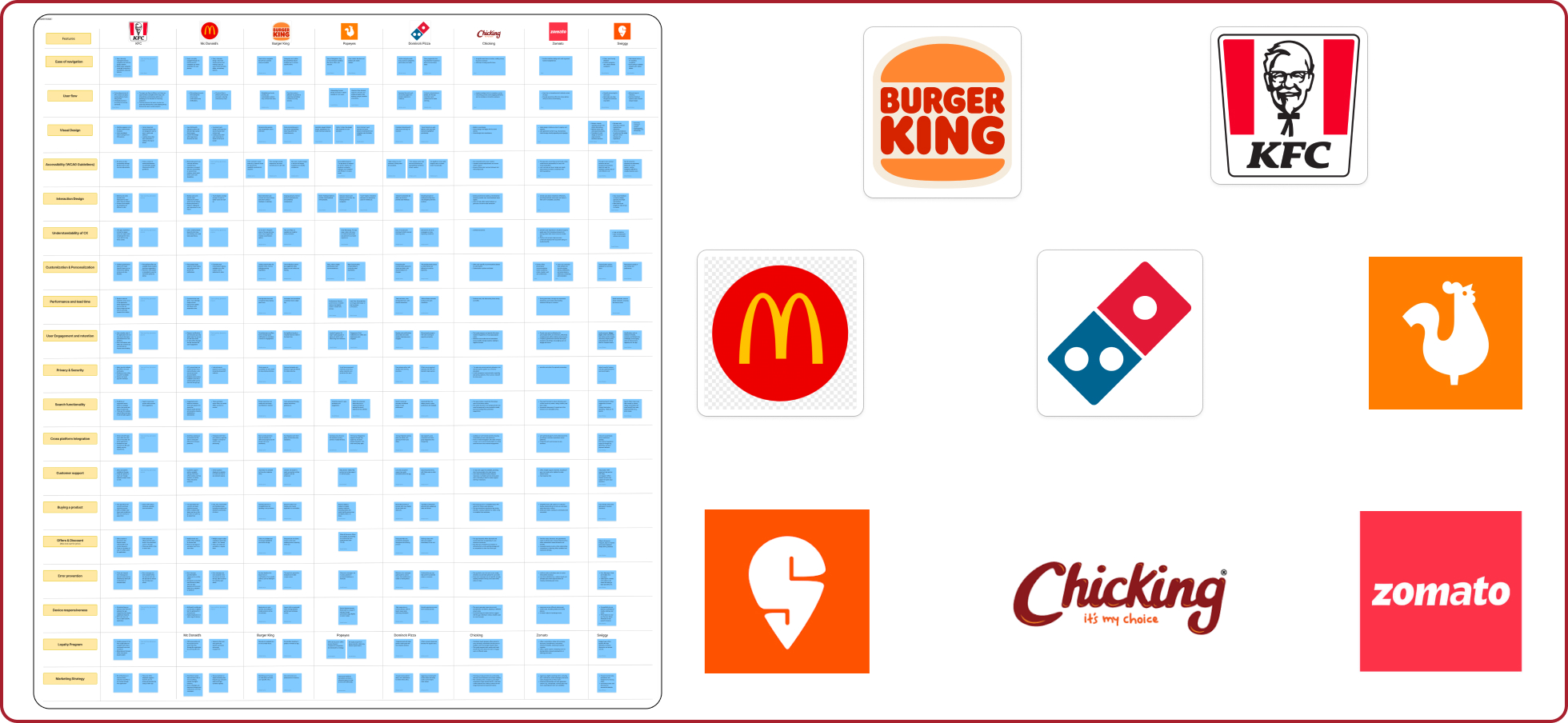 We conducted a competitive analysis of top fast-food chains and food delivery apps (KFC, McDonald’s, Domino’s, Zomato, Swiggy, etc.) to evaluate their UX/UI. The focus was on navigation, design, personalization, performance, and user engagement. This analysis highlights key strengths and opportunities across the platforms, offering insights into industry standards for enhancing user experience.
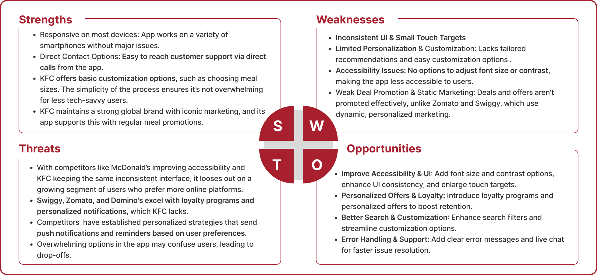
A detailed SWOT analysis was mapped out from the competitor analysis.
User Flow & Personalization: Zomato and Swiggy excel in personalized experiences and seamless user flows, while fast-food chains focus on simplicity.
Engagement & Offers: Food delivery apps drive high engagement through frequent offers and loyalty programs, unlike fast-food brands with limited promotions.
Performance & Support: Zomato and Swiggy offer superior customer support and faster, more reliable performance across devices.
Search & Integration: Advanced search and better cross-platform integration are strengths of food delivery apps compared to fast-food chains.
Interaction Style:
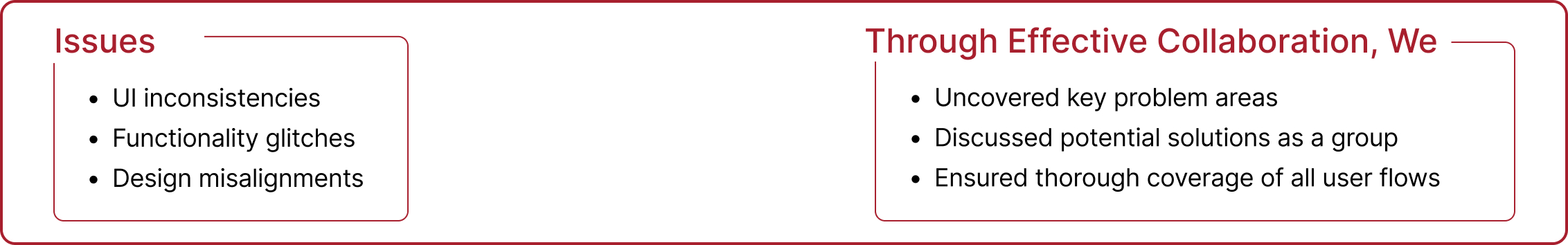
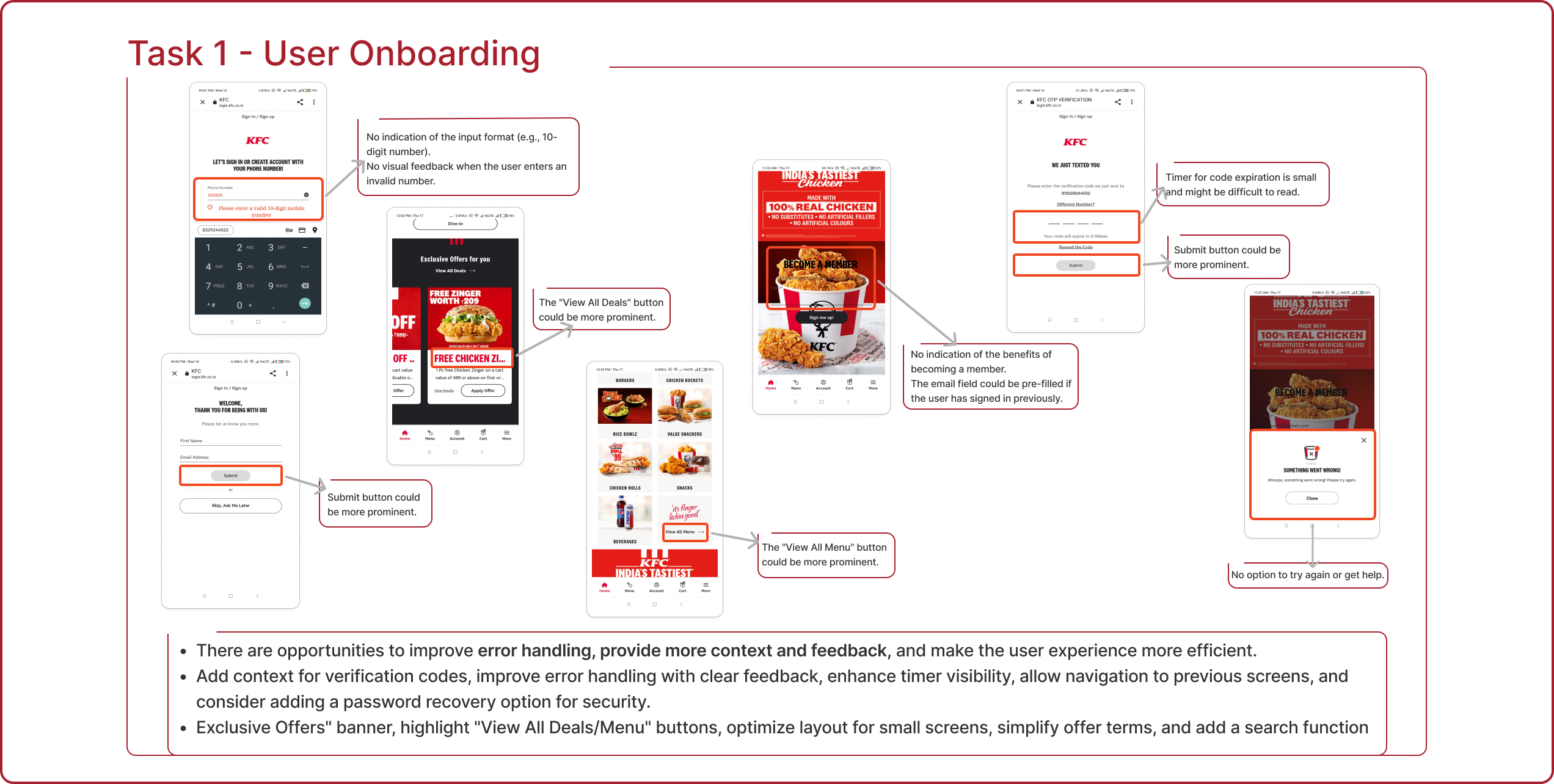
1. Most users navigated the app through trial and error, relying heavily on visible cues (e.g., buttons, icons).
2. Users expected common interaction patterns from competitor apps (e.g., McDonald’s, Zomato).
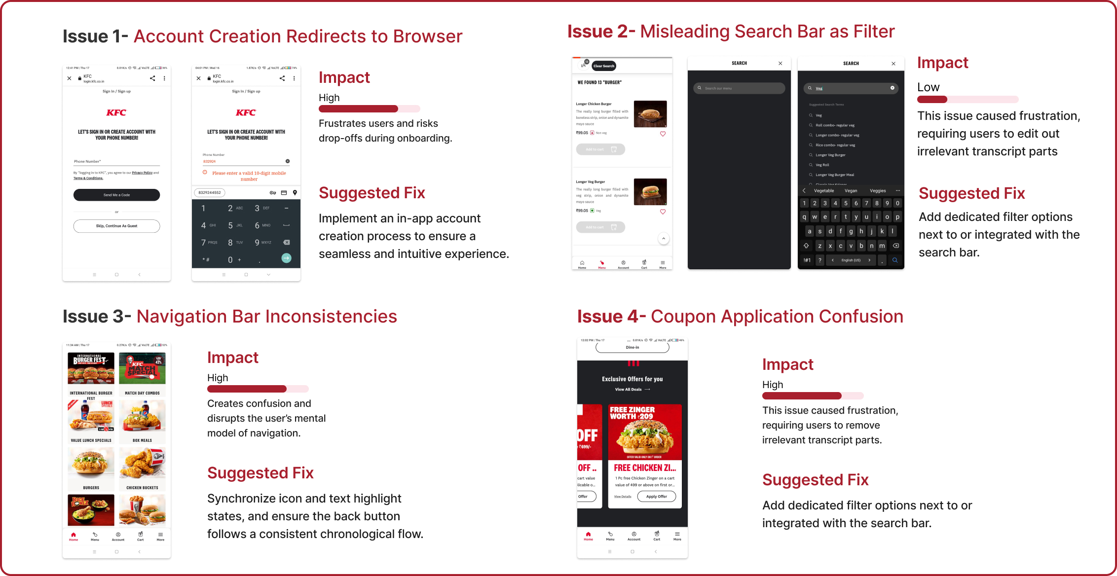
3. Users preferred simplicity and disliked redirections to external browsers for account creation and sign-in.
Notable Actions:
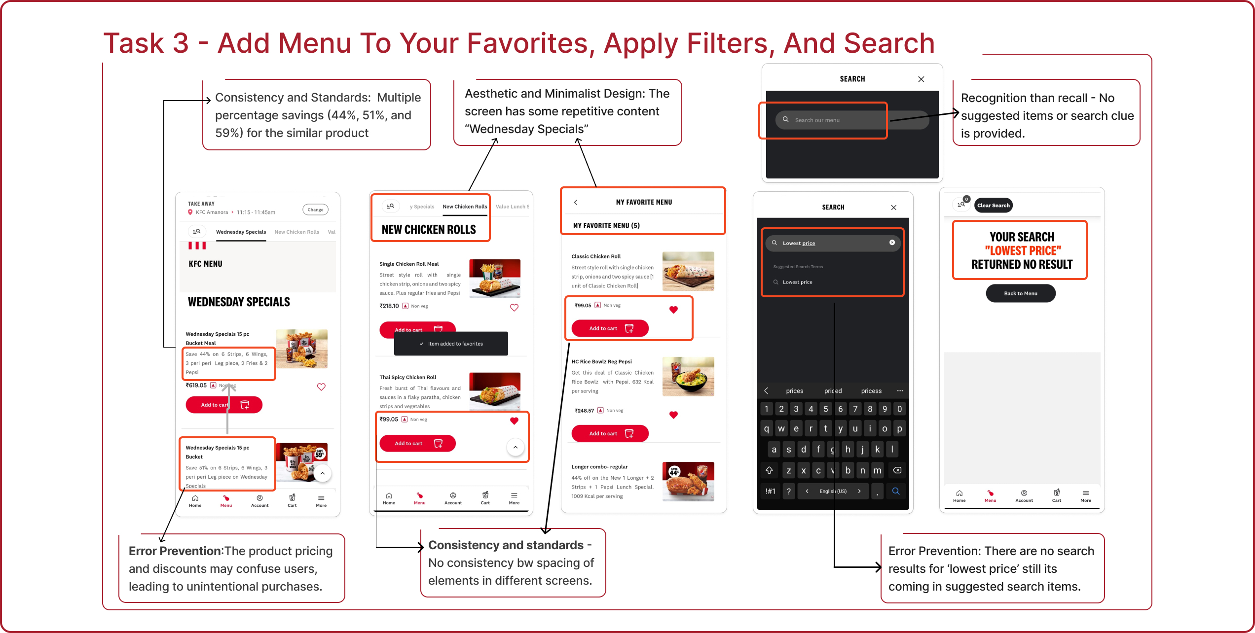
1. Repeated attempts to click on unresponsive or small-sized icons (e.g., heart icon for favorites).
2. Frequent mentions of confusion with search and filter functionalities being misleading.
3. Frustration over UI inconsistencies like buttons and navigation not lighting up as expected.
4. Users compared the app unfavorably to competitor apps, finding it less intuitive.
Common Patterns:
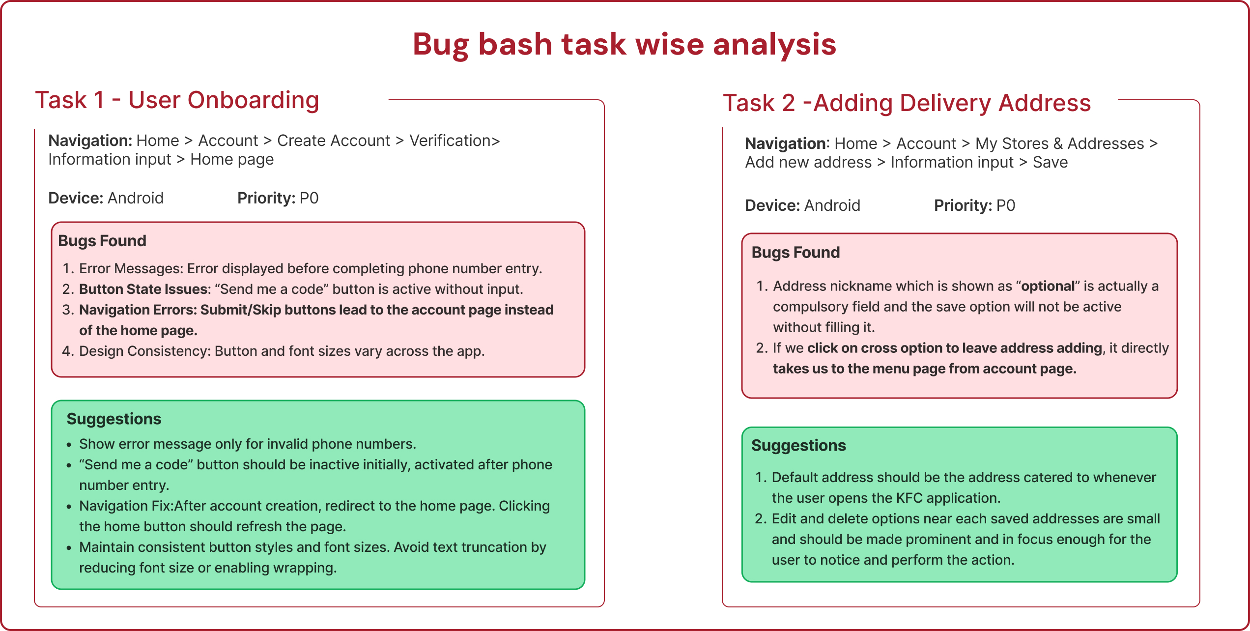
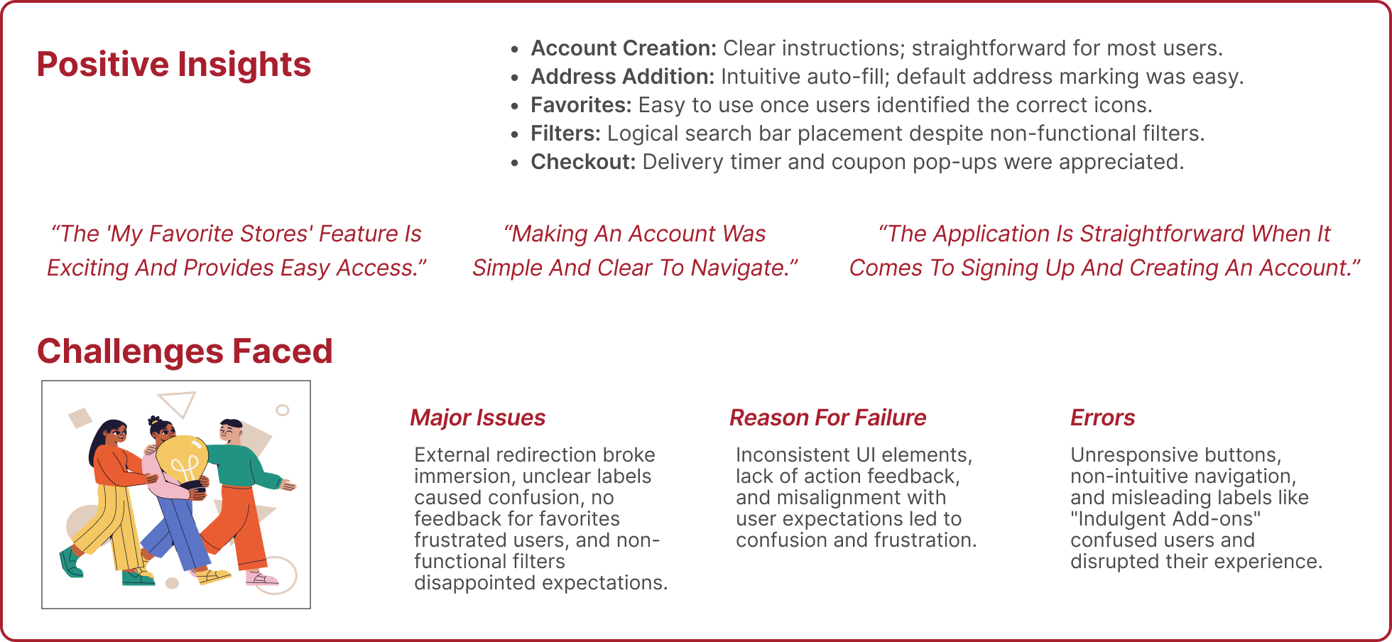
1. Account Creation: Users expected an in-app experience without redirection.
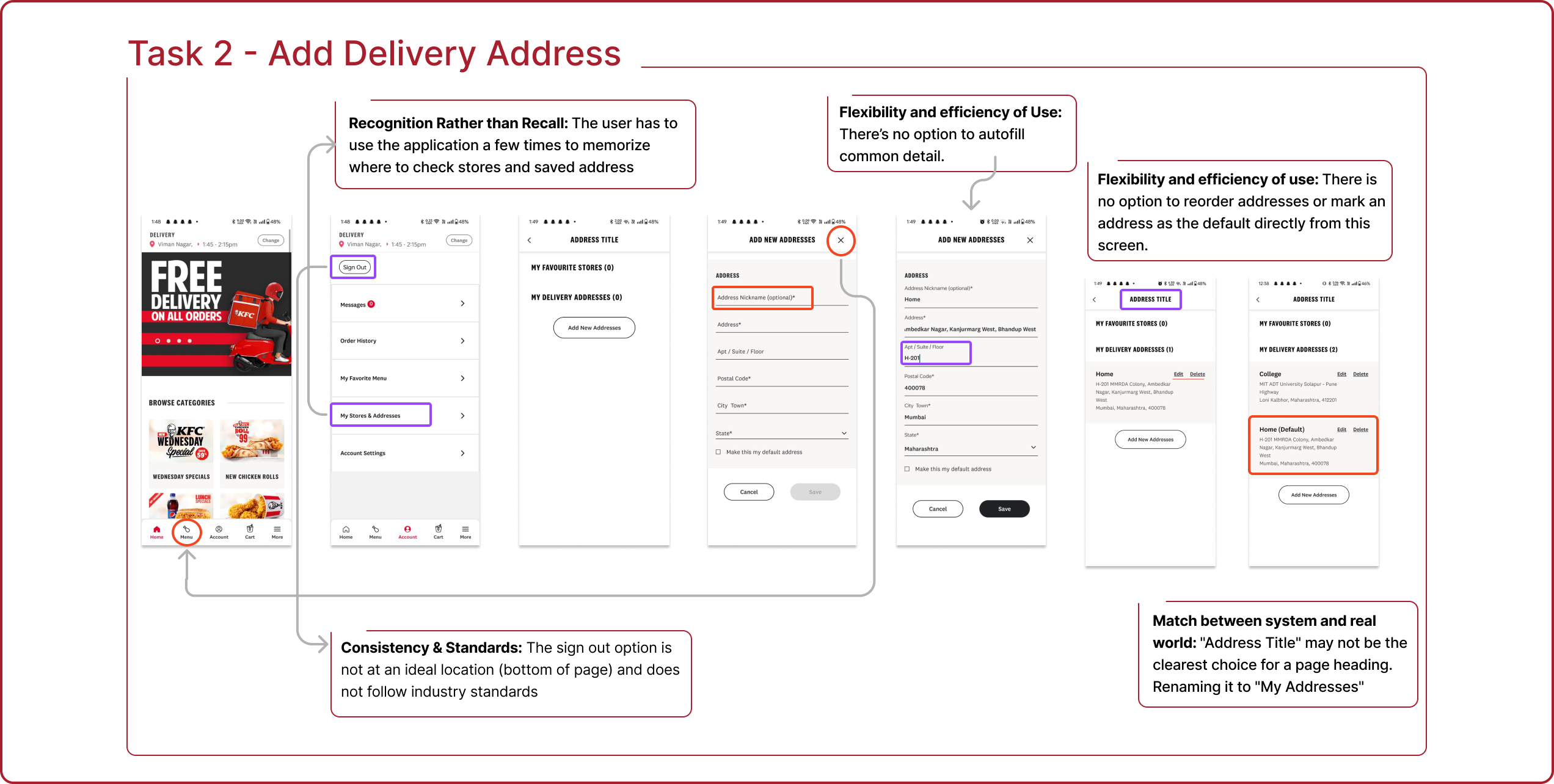
2. Address Addition: Users followed navigation paths logically but got confused by unclear labels like “My Stores & Addresses.”
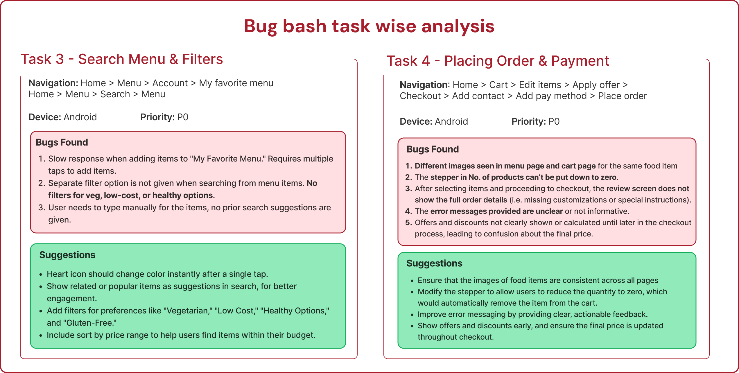
3. Favorites: Users struggled with inconsistent feedback, unclear icon placement, and the need for confirmation messages.
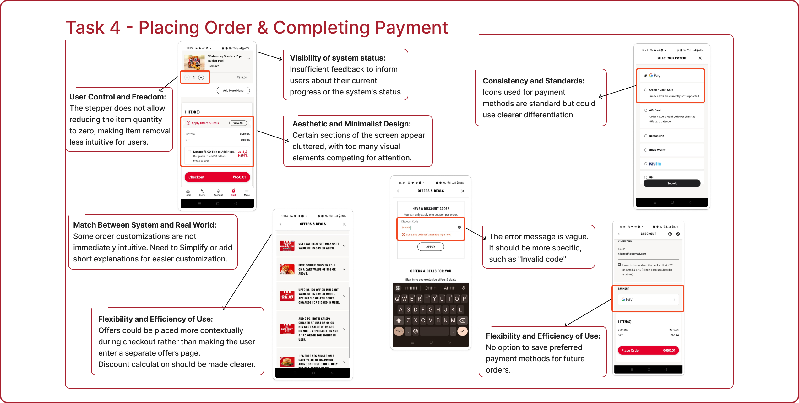
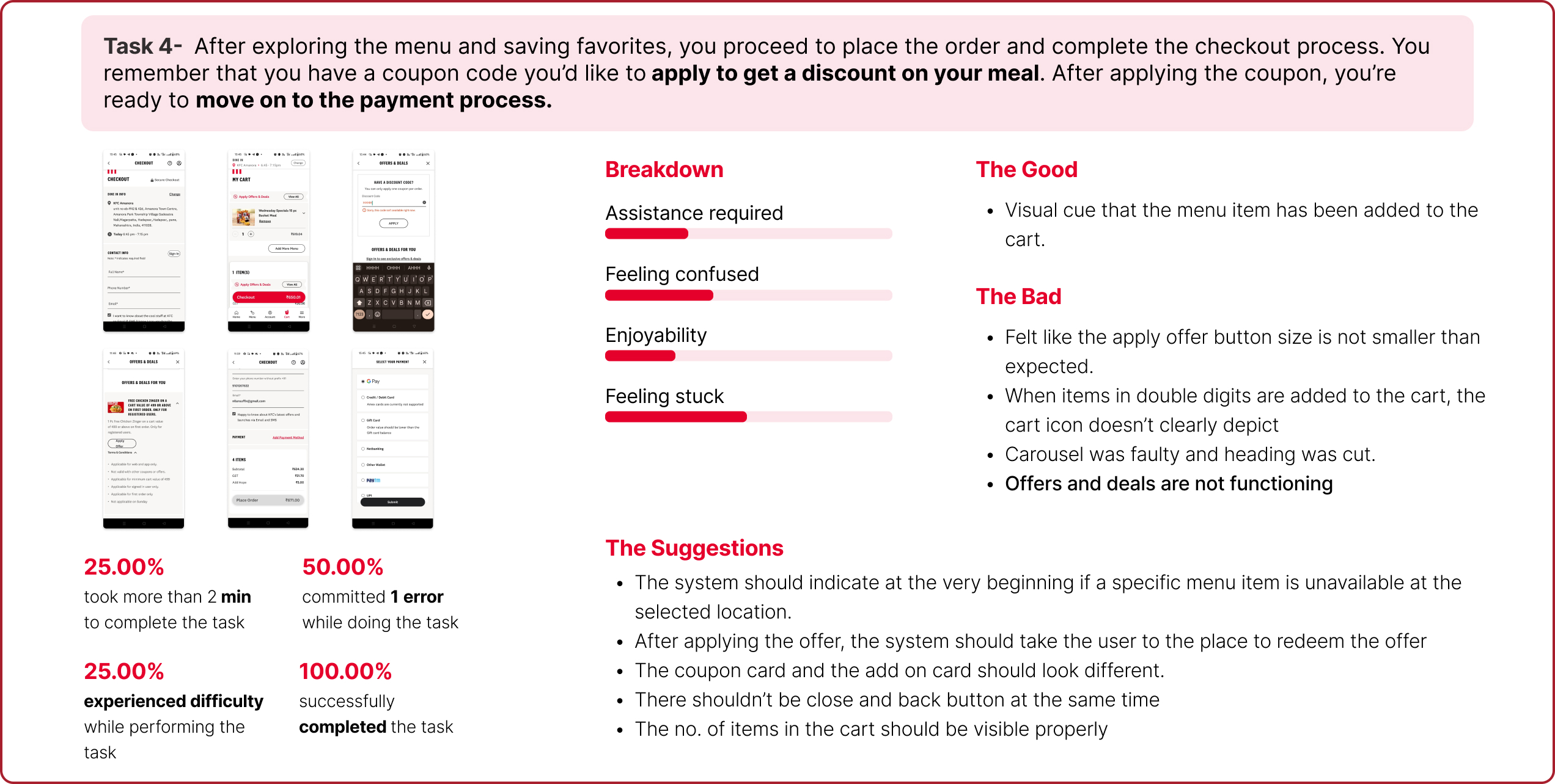
4. Checkout: Users faced misleading navigation labels and poor coupon application feedback
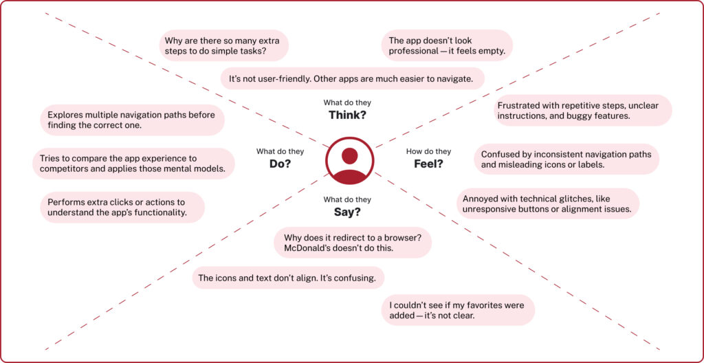
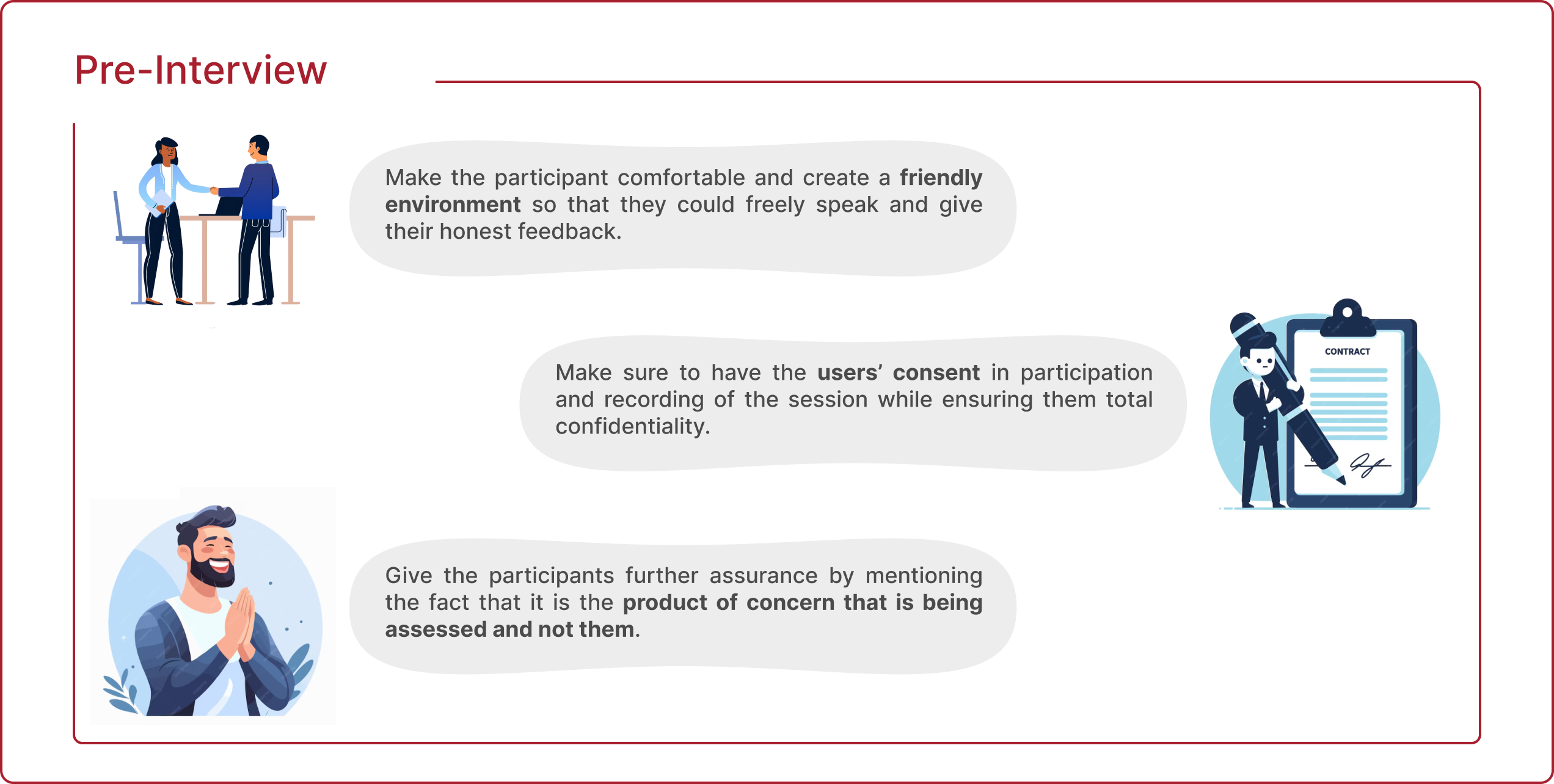
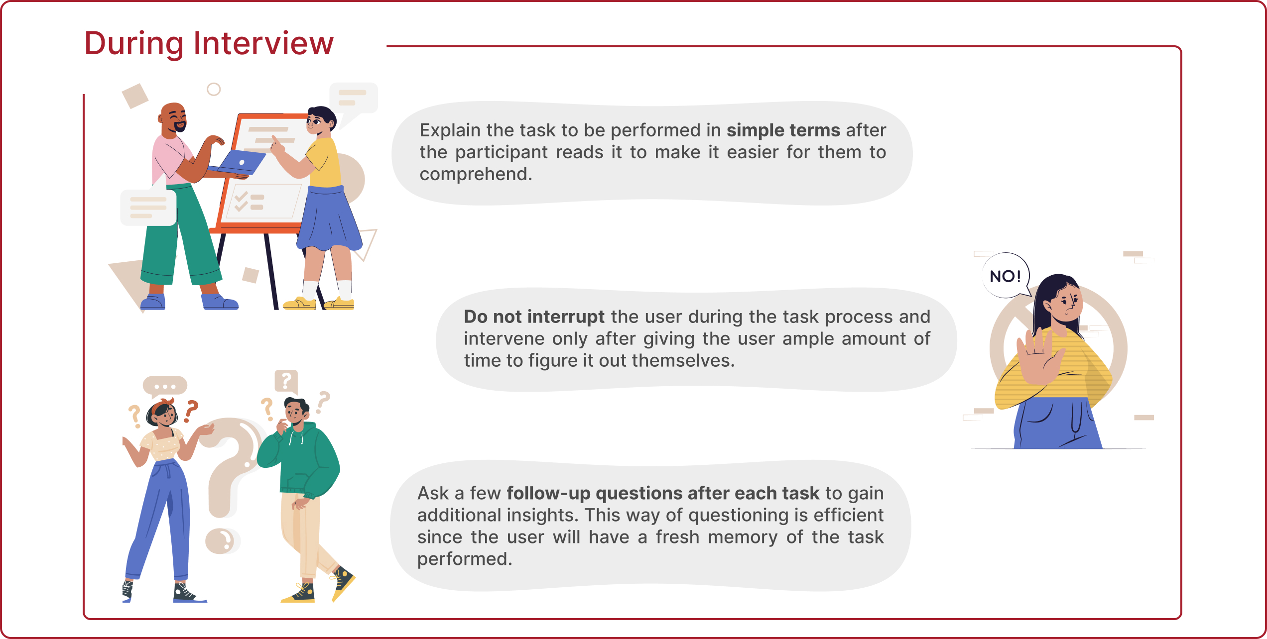
An empathy map is a tool that helps understand how a target audience thinks, feels, and behaves. In this case, the actions, emotions, and thoughts of the users were mapped out while using the KFC application.
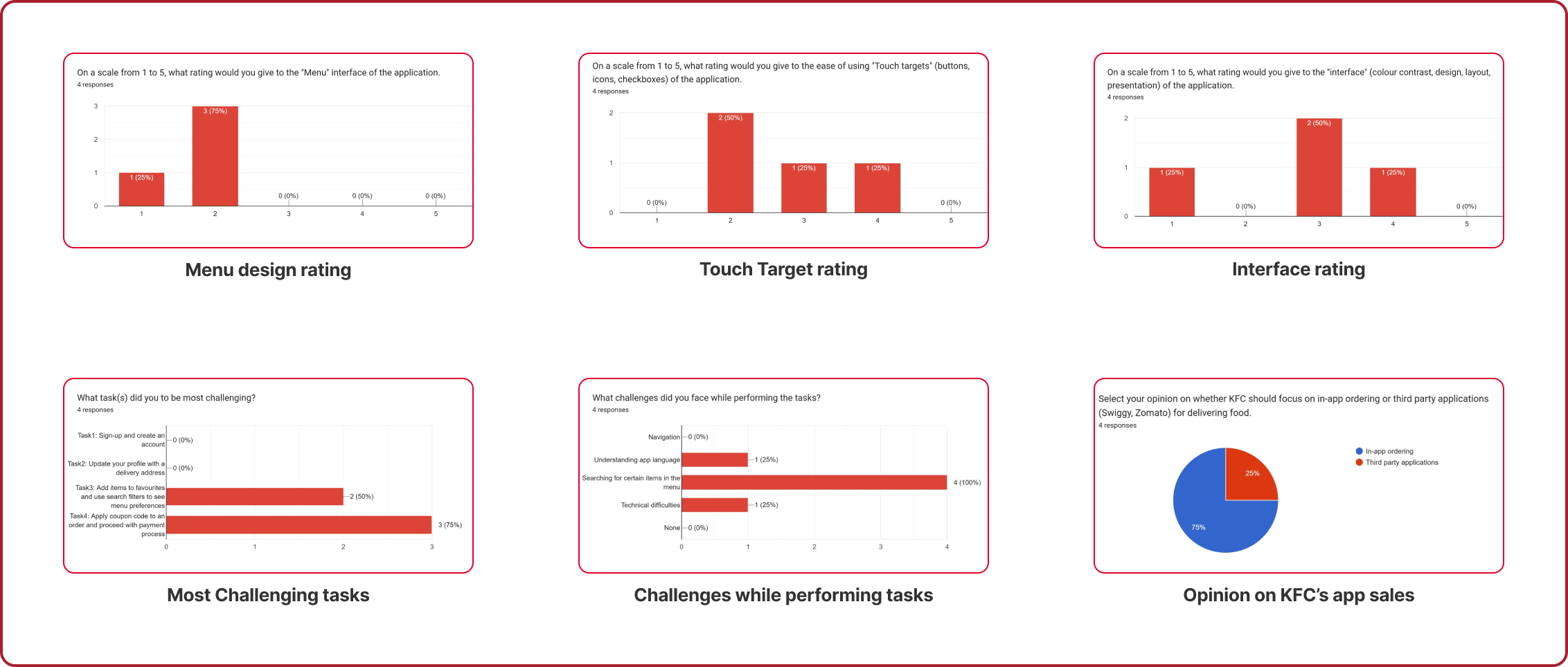
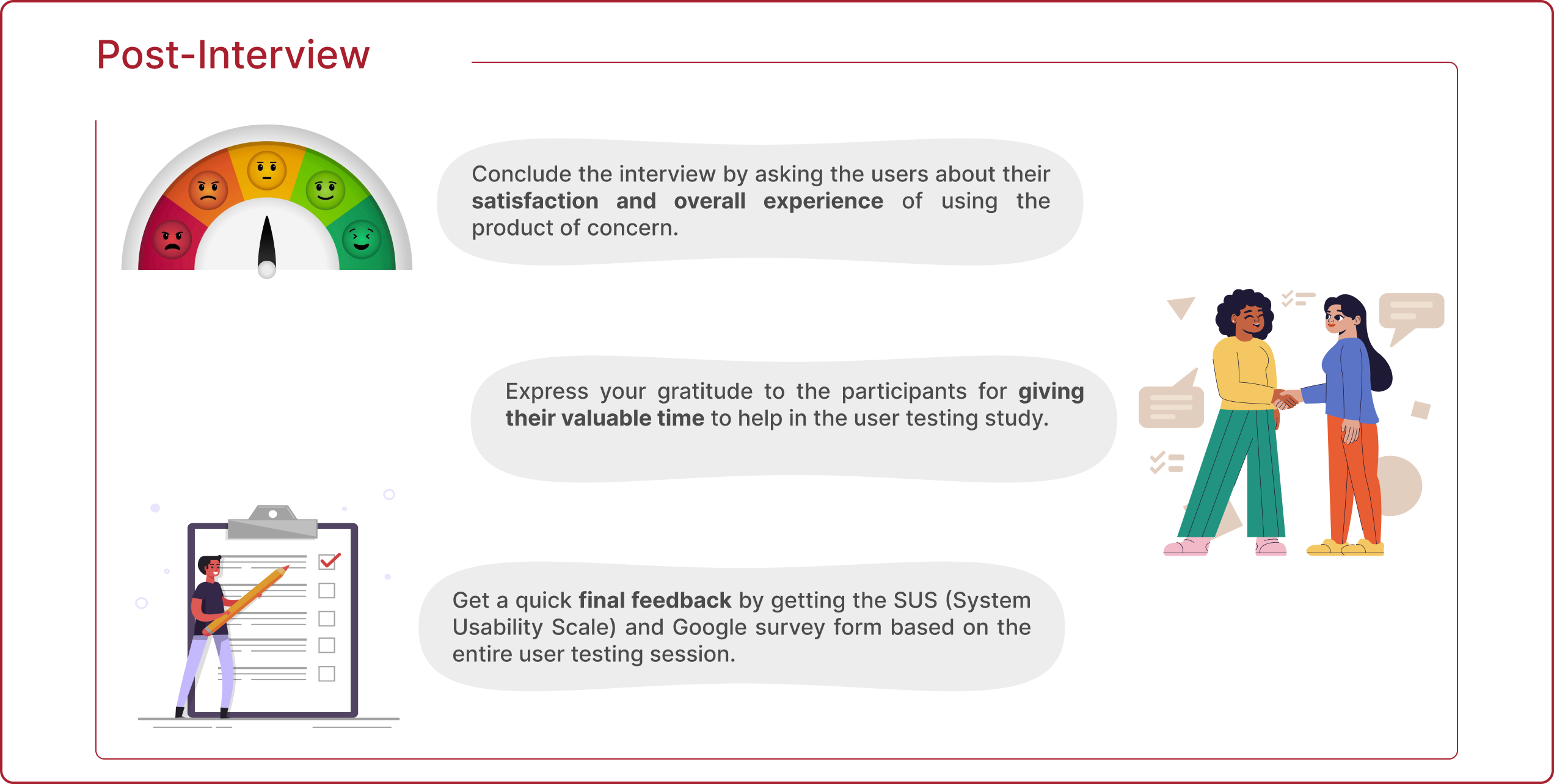
A survey was conducted after the usability testing sessions, and each of the participants gave their opinions about different components of the application.
Sign-Up Process:
Browser redirection, unclear icons, and mandatory phone number entry frustrate users.
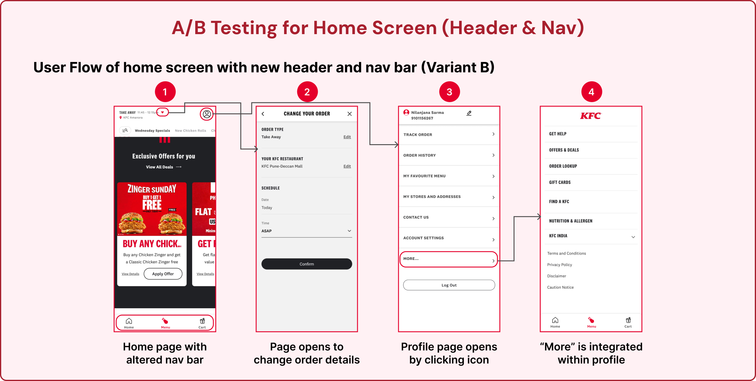
Homepage Improvements:
Improve offer visibility, simplify the navigation bar, and relocate the “Account” tab.
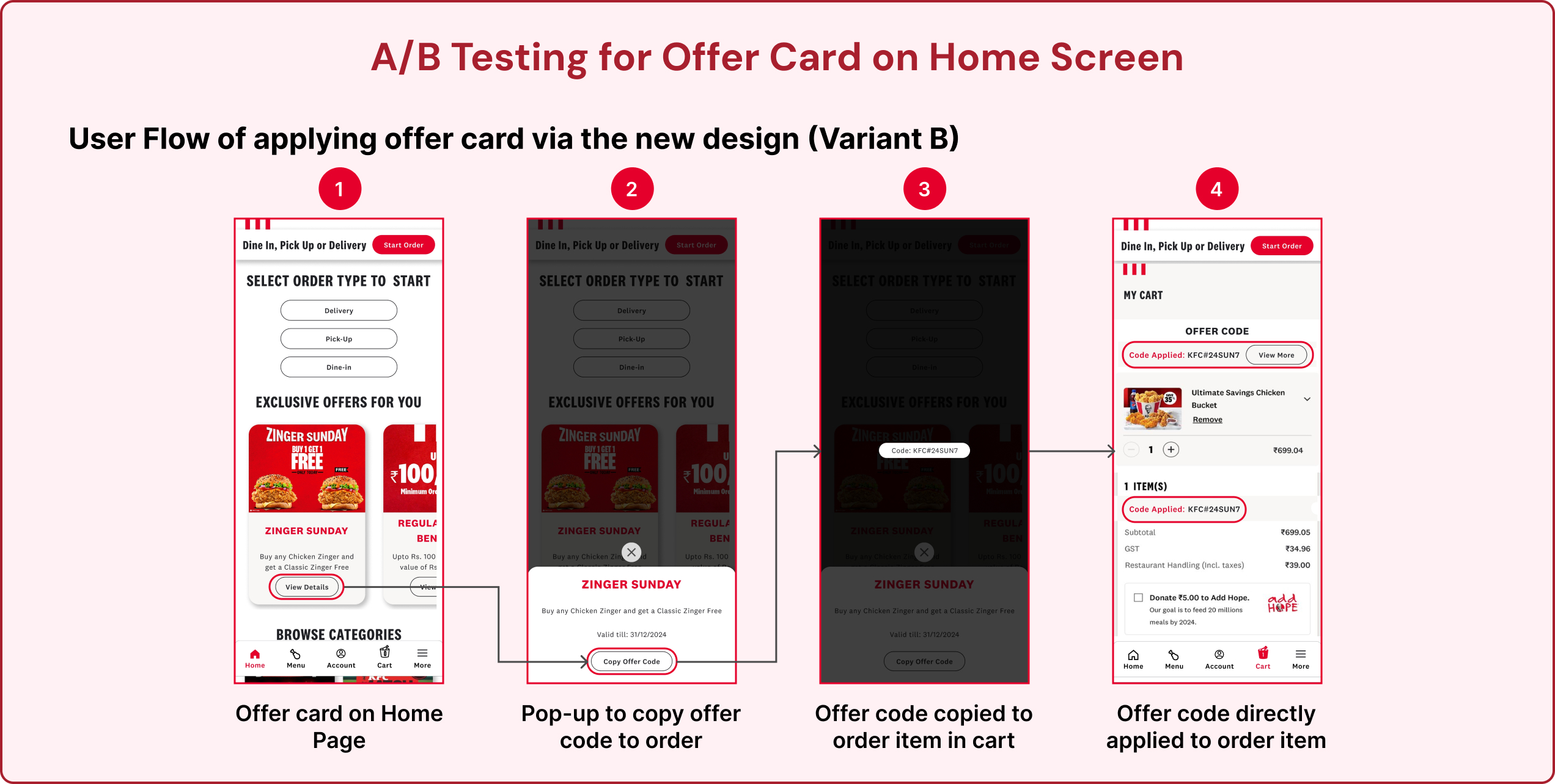
Offers & Discounts:
Place “Apply Offers” below the total amount and highlight discounts clearly.
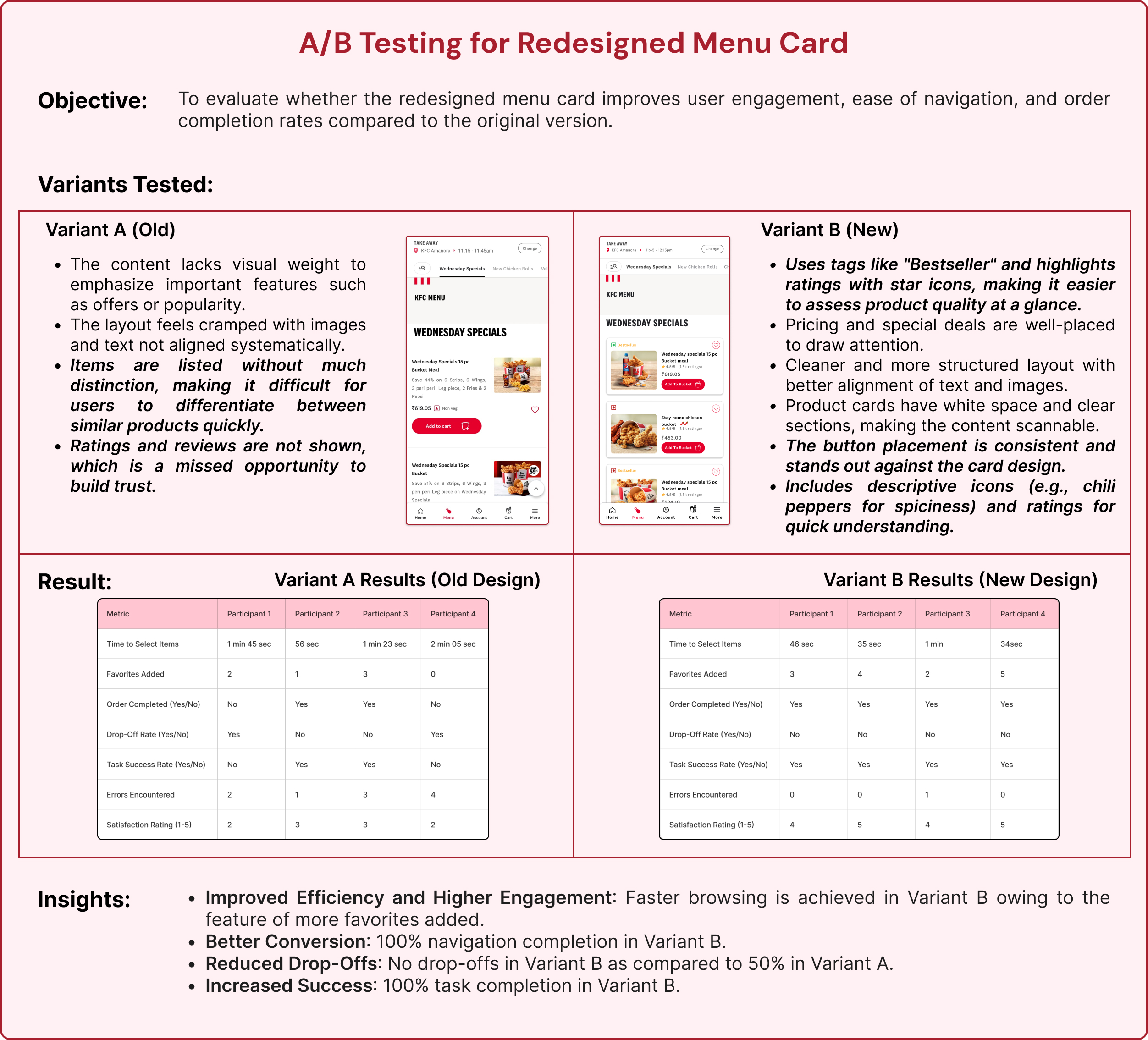
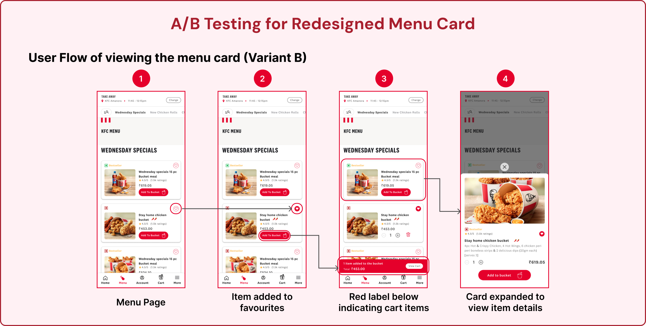
Menu Card:
Focus on key details, improve layout, and show ratings and reviews for trust.
Favorites & Filters:
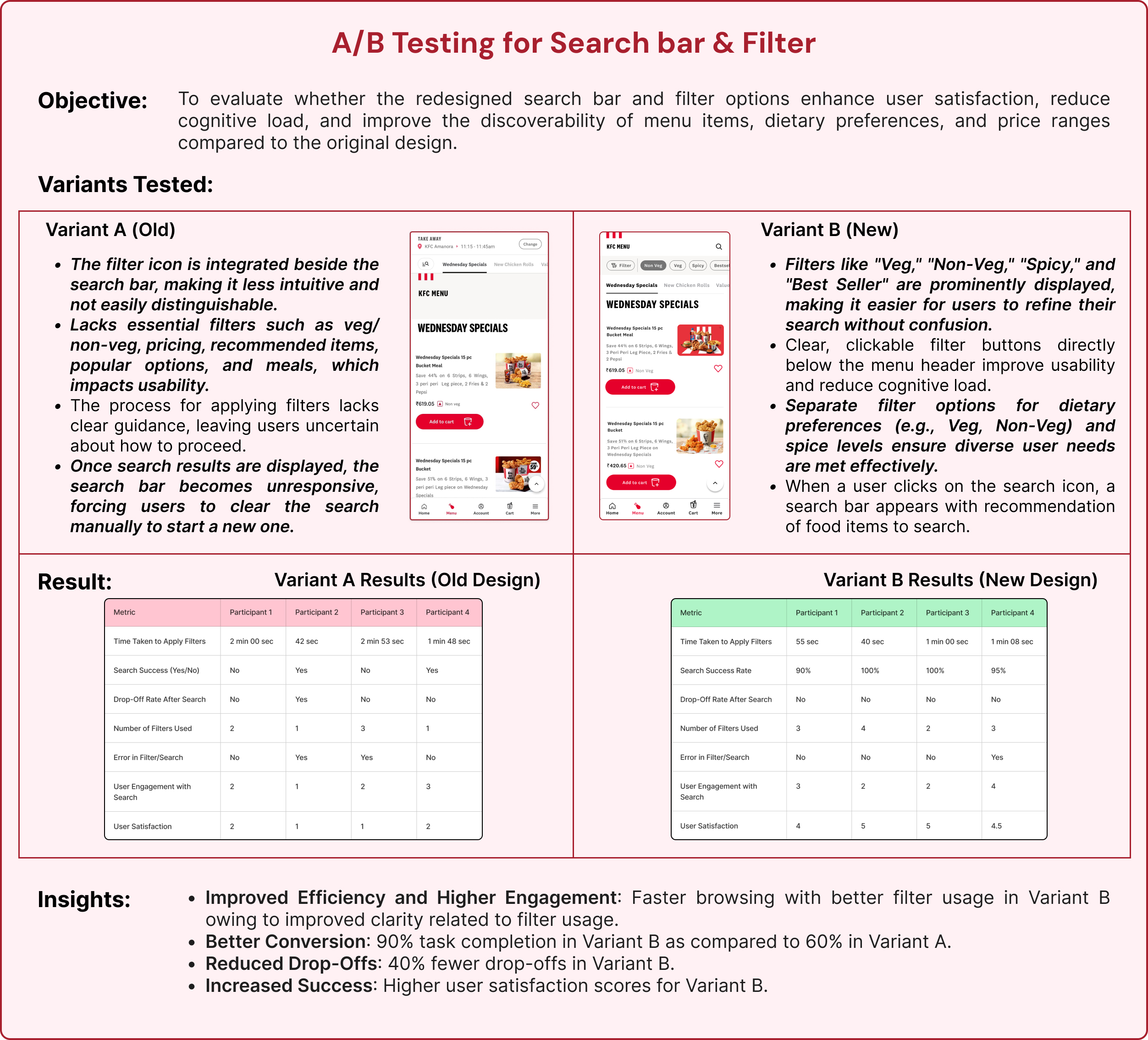
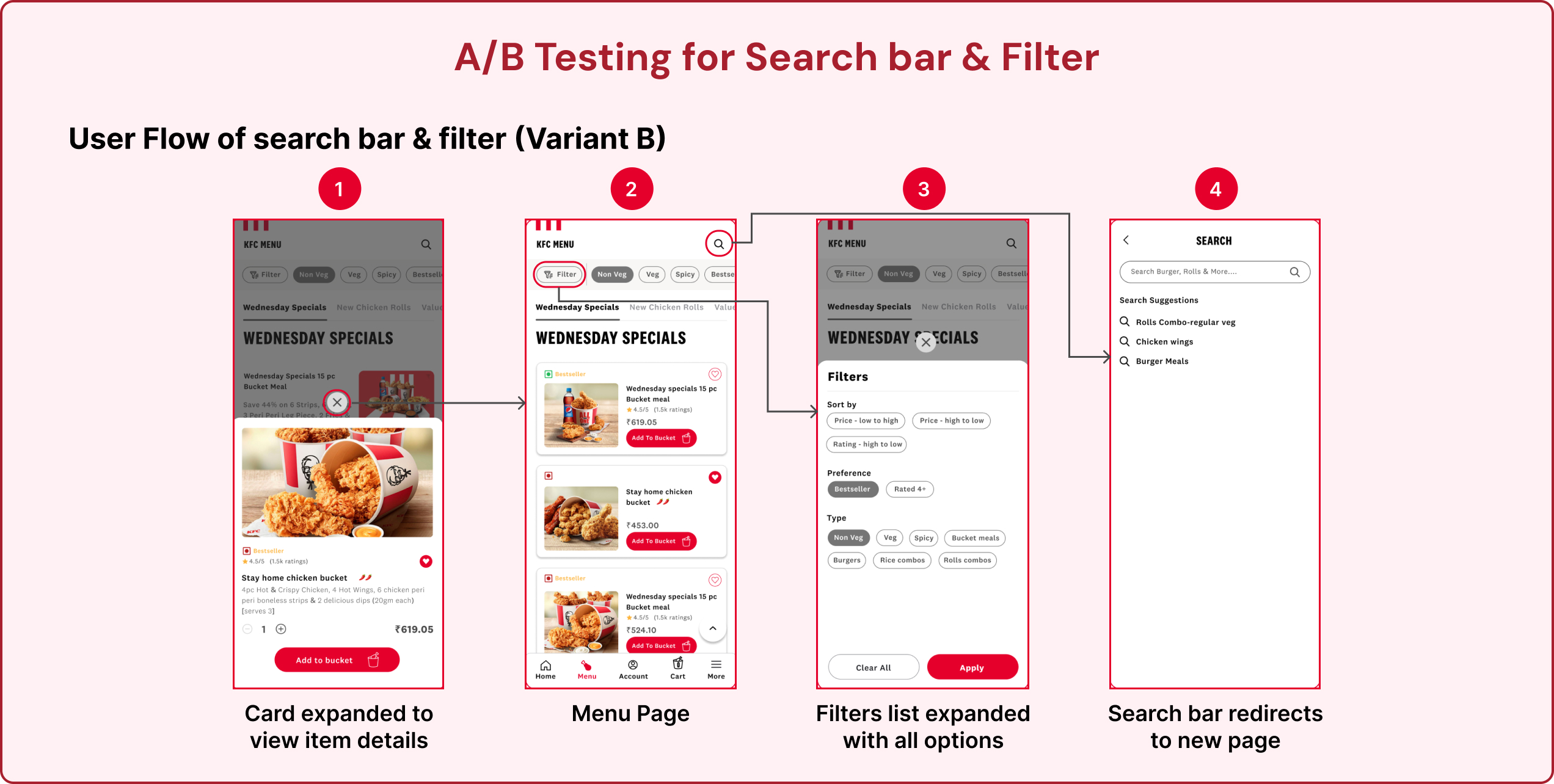
Add categorization, improve feedback, and fix the misleading “Search” icon.
General Design:
Address alignment, sizing issues, and overall UI consistency for a more polished look.

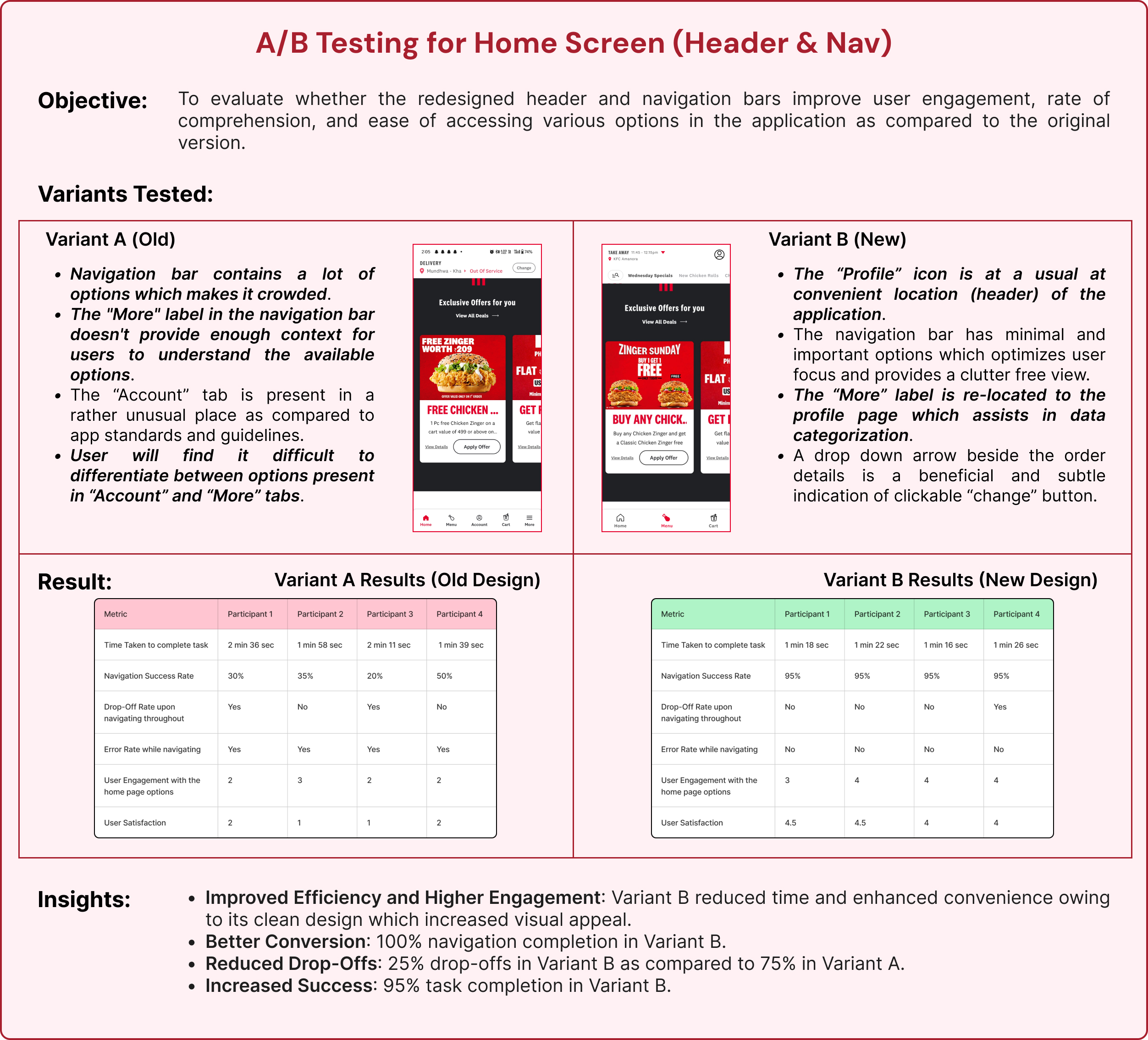
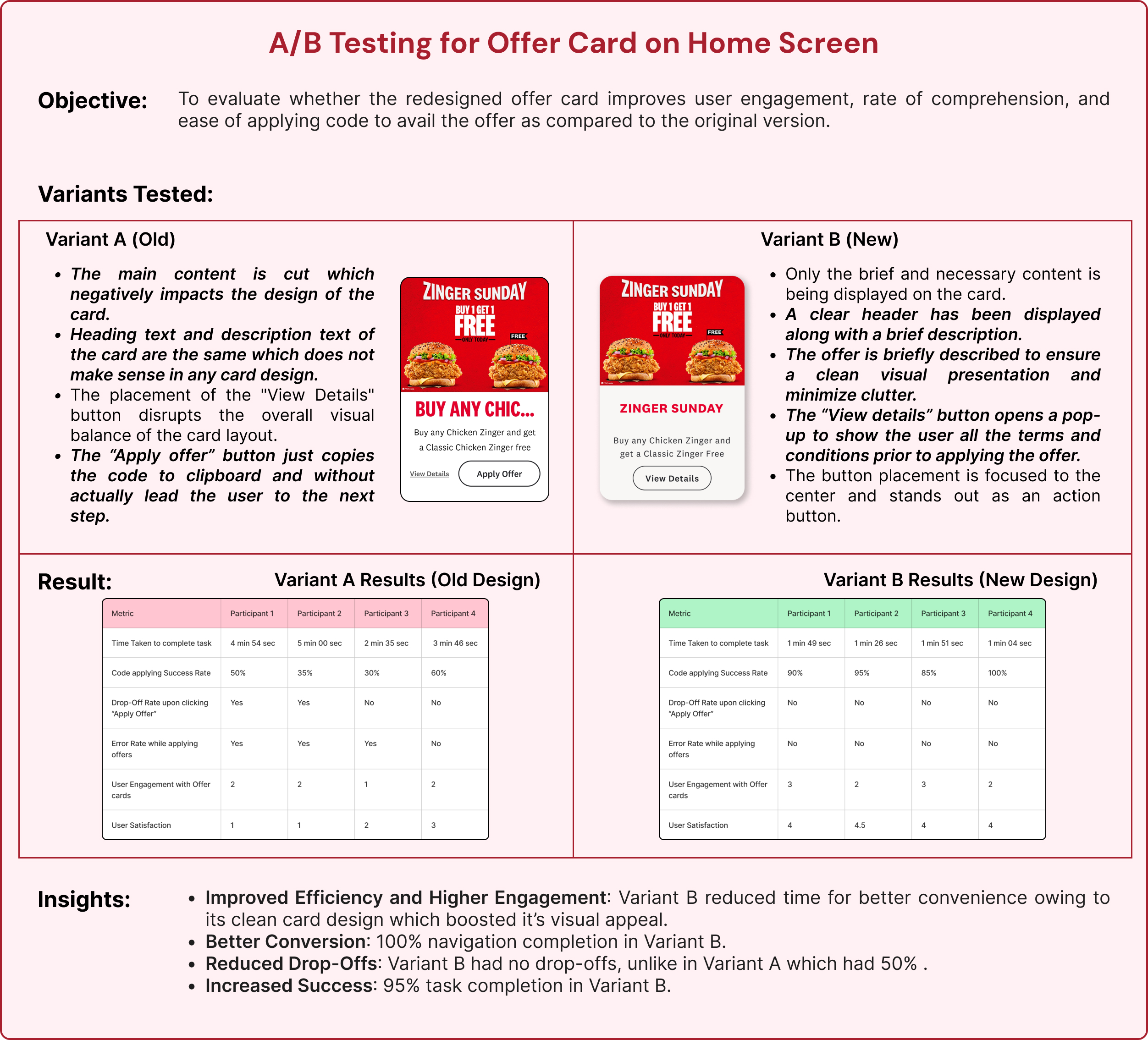
How are we solving this problem?
We refined the screens based on critical insights obtained from user testing and further validated the redesigns through A/B testing.
This process allowed us to assess the performance of the updated designs, ensuring they addressed user pain points while enhancing usability, engagement, and overall satisfaction.
Recommendations:
1. Personalized meal recommendations using AI by observing the ordering history of the user.
2. The app requires good and apt UX writing that matches the target audience (youth) at a few places.
USP Ideas:
1. Gamified rewards: Create a “Bucket Points” system where customers earn points with every order to unlock exclusive perks.
2. Customizable Bucket Builder: Allow users to create their own meal bucket by choosing preferred chicken pieces, sides, and drinks, with instant price updates and also offering curated offer combos.
3. Time Capsule Meals: Users can pre-order meals for specific future dates, like birthdays, anniversaries, or events (ex., schedule a family bucket delivery for game night next Friday).
4. Colonels Deal Maker: “Colonel’s Deal Maker” is an interactive, AI-powered feature where users negotiate their meal prices directly with a virtual avatar of Colonel Sanders. The experience blends playful bargaining with engaging storytelling, creating a unique and personal interaction every time users order through the app/Kiosk.
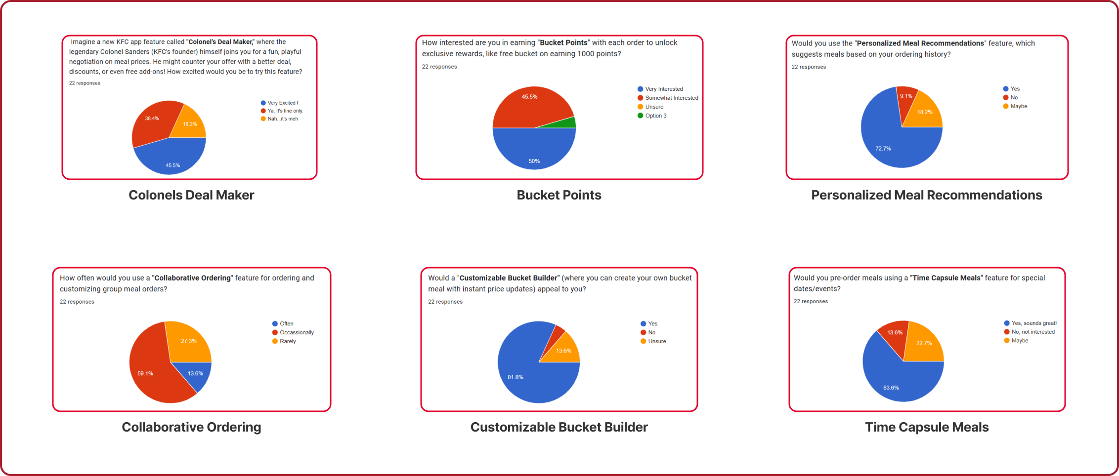
A survey was designed to gather user feedback, validate our unique selling proposition (USP) ideas, and support our recommendations with real user insights. This initiative helped us understand user preferences and refine our approach based on the reviews.
UX Design Proposal (Hypothetical)
A design proposal is a document or presentation that defines the objectives, scope, and methodology of a design project. It serves as a tool for designers to convey their ideas to clients and secure their approval for a project. This design proposal is prepared for IRCTC, focusing on enhancing the user experience of its online booking platform. The design firm drafting this particular design proposal has been named Synergia, which comprises a well-versed and experienced design team to execute any project on a large scale such as this.


